No configuration and no additional HTML markup required. Just include the library's JavaScript and CSS files, and your new navigation is ready.
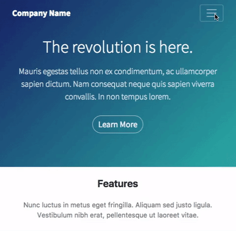
The library works only in Bootstrap 4 projects and requires a valid Navbar to be present on the page.
To use it, simply include its CSS and JavaScript in your HTML. You can find the necessary files in the /dist directory of this project.
<!-- In <head> after the Bootstrap CSS. -->
<link
  rel="stylesheet"
  href="https://unpkg.com/bootstrap-offscreen/dist/bootstrap-offscreen.css"
/>

<!-- At the end of <body>, after jQuery and the Bootstrap js -->
<script src="https://unpkg.com/bootstrap-offscreen/dist/bootstrap-offscreen.js"></script>
Or use npm:
npm i bootstrap-offscreen
Once the JavaScript is included in the page the library is automatically enabled. A new off-screen menu is added to the HTML, which is synced with the contents of your navbar automatically.
<div id="side-menu">
  <button class="close"><span aria-hidden="true">×</span></button>
  <div class="contents">
    <!-- The items from the Bootstrap Navbar will be copied here by the library. -->
  </div>
</div>
Clicking on the navbar toggle button will show the off-screen menu instead of expanding the Bootstrap navbar.
The menu has only basic styling, you can easily customize it with CSS.
The slide-in menu can be positioned on the left or the right side of the screen. By default it is on the right, but that can be easily changed by adding the better-bootstrap-nav-left class to the Bootstrap navbar.
<nav class="navbar navbar-expand-md better-bootstrap-nav-left"></nav>