Responsiveness and Content Placement #3518
Comments
|
PS This only applies to tables it seems. PSS seems on both the dev branch docs and the stable branch docs. PSSS thanks for all the effort! |
|
The newer one seems a bit better https://awesomewm.org/apidoc/index.html The top image still has some resize issues in mobile form factor, but not the main table, at least not in Firefox. |
|
this one i also can reproduce with standard 1920x1080 display:
|
|
Since we now introduced flexbox in our CSS for the mouse style list, I think we could also use it to stack the two UML table for smaller screens. I'll transfer the issue to the awesome repo. |
Sign up for free
to join this conversation on GitHub.
Already have an account?
Sign in to comment
Responsiveness and Placement
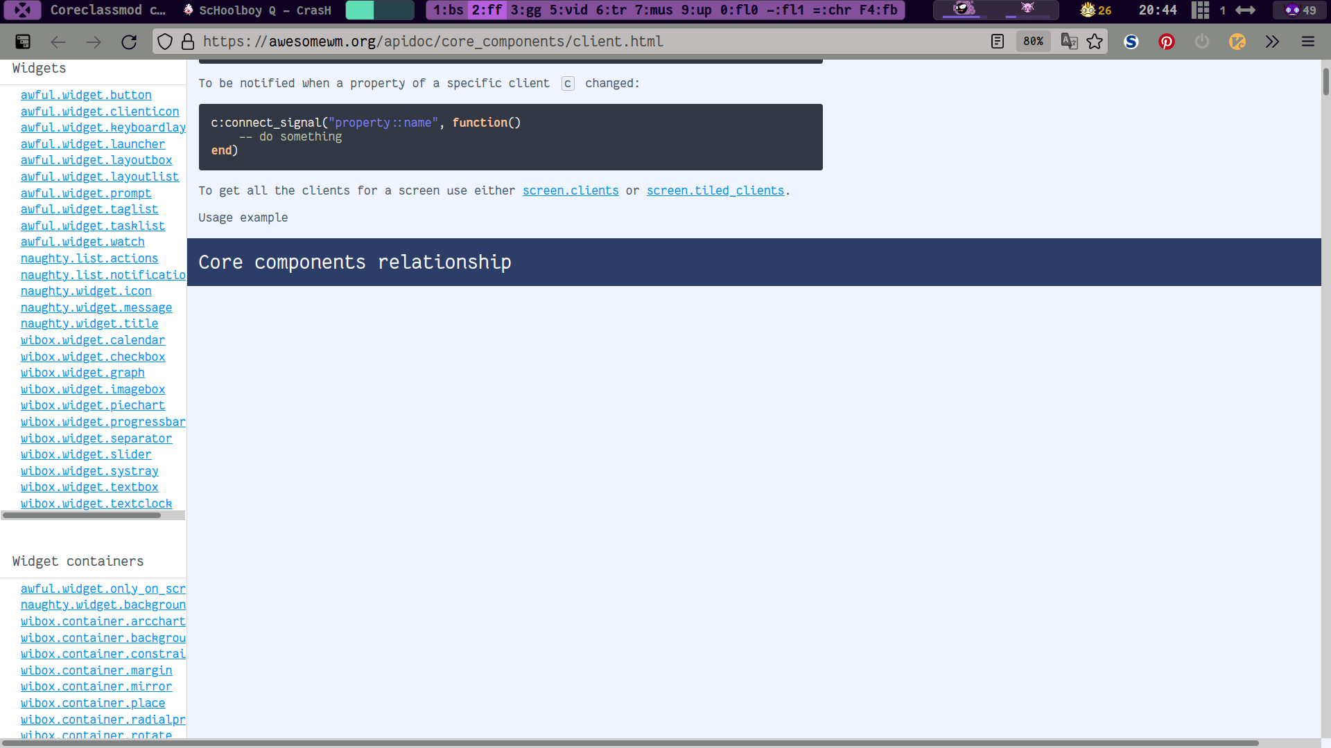
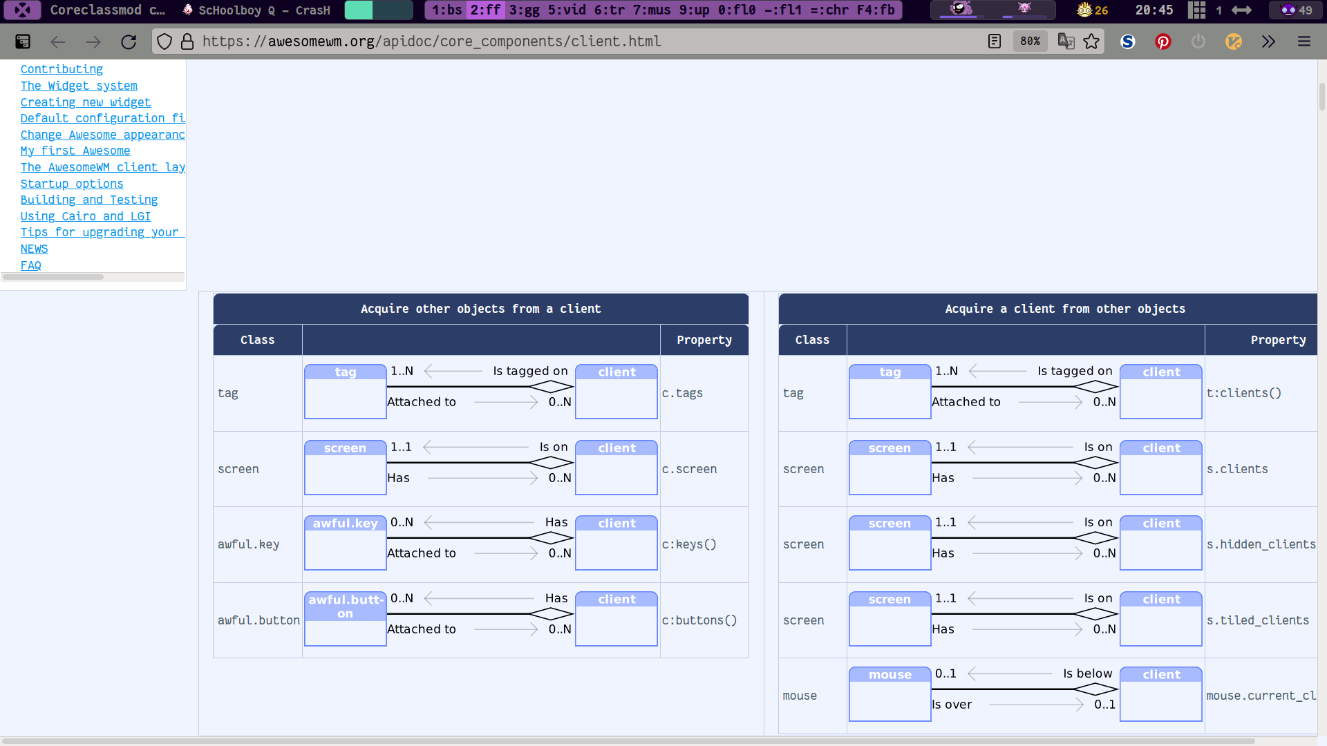
One awesome feature of using awesome as a web developer is being able to dynamically change the size of my browser windows, thus being about to easily check if my media-queries are working, and if so if they are working well. When on awesome's sparse documentation site, I noticed that the media-queries on it were not working the right way, so I made this issue with some ideas to help whoever fixes it along (including if that is me at some point in the future when I have time)
Exhibits A & B
As the images above make clear, when the browser window is narrow enough, the content of tables gets pushed below the sidebar. (maybe less of an issue if we had more explanatory information above such tables...) this means that something is given a fixed size which it cannot be smaller than, in one of a few ways this is possible in CSS so I cannot easily tell you how to fix it like the other issue I just posted.
Avoiding This Altogether
Its very easy to avoid this issue altogether, however it arose, by setting the sidebar and main content's widths with percentages.
Or (because no one can do much with the sidebar if the window is too small, and it wastes good screen real estate) by setting the sidebar to be
100%wide in media queries with a max-width at about where this problem begins to arise. This second solution is more elegant than the first, however there is an even more elegant third solutionOr you can create a hamburger menu that contains the side bar and appears when the width of the screen reaches whatever size, then at the same time the hamburger menu becomes visible, hide the sidebar that would normally be there. This is the most elegant solution to the problem of responsiveness in a two column layout, typically how major websites and web dev hipsters solve this issue, blah, blah, blah.
Another Possible Means of solving this issue
.
Here it is clear that the
bodyselector is set to make overflow visible, yet tables seem set to hide overflow, meaning the space is being created for the extra space the table wants drawn, yet the space is empty clear up to the top of the page, which doesn't look nice and means there is a fundamental design issue (or several probably) in how responsiveness is being handled for this site...Plea For Refactoring
which is probably due to the usual fear and revulsion of this part (and pretty much all) of CSS that is standard fair among devs, which is highly unnecessary and not so hard to solve if the team can manage things like pulling comments from lua and c code to generate a website in the first place. Being that at times users will be using awesome, have a narrow window and check the docs, which at present they might assume a page was generated but lacks content and then leave (and further complain about the docs, which is always inspires a special kind of contributor flame. Yes we all appreciate the hell out of the volunteer effort you've put in, pointing out structural issues underlying how that effort is made into documentation is not an expression of being ungrateful if issues in general aren't seen the same way...) and ultimately means less confidence in, thus less users of, thus less potential contributors to, AwesomeWM.
So please fix this (or I will when I have time, but adding in time-to-pr-merge its probably better anyone else address this first).
Thank you,
Thomas Leon Highbaugh
The text was updated successfully, but these errors were encountered: