Blog post: visual arguments are everywhere #7
Comments
|
This poster was found outside Hillman Library, and while it's not fully composed of visual elements I wanted to concentrate mostly on the image on the right side. The argument is pretty explicit (since it's listed in bold text saying "capitalism is killing our planet"), and then when your eyes are drawn to the image you can see how it supports that argument. While there wasn't much going on in terms of using negative space productively (since there's not that much in the image to begin with), dominance, hierarchy, and rhythm were demonstrated in interesting ways. The relatively darker color of the smoke at the top along with the consistently flowing lines creates a repetition and contrast that attracts the eye and leads it in a certain direction. Similarly, the dark eyes of the capitalist "monster" draws the eye downwards, and the flowing conveyer-belt-like digestive tract also draws the eye to the right. The dark claw marks left by the monster are against the dull grey background of the Earth. When paired with the skeletal remains of animals and the low contrast in this part of the image, a barren atmosphere is created, which effectively supports the point that capitalism is killing and leaving a "dirty" mark on the planet. |

|
I was browsing the internet today during my break looking for tips on drawing animated characters. When doing so, I ended up looking at examples of Disney and Pixar characters and came across the promo poster for Finding Nemo, and it instantly caught my attention. In my opinion, this poster seems to have all the aspects discussed in the articles and each contribute to the viewer's assumptions of the movie. The very first part of the poster that caught my eye is the huge, menacing shark that is smiling at Nemo and Dory. The size of the shark dominates the poster, and it's teeth (black and white patterns with red at its ends) capture the viewer's attention immediately. Behind this shark is a character that blends with the dark water, but the dark and light triangular pattern can be immediately identified as a gigantic set of teeth. I believe it was a conscious, well-thought decision to keep the visible shark in the center of the poster, instead of also lurking at the back. This scary-looking shark in the middle adds a sense of danger and urgency that the other characters in the poster seem unaware of (all the other characters are looking directly at the "camera" except the shark, who is looking hungrily at Nemo and Dory). The positive and negative aspect is not as direct as color contrast. Here, the image above the water seems serene, calm and quiet while directly underneath the surface, the area is packed with fish and turtles and different species. This contrast (positive and negative) adds mystery to the viewer, who lives above the surface and is now curious to know what happens beneath. Here, movement is portrayed with the fins and tails (all of them are curved) of the species, and also with the direction they are facing. All face toward Nemo and Dory but look at the camera. If the characters did not face Nemo, the audience wouldn't be able to find Nemo as the two characters are small compared to their surrounding characters (tiny prey among huge predators- yikes... adds fear). This use of dominance, density, contrast and movement all aptly complement the title and spark curiosity in the audience. |
|
|

|
I was looking through some books at Hillman and the cover of this book Remix the Book by Mark Amerika really stood out to me. I immediately thought about Julie Thompson's Elements of Graphic Design. Although the design has no explicit argument, it uses many of the elements that Thomson mentioned to create a visual representation of the book, and to draw the attention of a potential reader.
The initial element of graphic design that came to my mind when seeing this was rhythm and movement. The design draws your eyes into the middle at first glance, and then makes your eyes want to move all over the picture all at once. There is repetition of the small print in the background-- even though the same words are not being repeated, the layout of it almost tricks your mind into thinking they are. The diagonal larger words in the foreground sort of direct your eyes in all directions around the design. With a design that has so much going on, like this one, it's easy for the elements to lead the viewer's eye directly off the page. A crucial decision that the designer made to avoid that here was to frame the bottom and top of the piece with the blocks of green. The yellow of the background is so bright that if it extended across the entire background, it would draw the viewer's eyes right off the edge of the page. The soft green, no matter how subtle it is, keeps the elements of the design contained within the page. The designer (I don't want to say Amerika here because I cannot assume that he designed the cover) also used negative space as well as dominance through color and proximity to draw the looker's eye directly to the dark, large 'R' with the title and author name in the middle. This was very clearly a conscious choice because the author and title are the two most important pieces of information about a book, so generally that should be the most prominent part of the cover design. Overall, the design has a very chaotic feel which very strongly embodies the title (and, I'm assuming, theme) of the work. I could unpack so much more about the design choices of this book cover, but I don't want everyone to be reading this forever. I just really like analyzing visual design like this and trying to understand all of the deliberate design choices that were made and why. |

|
|

|
This is a photo that I see circulate on Twitter every couple of months. Every time I see it, I stop and think about its argument. The picture has the words "Save Water" on the background, but it blends in and does not grab your attention right away. The hourglass shape really shows the difference in water usage around the world. The top half is filled with water and has two kids swimming. The bottom half shows a woman waiting for just a drop to fall. It really shows the difference in resources around the world. It also shows the lack of awareness of these issues. This picture uses negative space around the hourglass. Even though there are words in the background, they blend in enough that they don't take away from the focus. The background is darker, and it makes the hourglass stand out. The light colors and size of the hourglass allow it to have dominance. The photo has the same faded texture across it. The color scheme also works nicely together. I think that all of these elements allow the visual to present a strong and clear argument. |

|
The photo above is of 'Trump Baby'. The balloon originated in the UK and is obviously meant to ridicule Donald Trump. The balloon has many things going for it: the large head in comparison to body size (egotistic), the snarling face (condescending), the evident spray on tan and hairdo (superficial), the smartphone (whines through twitter), and the obvious caricature as a baby (unreasonable and prone to fits). All of these were design choices meant to mock Trump's actions or character. Besides the balloon, the wider picture also has rhythm (the crowd of people around Trump Baby), negative space (the space between Trump Baby and the crowd), and examples of dominance and hierarchy with the balloon placed in the center of the photo, larger than anything else in the photo, and noticeably contrasting in color with the rest of the crowd surrounding it. |

|
The image I chose was the cover of The Pitt News’ Employment Guide a few weeks ago. The little negative space in this image works in its favor, as it displays chaos which ties into the argument the creator was trying to make. I believe they are showing the chaos college students face when trying to enter into the workforce in an implicit way. There is so much competition and disarray, and the creator effectively displayed this through using multiple people all close together, leaving little negative space, and by drawing the people in an extremely tired and sort of deranged way. This image also displays dominance — they use the density of the college students combined with placing the, what I assume to be, full-timer at a larger scale, alone, and slightly in front of the students. The argument is implicit, because there are no direct words stating their argument. Rather, they hint at their argument through the small text and images to compliment it, such as “Internship Unpaid 168 hrs/wk” with three college students clamoring to grab the paper. |

|
This image talks about how colonization and imperialism have been overwritten and sugarcoated over the years. In the graphic, the word Thanksgiving is slowly being changed, and certain parts of the word are being left out. The letters remaining almost spell out "TAKE", minus the "E". At a certain point that "E" must be forcibly pasted over the "G" causing the word "GIVE" to shift over for the sake of "TAKE". The forced addition of this "E" is depicted as a bit violent as there is some bloodshed as a result of the action. The word "Thanksgiving" itself is an interesting choice as well, since the "holiday" has been severely whitewashed to be palatable to Americans as a day to eat turkey, rather than a day to contemplate the genocide of Native Americans. I think that the argument being made by this image is that history of genocide and oppression is often eroded away by the oppressor and sometimes even forcibly changed to the detriment of the oppressed party (the bloodshed representing the pain that these actions cause those groups). The words "GIVE" and "TAKE" are meant to clearly depict who to sympathize with. The graphic uses a well known case of colonization that has been sugarcoated in order to relate to a larger audience. From a design perspective, the bright red color in such a large volume draws your eyes to the word "THANKSGIVING" first. However, the downward motion of the letters helps the initial word fade from your mind while the stark white letters of the word "TAKE" overpower the narrative. |

|
I came across this ad by "Progressive Commercial" in a fortune magazine which I sometimes read in my free time.
|

|
I would say that the space that appears that the miners have dug out could be the negative space and the dirt around them and the diamonds are the positive space. How close the miner is to getting the diamonds can be an example of proximity in dominance and hierarchy. The image is very simplistic. The miners are the most complex parts of the images while the rest is made from basic shapes. The repeated images in the dirt and diamonds make for visual unity which which gives the image rhythm and movement. Overall, I would say this image is not the best example of negative and positive space, dominance and hierarchy, and rhythm and movement, but is still effective in making its argument. The image also has little text and I believe the text could be more prominent to enhance the image. |

|
This is an advertisement I have seen in class when discussing WWF, who makes quite powerful arguments with their visuals they circulate. Here, they are comparing our ecosystem to a game of Jenga, where many of us know that when you pull the wrong log, everything comes tumbling down. This is a very strong argument and visual, making it clear to the viewer how delicate and fragile our ecosystem is, and so we must take care of it and be careful of how we treat what is around us here on Earth. In terms of design functions in this visual, WWF uses negative space around the “game of Jenga” to emphasize the focal point of the advertisement, thus using the negative space quite well. I would say from a glance that there is not much dominance or hierarchy within the graphic, other than the human hand coming to remove a log, grabbing our attention a bit more. The clouds in the background and birds flying away to the right of the frame creates a sense of movement, in addition to the human hand, which appears to be moving to grab the log. In my opinion, this artifact is indeed effective, arguing a very valid and somewhat obvious point that humans aren’t being careful enough with our ecosystem and like Jenga, can crumble at any moment if we aren’t gentle. |

|
I saw this advertisement in a National Geographic and it really struck me because of how simple it was, and its use of negative space. the image that is under the lettering of "JEEP" is so much more striking and impactful than it would have been otherwise. I think a traditional ad would have that picture be in the background with big black letters spelling out jeep on the top, it's a familiar pattern. This use of making the background plain black/essentially blank makes the lettering far more striking, and the lettering is the dominant idea in the image. The picture in the background also embodies the rugged and natural imagery that jeep is trying to associate themselves with, and because the eyes are drawn to the lettering immediately, you can't help but also piece together the image as a whole once you see the letters. The asymmetry of having the red jeep in the J also caused my eyes to linger on the image also because the bold color is a stark contrast to the more earthy colors under all the other letters, and generally contributed to the effectiveness of the advertisement, as I definitely spent a little longer looking at this ad than any other in the magazine. |

|
This ad is a great representation of a visual argument. This ad comes from Nikon and they are advertising their Nikon CoolPix S810. The argument suggests that when consumers buy this camera from Nikon, the pictures that they take will be of professional quality. I was able to gather this conclusion because of all the photographers jammed into the camera. In terms of function, I think the negative space was really helpful in distingushing the main argument. The negative space helped draw attention to the main portion of the argument. I noticed the waterfall, but my eyes instantly caught focus of the subjects of the argument. In regards to rhytmm, the trajectory of the photographers helps guide the viewer's eyes towards the Nikon camera. It's key since the Nikon camera is so tiny in comparison to everything else in the image. I would say the argument is successfully communicated. |

|
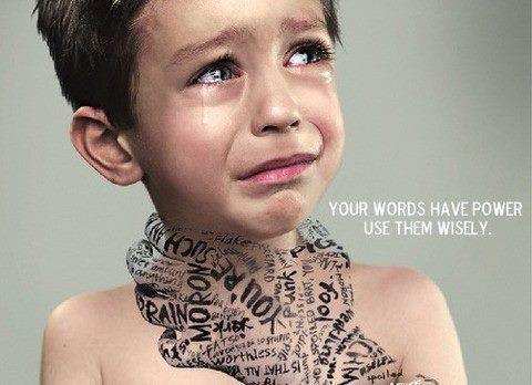
I apologize, I just realized I did not pay attention to the assignment prompt, and did not choose an example that had an argument/claim. I looked up visual argument examples, and I like the picture above. It is simple (lots of empty space in the background), but powerful. Here, the crying child is in the center of the figure and immediately captures the attention of the audience. The words are in the shape of the hand and are black in color (contrasting the colors beneath- fair skin and a light background). The words are varied in style and size, and this disruption of pattern adds to the negative effect of the words on mental wellbeing. The words on the right, “your words have power, use them wisely” are visible but not immediately attention-seeking. This choice of less dominant font works for this case, since the attention of the viewer is first drawn to the crying child and then the hand and then the message. This way, the message is more impactful. |
For homework after lesson 9, I've asked you to find and photograph an example of an argument being made through graphic or visual design. (Note that arguments can be explicit – right there in plain text – or implicit, even subtle. Often both kinds of claims will exist in the same artifact, and will interact.)
Once you've found one, post a picture of it here, and tell us more about the image. What is the argument it's making? How does the design function in terms of positive and negative space, dominance and hierarchy, or rhythm and movement? Would you say the artifact is effectively designed for making the argument you've identified?
The text was updated successfully, but these errors were encountered: