#MaterialDrawer 

The MaterialDrawer library aims to provide the easiest possible implementation of a navigation drawer for your application. It provides a great amount of out of the box customizations and also includes an easy to use header which can be used as AccountSwitcher.
- the easiest possible integration
- integrate in less then 5 minutes
- includes an AccountSwitcher
- Easy to use
- No additional setup
- Many additional usecases possible
- Compact style included
- quick and simple api
- follows the Google Material Design Guidelines
- comes with various themes which help to get your own themes clean
- modify the colors on the go
- uses the AppCompat support library
- compatible down to API Level 10
- supports multiple drawers
- comes with multiple default drawer items
- badge support
- define custom drawer items
- tested and stable
- many many options how to display the drawer
- Translucent StatusBar
- Display Above the Toolbar
- Display Under the Toolbar
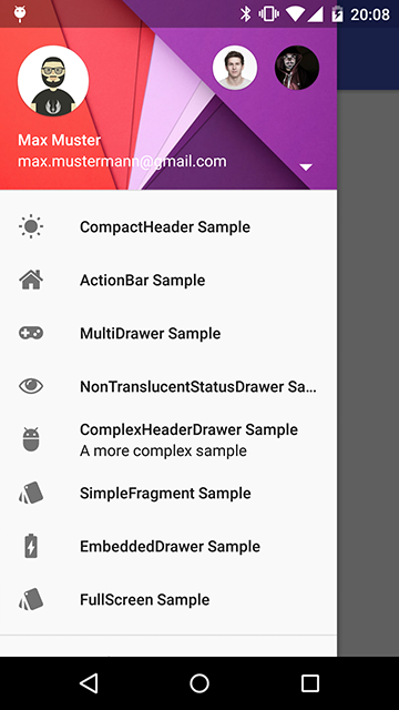
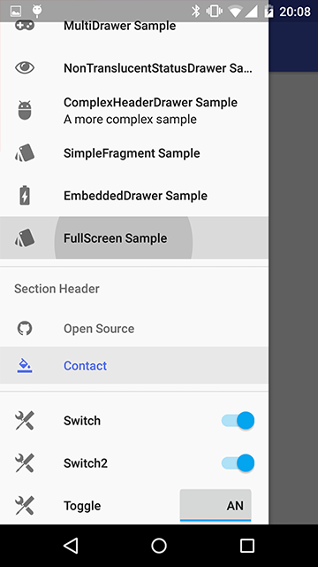
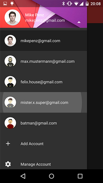
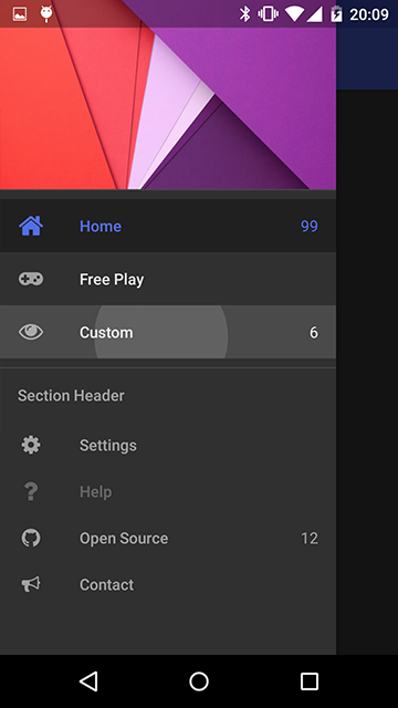
#Preview ##Demo You can try it out here Google Play (wall:splash an open source application which uses this drawer implementation)
##Screenshots
#Include in your project
##Using Maven
The MaterialDrawer Library is pushed to Maven Central, so you just need to add the following dependency to your build.gradle.
compile('com.mikepenz.materialdrawer:library:2.8.2@aar') {
	transitive = true
}
##How to use Here's a quick overview what you have to do within your application. You can find a detailed description of all methods in the WIKI.
###Upgrade Notes
v2.8.0 now uses the latest com.android.support:appcompat version 22.1.0. Please update if you use an older version.
Beginning with v2.7.7, the DrawerImageLoader.IDrawerImageLoader interface now requires you to override the placeholder method (returning a custom placeholder Drawable). You may simply return a null Drawable to retain pre-v2.7.7 behavior, but it must be defined. See the sample app for an example.
Starting with v2.6.0 the OnAccountHeaderListener.onProfileChanged and OnAccountHeaderSelectionViewClickListener.onClick events will allow you to return an boolean.
This boolean indicates if the event was consumed. Return false if you want the drawer to get closed. Also the onProfileChanged event will now contain a boolean
variable which indicates if the clicked profile is the current profile.
If you used a version prior to v2.5.0 check following:
You can remove the padding above the ToolBar. The library now uses a ScrimInsetsLayout. Just set your toolbar within the layout
as you would normally do.
The MaterialDrawer now uses a translucent style by default. (Even if you use a non translucent theme) You can disable this by
setting .withTranslucentStatusBar(false).
###Minimal SetUp
####Code: It's (theoretically) a one-liner :D. This will create an empty drawer.
new Drawer().withActivity(this).build()###Activity with Toolbar ####Code:
Drawer.Result result = new Drawer()
    .withActivity(this)
    .withToolbar(toolbar)
    .addDrawerItems(
	    new PrimaryDrawerItem().withName(R.string.drawer_item_home),
	    new DividerDrawerItem(),
	    new SecondaryDrawerItem().withName(R.string.drawer_item_settings)
    )
    .withOnDrawerItemClickListener(new Drawer.OnDrawerItemClickListener() {
    @Override
    public void onItemClick(AdapterView<?> parent, View view, int position, long id, IDrawerItem drawerItem) {
    	// do something with the clicked item :D
    }
    })
    .build();

//use the result object to get different views of the drawer or modify it's data
//some sample calls
result.setSelectionByIdentifier(1);
result.openDrawer();
result.closeDrawer();
result.isDrawerOpen();
result.addItem(..);
..
###Drawer with AccountSwitcher ####Code:
// Create the AccountHeader
headerResult = new AccountHeader()
	.withActivity(this)
    .withHeaderBackground(R.drawable.header)
	.addProfiles(
		new ProfileDrawerItem().withName("Mike Penz").withEmail("mikepenz@gmail.com").withIcon(getResources().getDrawable(R.drawable.profile))
	)
    .withOnAccountHeaderListener(new AccountHeader.OnAccountHeaderListener() {
		@Override
		public boolean onProfileChanged(View view, IProfile profile, boolean currentProfile) {
		    return false;
		}
	})
	.build();

//Now create your drawer and pass the AccountHeader.Result
Drawer.Result result = new Drawer()
    .withActivity(this)
    .withToolbar(toolbar)
    .withAccountHeader(headerResult)
    .addDrawerItems(
	    new PrimaryDrawerItem().withName(R.string.drawer_item_home),
	    new DividerDrawerItem(),
	    new SecondaryDrawerItem().withName(R.string.drawer_item_settings)
    )
    .withOnDrawerItemClickListener(new Drawer.OnDrawerItemClickListener() {
    @Override
    public void onItemClick(AdapterView<?> parent, View view, int position, long id, IDrawerItem drawerItem) {
    	// do something with the clicked item :D
    }
    })
    .build();
###Activity with ActionBar ####Code:
new Drawer()
	.withActivity(this)
	.withTranslucentStatusBar(false)
    .withActionBarDrawerToggle(false)
	.addDrawerItems(
		//pass your items here
	)
	.build();
###Activity with Multiple Drawers ####Code:
Drawer.Result result = new Drawer()
	.withActivity(this)
	.withToolbar(toolbar)
	.addDrawerItems(
		//pass your items here
	)
	.build();

new Drawer()
	.withActivity(this)
    .addDrawerItems(
    	//pass your items here
    )
    .withDrawerGravity(Gravity.END)
    .append(result);
###Switching between Back-Arrow or Hamburger-Icon If you use the included ActionBarDrawerToggle you can switch between back-arrow or hamburger-icon with the following code snippet. (Please note that the order of these lines matter) ####Code - Show the back arrow:
result.getActionBarDrawerToggle().setDrawerIndicatorEnabled(false);
getSupportActionBar().setDisplayHomeAsUpEnabled(true);
####Code - Show the hamburger icon:
getSupportActionBar().setDisplayHomeAsUpEnabled(false);
result.getActionBarDrawerToggle().setDrawerIndicatorEnabled(true);
###AndroidManifest.xml Use one of the provided themes. They all use the AppCompat theme as parent and define the color values for the drawer.
NOTE: The theme states ActionBar and not NoActionBar like the Appcompat style
- MaterialDrawerTheme (extends Theme.AppCompat.NoActionBar)
- MaterialDrawerTheme.TranslucentStatus
- MaterialDrawerTheme.ActionBar (extends Theme.AppCompat)
- MaterialDrawerTheme.ActionBar.TranslucentStatus
- MaterialDrawerTheme.Light (extends Theme.AppCompat.Light.NoActionBar)
- MaterialDrawerTheme.Light.TranslucentStatus
- MaterialDrawerTheme.Light.ActionBar (extends Theme.AppCompat.Light)
- MaterialDrawerTheme.Light.ActionBar.TranslucentStatus
- MaterialDrawerTheme.Light.DarkToolbar (extends Theme.AppCompat.DarkActionBar) (disabled the ActionBar)
- MaterialDrawerTheme.Light.DarkToolbar.TranslucentStatus
- MaterialDrawerTheme.Light.DarkToolbar.ActionBar (extends Theme.AppCompat.DarkActionBar)
- MaterialDrawerTheme.Light.DarkToolbar.ActionBar.TranslucentStatus
###Style the drawer
If you don't use one of the provided styles you have to add the style values to your style. Here's a simple sample.
This is the same as the Custom style just with a parent like parent="Theme.AppCompat.Light.DarkActionBar"
Create your custom style and use one of the provided themes as parent. If you don't need a custom theme see the next section, how you can set the colors just by overwriting the original colors.
    <style name="CustomTheme" parent="MaterialDrawerTheme">
        <!-- ...and here we setting appcompat’s color theming attrs -->
        <item name="colorPrimary">@color/material_drawer_primary</item>
        <item name="colorPrimaryDark">@color/material_drawer_primary_dark</item>
        <item name="colorAccent">@color/material_drawer_accent</item>

        <!-- MaterialDrawer specific values -->
        <item name="material_drawer_window_background">@color/material_drawer_window_background</item>
        <item name="material_drawer_background">@color/material_drawer_background</item>
        <item name="material_drawer_icons">@color/material_drawer_icons</item>
        <item name="material_drawer_primary_text">@color/material_drawer_primary_text</item>
        <item name="material_drawer_primary_icon">@color/material_drawer_primary_icon</item>
        <item name="material_drawer_secondary_text">@color/material_drawer_secondary_text</item>
        <item name="material_drawer_hint_text">@color/material_drawer_hint_text</item>
        <item name="material_drawer_divider">@color/material_drawer_divider</item>
        <item name="material_drawer_selected">@color/material_drawer_selected</item>
        <item name="material_drawer_selected_text">@color/material_drawer_selected_text</item>
        <item name="material_drawer_header_selection_text">@color/material_drawer_header_selection_text</item>
</style>No need to create a custom theme. Just set these colors (or some of them) and you have your own style.
	<!-- Material DEFAULT colors -->
    <color name="material_drawer_primary">#2196F3</color>
    <color name="material_drawer_primary_dark">#1976D2</color>
    <color name="material_drawer_primary_light">#BBDEFB</color>
    <color name="material_drawer_accent">#FF4081</color>

    <!-- OVERWRITE THESE COLORS FOR A LIGHT THEME -->
    <!-- MaterialDrawer DEFAULT colors -->
    <color name="material_drawer_window_background">#F9F9F9</color>
    <color name="material_drawer_background">#F9F9F9</color>
    <!-- Material DEFAULT text / items colors -->
    <color name="material_drawer_icons">#FFF</color>
    <color name="material_drawer_primary_text">#DE000000</color>
    <color name="material_drawer_primary_icon">#8A000000</color>
    <color name="material_drawer_secondary_text">#8A000000</color>
    <color name="material_drawer_hint_text">#42000000</color>
    <color name="material_drawer_divider">#1F000000</color>
    <!-- Material DEFAULT drawer colors -->
    <color name="material_drawer_selected">#E8E8E8</color>
    <color name="material_drawer_selected_text">#2196F3</color>
    <color name="material_drawer_header_selection_text">#FFF</color>

    <!-- OVERWRITE THESE COLORS FOR A DARK THEME -->
    <!-- MaterialDrawer DEFAULT DARK colors -->
    <color name="material_drawer_dark_window_background">#303030</color>
    <color name="material_drawer_dark_background">#303030</color>
    <!-- MaterialDrawer DEFAULT DARK text / items colors -->
    <color name="material_drawer_dark_icons">#000</color>
    <color name="material_drawer_dark_primary_text">#DEFFFFFF</color>
    <color name="material_drawer_dark_primary_icon">#8AFFFFFF</color>
    <color name="material_drawer_dark_secondary_text">#8AFFFFFF</color>
    <color name="material_drawer_dark_hint_text">#42FFFFFF</color>
    <color name="material_drawer_dark_divider">#1FFFFFFF</color>
    <!-- MaterialDrawer DEFAULT DARK drawer colors -->
    <color name="material_drawer_dark_selected">#202020</color>
    <color name="material_drawer_dark_selected_text">@color/material_drawer_primary</color>
    <color name="material_drawer_dark_header_selection_text">#FFF</color>
##FAQ #####How can i create a drawer without a default selection
//just use this with the Drawer.Builder
.withSelectedItem(-1)
#####How can i use this with espresso
androidTestCompile ('com.android.support.test.espresso:espresso-contrib:2.0') {
//this library uses the newest app compat v22 but the espresso contrib still v21.
//you have to specifically exclude the older verisions of the contrib library or
// there will be some conflicts
    exclude module: 'support-annotations'
    exclude module: 'support-v4'
    exclude module: 'recyclerview-v7'
}
##Apps using the MaterialDrawer (feel free to send me new projects)
#Credits
-
Mirosław Stanek - GitHub
- For his InstaMaterial concept and the idea of inflating the drawerLayout InstaMaterial Concept
-
Lunae Luman - Behance for the Header Image
#Developed By
- Mike Penz - http://mikepenz.com - mikepenz@gmail.com
#License
Copyright 2015 Mike Penz

Licensed under the Apache License, Version 2.0 (the "License");
you may not use this file except in compliance with the License.
You may obtain a copy of the License at

   http://www.apache.org/licenses/LICENSE-2.0

Unless required by applicable law or agreed to in writing, software
distributed under the License is distributed on an "AS IS" BASIS,
WITHOUT WARRANTIES OR CONDITIONS OF ANY KIND, either express or implied.
See the License for the specific language governing permissions and
limitations under the License.