Improve "Fund your offer" popup #1218
Comments
|
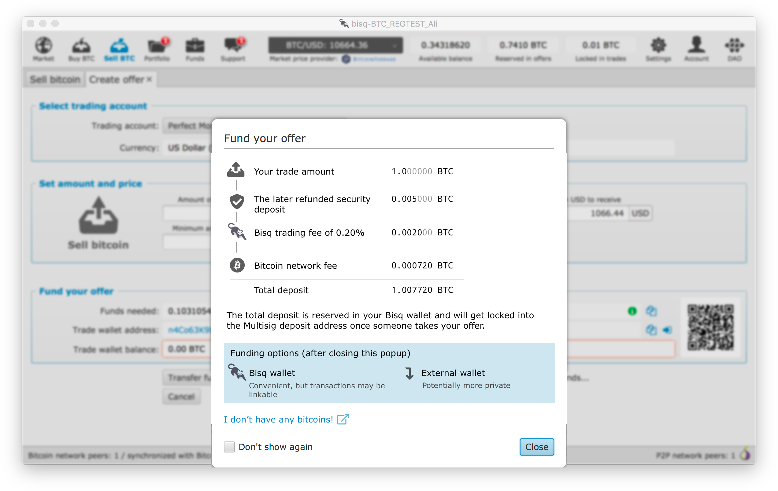
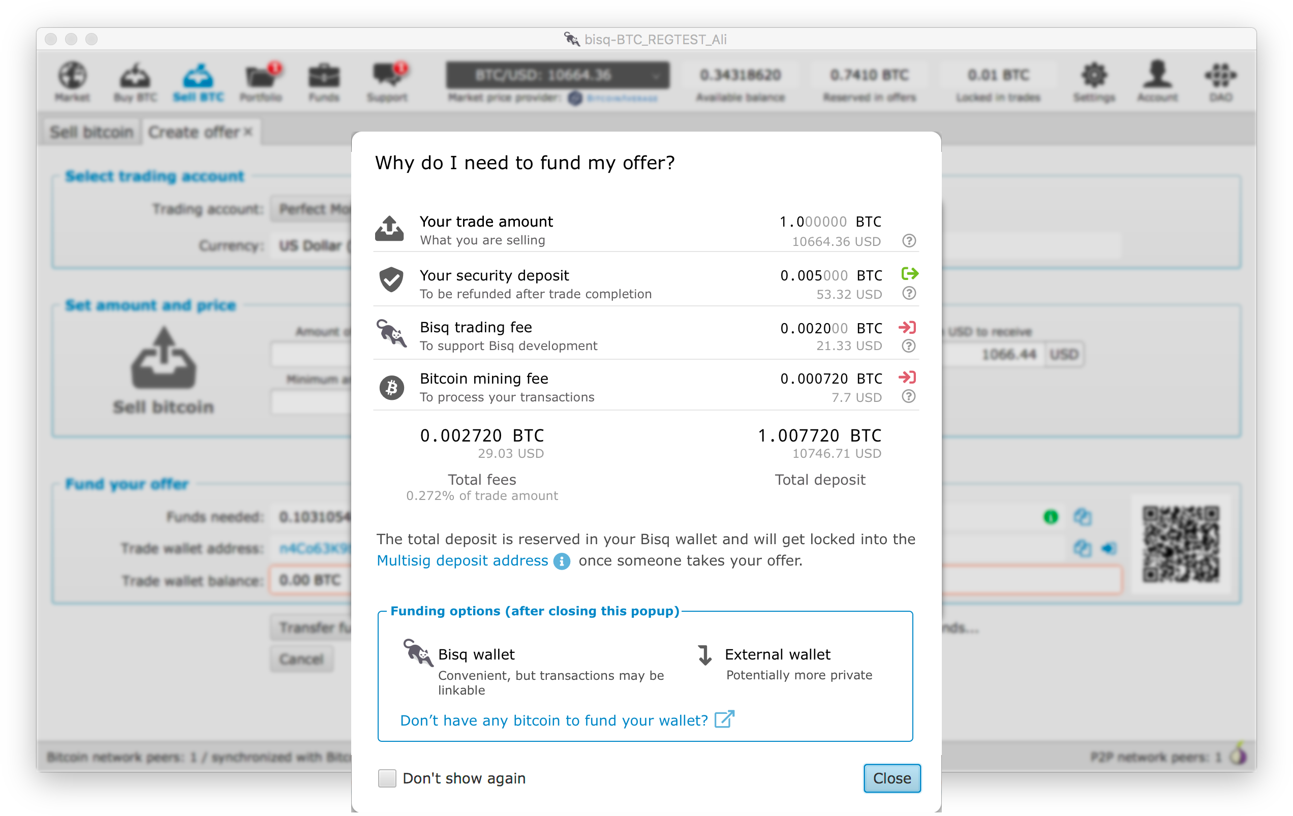
I'm thinking of shortening the text while keeping details following @ripcurlx idea of listing it like a receipt : |
|
I've tried to put all ideas into a mockup to continue the discussion 😄. I'm not happy with the funding option box yet, but just as a first iteration. |
|
Looks great!!!! The new icons might be used at more places! |
|
Thanks - still I'll start to put this kind of more designable screens out into the #ux channel so real UI designers may pick it up and no one will check "Don't show again" any more 😉 |
|
I also need to check the current state of the http://www.jensd.de/wordpress/?p=2686 lib as I've also used icons from the Fontawesome Pro pack (just purchased it yesterday). Maybe in worst case I need to fork it and include the pro version of the font myself. |
|
Very nice!
|
|
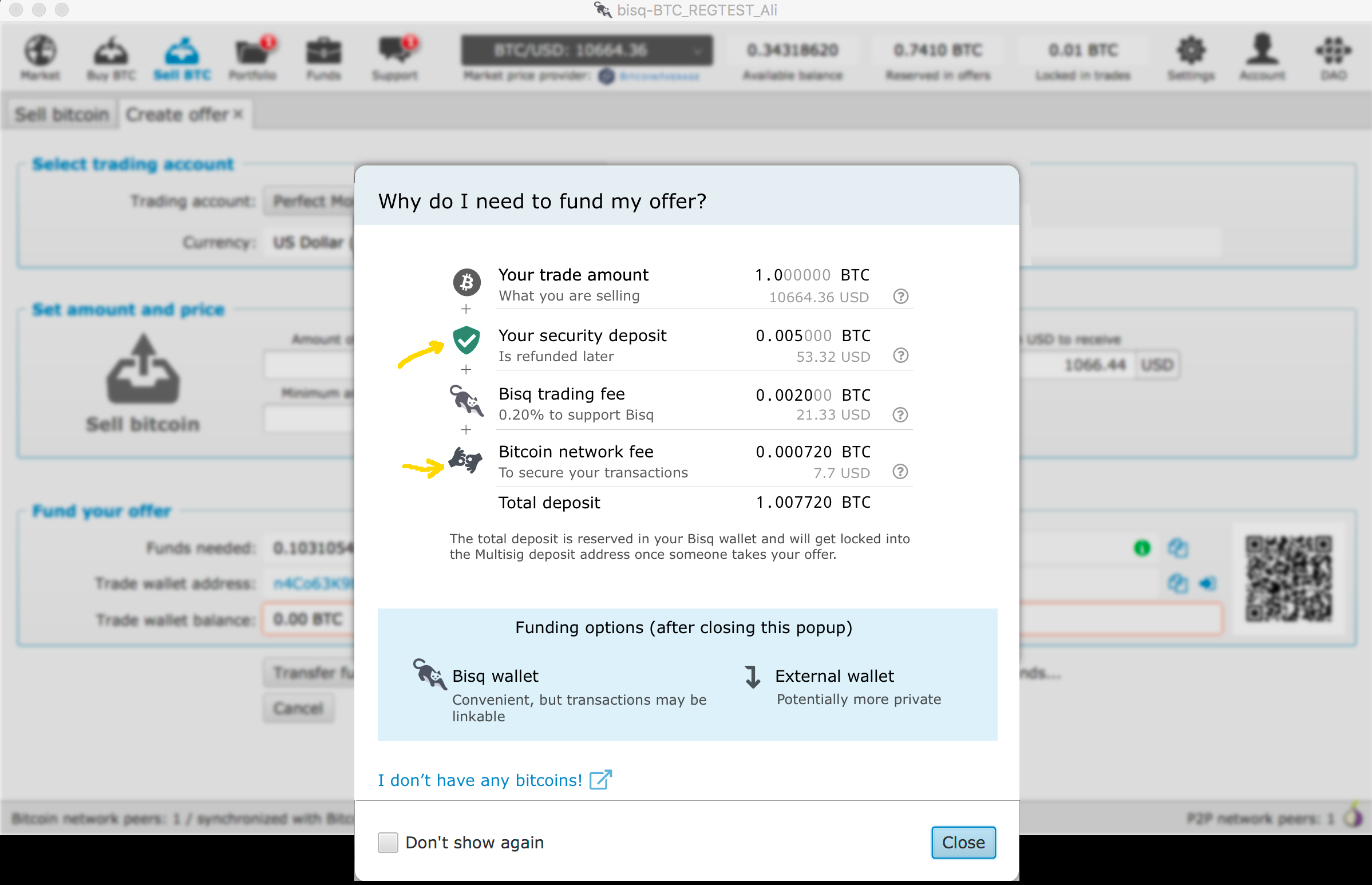
Good point @mrosseel on the price equivalents. This might make it easier for people to valuate the fees and deposit especially if they are new to the crypto world. |
|
The only issue I see is in non-fiat trades, e.g. BTC <-> LTC, is choosing which fiat currency to use. There is no 'global' fiat currency as far as I know, only currencies inside of payment accounts. These could either not be setup or have a mix of USD/EUR/... . Maybe the easiest would be to define a fallback currency 'USD'. Even better would be to have a 'preferred' fiat currency in the account settings. |
|
I've created an updated version with and without Dollar values. Of course in the case of crypto-crypto trading we could think about leaving the conversion out atm until we have a proper solution for that. We also should think about how we could phrase "Multisiq deposit address" in a more user friendly way. If you are not into cryptocurrencies more deeply this might just sound confusing to you. Maybe someone of you has a good idea how to communicate this kind of escrow transaction in another way. |


|
I like the visual look of the Receipt UI Givie it a bit more white space. Eg. |
|
looking good!
|
|
Agree that more whitespace would be better. Also darkgreen icon is good. Yes USD value might be good. |
|
Thanks for the feedback! We definitely could add more whitespace. Just was to lazy in the mock-up to move it more upwards 😉. Having just one icon colorized is not very good, as I personally wasn't sure what it should mean. Having all others grey gives you the feeling, that only the green one is somehow selected. Maybe we could add an additional indicator showing which entry gets refunded and which are part of the total fees to be paid for doing this transaction. I'll add the total value in USD also in the next mockup. |
|
@ripcurlx The icon coloured was just a test getting an idea how this might look if refunds are coloured differently. You can split the |
|
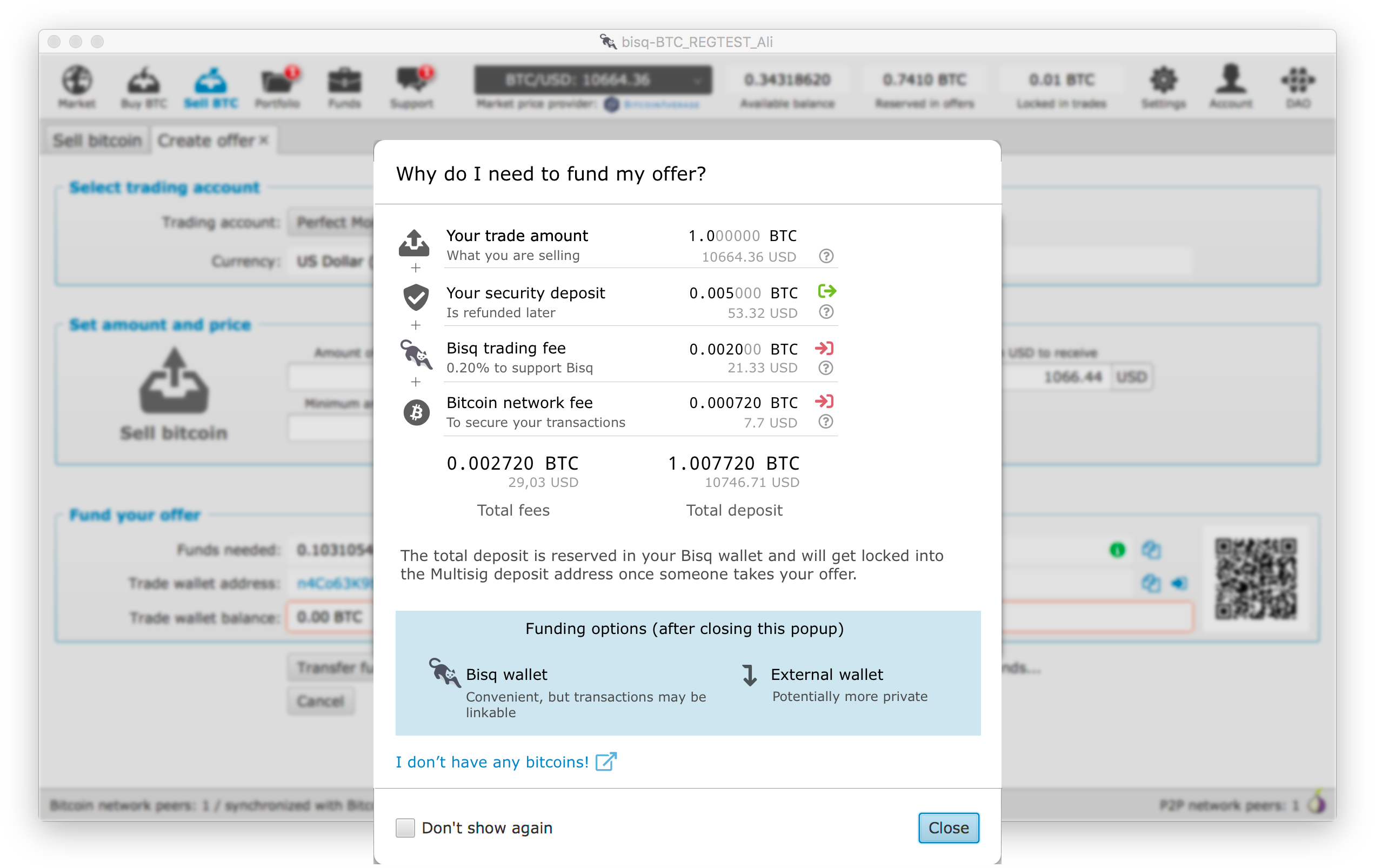
I like the idea of making it easier to see to total fees paid per trade. Also I've added the USD value now for all BTC values. I've added the colorized indicator which item is refunded or not at the end of each line, as it will also be next to the help icon which would explain the reason behind it as well. |
|
Or layouted a little bit different again to use the available space and not to have this big blue box at the bottom. |
|
Or because of consistency reasons atm we might use our Titled Group style. |

|
If we want to stick with the "Multisig deposit address" wording then I think we should add some information or FAQ link where it is explained. |

|
@ripcurlx Good work. Some small additions:
|
|
Thanks for your remarks @tr37ion!
|

|
This new popup looks so much better. I just walked a friend through setting up Bisq last night and was desperately wishing that this information in particular was more clear. A Big +1. I suggest the following changes:
The reason I suggest dropping the 0.20% above is because (a) it's not always 0.20%, it's based on a minimum fee + a formula based on distance from market price, and (b) because it's inconsistent with the other items in the list—none of them talk about a percentage at all. One reason to change the word "secure" to "process" in number (4) above is that it avoids confusion with our "security deposit" term. Yes, mining fees are all about security, but it's simpler for the uninitiated to just think about paying to have their transactions "processed" by the Bitcoin network I think. Also, having a link like "I don't have any bitcoins" is a great idea. I'd change the text to read "Don't have any bitcoin to fund your wallet? Read [this]." (I don't really like the "read this" part, but the point is to make the text even more explicit for people. |
|
Thanks for your input @cbeams! I've updated the mockup.
I've removed the trading fee percentage from the receipt as well. You're right that it might be mistaken being a fixed trading fee as it is written more like a description text. Still I want to make it as easy and transparent to the user how much she is paying for doing the trade. Because of this, I've added the total fee percentage as an additional information to the total fees section.
I don't think we need the additional "Read [this]" to make it obvious to the user that she can click on this link to get more information. |
|
The in and out icons are a bit confusing imo. the red ones mean to me to receive money but then should be green. Security deposit is just locked, so might need some other icon. For trade amount maybe 2 arrows with opposite directions might work? Of maybe no icons are needed at that part at all? |
|
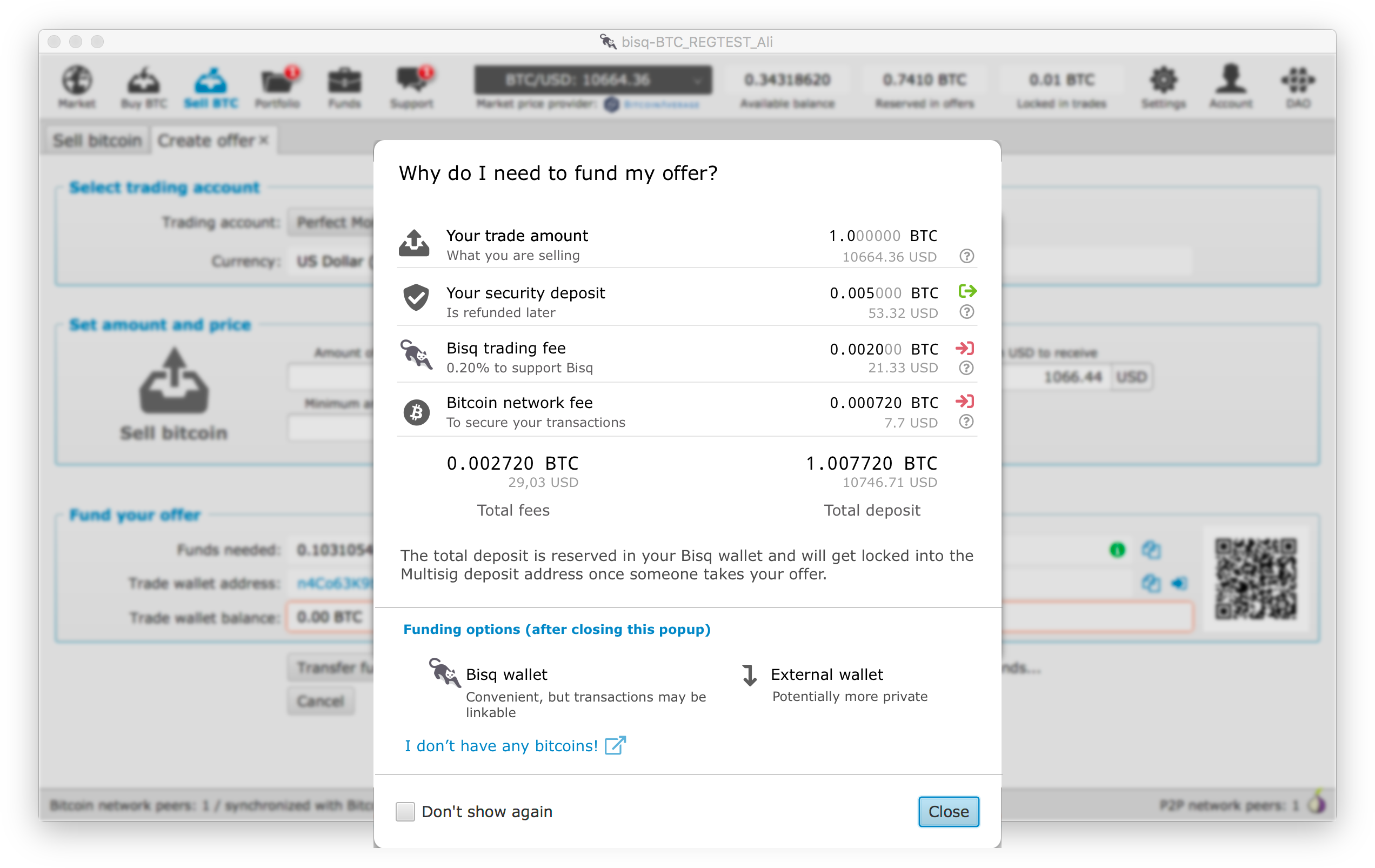
Actually after a second look. I think the question mark gets too much in the background with the icons and also the left icons which are perfect looses weight due the colors of the right icons. So maybe we really could just drop them? Beside that it looks great! |
|
Mocked up something quickly to try a cleaner way of showing the information. I just joined slack today but would like to contribute to the project in regards to the UX/UI side of things. A good first approach would be for us to put together some standard components e.g: modals/popups, panels, etc.. that can then be re-used and to define some guidelines for them, this would create a more consistent and aligned look and feel for the app. I'll catch up tomorrow with @ripcurlx and see what we can do and what are the plans.
|

|
Is there any progress in @diogorsergio 's direction? The mockup is well done. |
|
Actually @pedromvpg and @diogorsergio are working on a complete redesign of the client and are about to finish the proposal (https://docs.google.com/document/d/1KFRAsPruYNXnK0HQU3HBZln3V8G8ymm3zc2VzNJL2kI/edit). As soon as it is published and finds consensus I'll can start implementing it. This would affect all popups as well. |
|
This issue has been automatically marked as stale because it has not had recent activity. It will be closed if no further activity occurs. Thank you for your contributions. |
|
This issue has been automatically closed because of inactivity. Feel free to reopen it if you think it is still relevant. |
As this is a very important screen especially for a first time user, we should structure it in a way that it is easier to digest. E.g. having it more in the form of a receipt like on other exchanges.
The text was updated successfully, but these errors were encountered: