#a11y: Lack of clearly visible focus indication for some interface components #1332
Comments
|
Hi @patrickhlauke, Thanks for reporting this. If I understand it correctly it's primarily the |
|
yes, primarily the |
|
I will also note that I only discovered this issue because the UI behavior recently changed when hitting tab after entering a search query. It used to jump the cursor to the list of search results and now (frustratingly) jumps the cursor to the account selection dropdown followed by the menu on the left side of the application, which can be seen in the gif at the top of this issue report. As a by-the-way, does anyone know how to quickly get to your first search result without having to touch the mouse? |
|
@squarepupil this will likely be one of those "squaring the circle" type problems. for some folks the old focus order will make sense, for others the current one (and it will likely depend on their actitivity/intent - if they did do a search, then I could imagine them wanting to get right to the results, but then again maybe they want to filter out/hone in on results specific to a particular type or folder as well). i think the only way around that would be to start treating the different areas/panels in the app as separate regions that you jump between using something like |
|
x-ref #1325 |
Steps To Reproduce
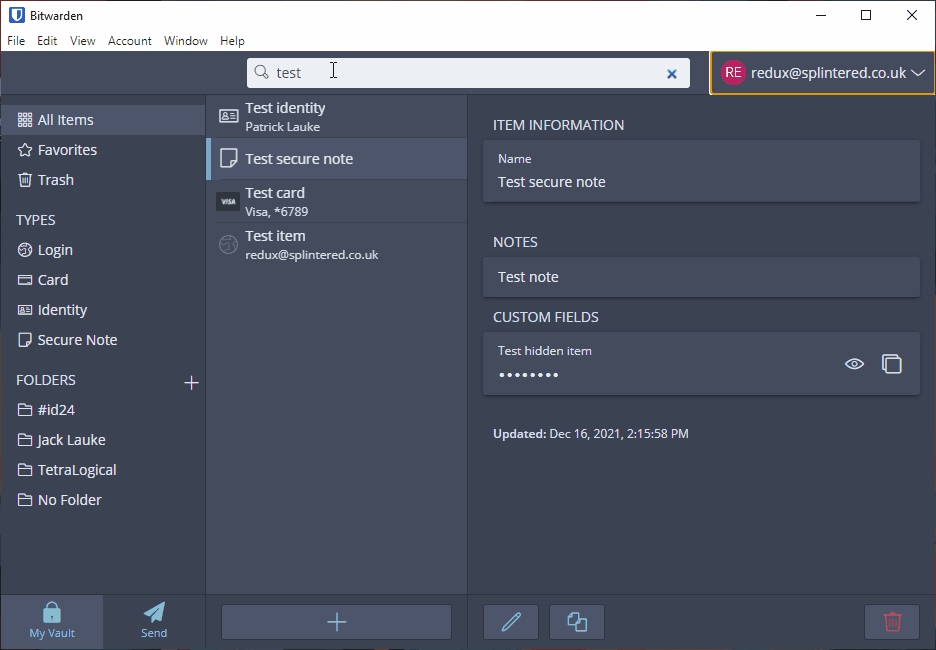
Tab/Shift+Tabto navigate using the keyboardExpected Result
A visible keyboard focus indication on the "My Vault" and "Send" controls.
Actual Result
While there does appear to be a subtle shift in background colour, there's no clear indication which one has focus (compare with other elements that have a reasonably clear indicator)
Screenshots or Videos
Animated GIF of navigating through the application - note that after the "No folder" focus goes to "My Vault", then "Send", but there really isn't much of a visual indication.
Additional Context
No response
Operating System
Windows
Operating System Version
10
Installation method
Direct Download (from bitwarden.com)
Build Version
Version 1.31.2 Shell 16.0.7 Renderer 96.0.4664.110 Node 16.9.1 Architecture x64
The text was updated successfully, but these errors were encountered: