Slider component to select single value from a range of values.
import { Slider, Button } from "tit-ui";
//...
const sliderRef = useRef<SliderHandler>(null);
const [sliderValue, setSliderValue] = useState(-100);
return (
<>
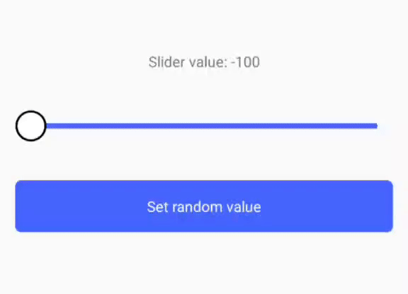
<Text>Slider value: {sliderValue}</Text>
<Slider
ref={sliderRef}
onValueChange={(value) => {
setSliderValue(value);
}}
minValue={-100}
maxValue={100}
initValue={0}
style={{ marginVertical: 50 }}
/>
<Button
text="Set random value"
onPress={() => {
const randomValue = Math.floor(Math.random() * (100 - -100) + -100);
sliderRef.current?.setValue(randomValue);
}}
/>
</>
);
| Name | Description | Default | Type |
|---|---|---|---|
| ref | reference to component | undefined | SliderHandler |
| minValue | initial minimum value of the slider | 0 | number |
| maxValue | maximum value of slider | 100 | number |
| initValue | initial value of slider | minValue | number |
| style | style of the component container | undefined | style |
| trackStyle | style of slider track line | undefined | style |
| circleStyle | style of circle on track | undefined | style |
| circleSize | size of circle | 30 | number |
| circleIsScale | boolean props to enable or disable circle scale on press | true | boolean |
| circleMaxScale | circle scale value | 1.3 | float |
| CustomCircle | component that will render instead of default circle | null | React Component |
| onValueChange | callback when slider value changed | (value) => {callback(value)} | func |
| themes | provide an object with all style props to configure your styled by theme. to lern more click here | undefined | SliderThemesObject |
| theme | name of procided theme | undefined | string |
| styles in props | provide special props to quick style changes. to lern more click here |
| Name | Description | Return type |
|---|---|---|
| getValue() | getting value | number |
| setValue() | setting value | none |