
Beautiful, native menus for React Native + Web, inspired by Radix UI.
- 🕺 Radix UI on Web
- 🛫 Native elements on iOS/Android (where possible)
- 🌲 Same API cross-platform
- 🌊 Works with Solito and Next.js
- 🤖 Supports Expo (with custom dev clients)
- 🍦 Vanilla React Native too
- 🎨 100% unstyled components
yarn add zeegoAdd peer deps:
yarn add react-native-ios-context-menu react-native-popperBe sure to install react-native-ios-context-menu in your Expo folder (likely apps/expo).
You should also follow the Next.js steps below.
You need to add zeego to your next-transpile-modules in next.config.js.
You need to use a custom development client, since react-native-ios-context-menu uses native code.
After installing, you'll need to rebuild your custom development client and app.
Run pod install in your ios folder.
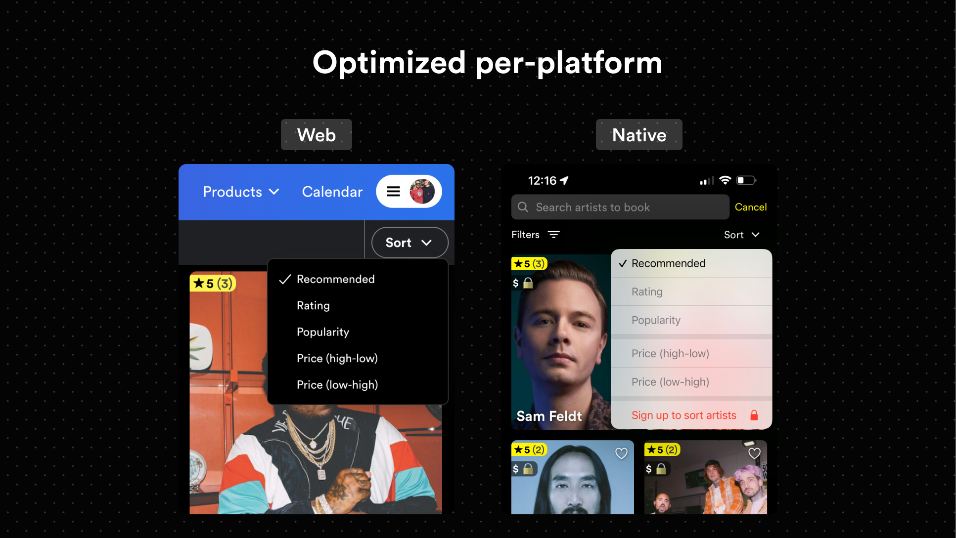
- Use the best API possible
- Create the best experience for each platform, without concern for sharing styles
- Rely on built-in native menus for iOS and Android
- Everything ships unstyled
The API follows that of Radix UI closely.
import * as DropdownMenu from 'zeego/dropdown-menu'See radix-ui's dropdown menu. It's really similar.
One difference is that DropdownMenu.Item needs a child DropdownMenu.ItemTitle, since React Native separates Text and View components.
<DropdownMenu.Item>
  <DropdownMenu.ItemTitle>Bookmark</DropdownMenu.ItemTitle>
  <DropdownMenu.ItemIcon iosIconName="bookmark">
    <YourIconComponent />
  </DropdownMenu.ItemIcon>
</DropdownMenu.Item>To use a custom component, you'll first need to menuify it.
Here is an example of a custom component using Dripsy:
import * as DropdownMenu from 'zeego/dropdown-menu'
import { styled } from 'dripsy'

const StyledMenuItem = styled(DropdownMenu.Item)({
  height: 32,
})

// this part is important
const DripsyMenuItem = DropdownMenu.menuify(StyledMenuItem, 'Item')
And now, you can use it:
<DripsyMenuItem key="fernando">
  <DropdownMenu.ItemTitle>Fernando</DropdownMenu.ItemTitle>
<DripsyMenuItem>
Under the hood, menuify applies a displayName to your component. This allows zeego to recognize it when it's mapping children for iOS and Android.
For now, you should reference the example in the repo.
I also added a Moti + Dripsy example.
In the future, I'll make an example app with Solito too.
const DropdownMenuExample = () => {
  const [bookmarked, setBookmarked] = useState<'on' | 'off' | 'mixed'>('on')
  return (
    <DropdownMenu.Root>
      <DropdownMenu.Trigger>
        <View>
          <Text style={styles.button}>{`<DropdownMenu />`}</Text>
        </View>
      </DropdownMenu.Trigger>
      <DropdownMenu.Content style={dropdownStyles.content}>
        <DropdownMenuLabel>Help</DropdownMenuLabel>
        <DropdownMenuItem
          style={dropdownStyles.item}
          onSelect={select(1)}
          key="first"
        >
          <DropdownMenuItemTitle style={dropdownStyles.itemTitle}>
            See more
          </DropdownMenuItemTitle>
          {Platform.OS === 'ios' && (
            <DropdownMenu.ItemSubtitle style={dropdownStyles.itemSubtitle}>
              12 artists fit your search
            </DropdownMenu.ItemSubtitle>
          )}
          <DropdownMenuItemIcon iosIconName="list.star">
            <Ionicons name="list" size={15} />
          </DropdownMenuItemIcon>
        </DropdownMenuItem>
        <DropdownMenuItem
          style={dropdownStyles.item}
          onSelect={select(2)}
          key="second"
        >
          <DropdownMenuItemTitle>Favorite</DropdownMenuItemTitle>
          <DropdownMenuItemIcon iosIconName="star.fill">
            <Ionicons name="star" size={15} />
          </DropdownMenuItemIcon>
        </DropdownMenuItem>
        <DropdownMenuCheckboxItem
          style={dropdownStyles.item}
          value={bookmarked}
          onValueChange={setBookmarked}
          key="third"
        >
          <DropdownMenuItemIndicator>
            <Ionicons name="checkmark" size={19} />
          </DropdownMenuItemIndicator>
          <DropdownMenuItemTitle>
            {bookmarked === 'on' ? 'Bookmarked' : 'Bookmark'}
          </DropdownMenuItemTitle>
          <DropdownMenuItemImage
            iosIconName="book"
            source={require('./camera-outline.png')}
            width={20}
            resizeMode="contain"
          />
        </DropdownMenuCheckboxItem>
      </DropdownMenu.Content>
    </DropdownMenu.Root>
  )
}-
zeego/dropdown-menu -
zeego/context-menu(in-progress, missing Web implementation) - Android native implementation (currently a JS implementation)
- Docs
-
zeego/tooltip(probably?) -
zeego/popover(probably)