Improve placement of mobile CTA #1213
Comments
|
Removing from the SacRT milestone so we aren't blocked there, this was an existing bug. |
|
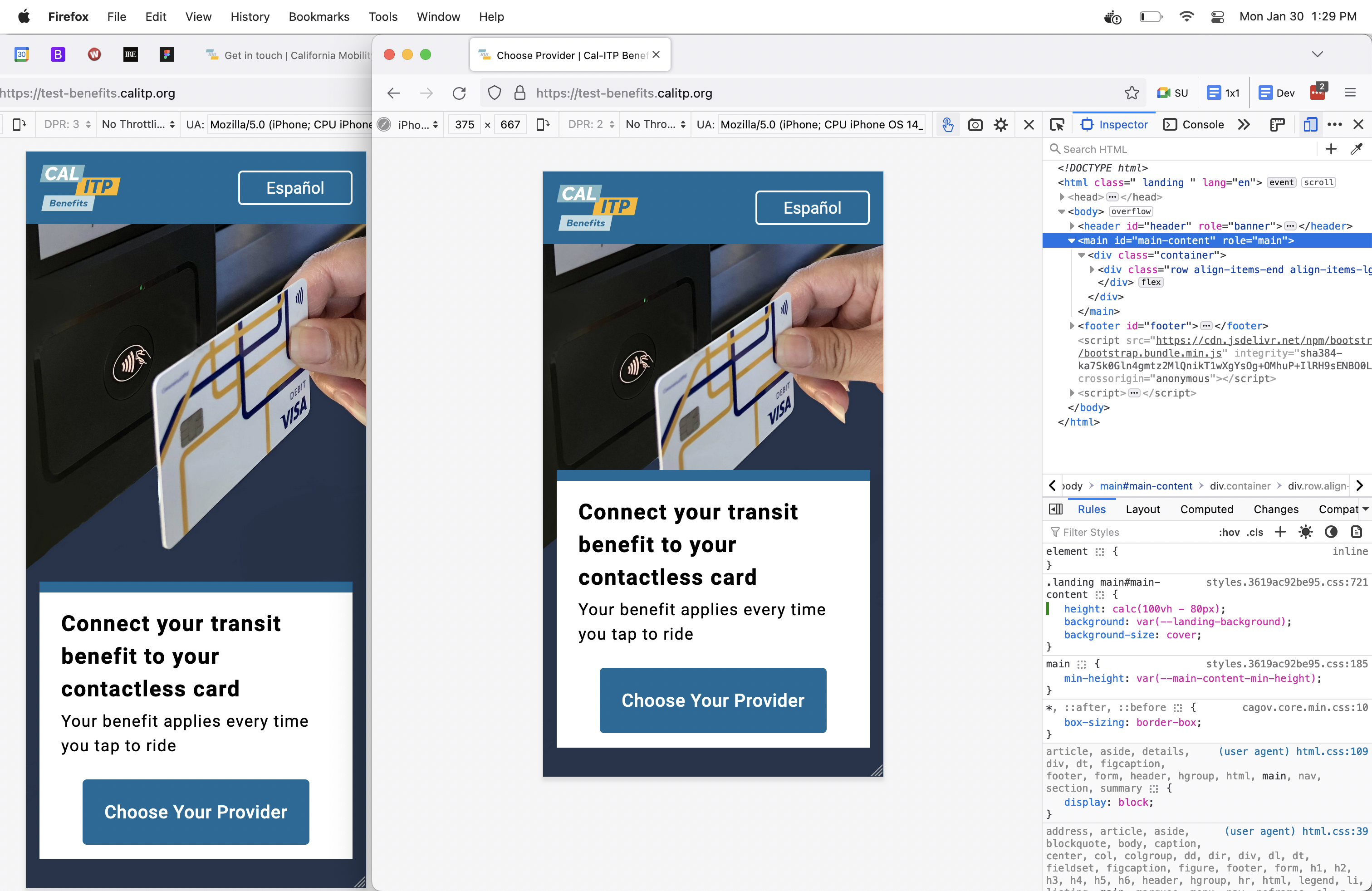
@srhhnry What kind of parameters or logic should there be for the height of the home page on Mobile? Here are some proposals of design logic options:
iPhone 12 mini, iPhone SE vertical
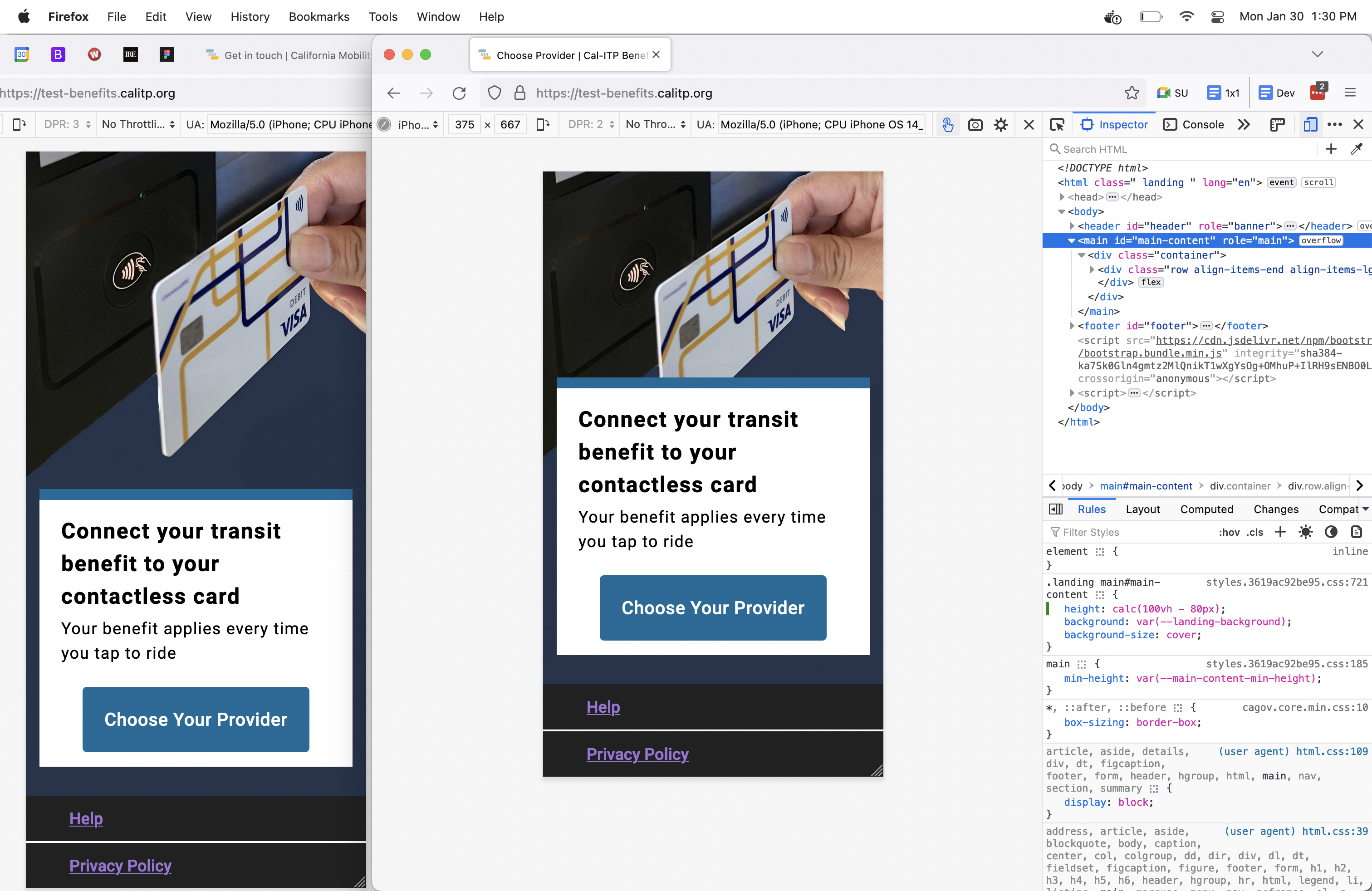
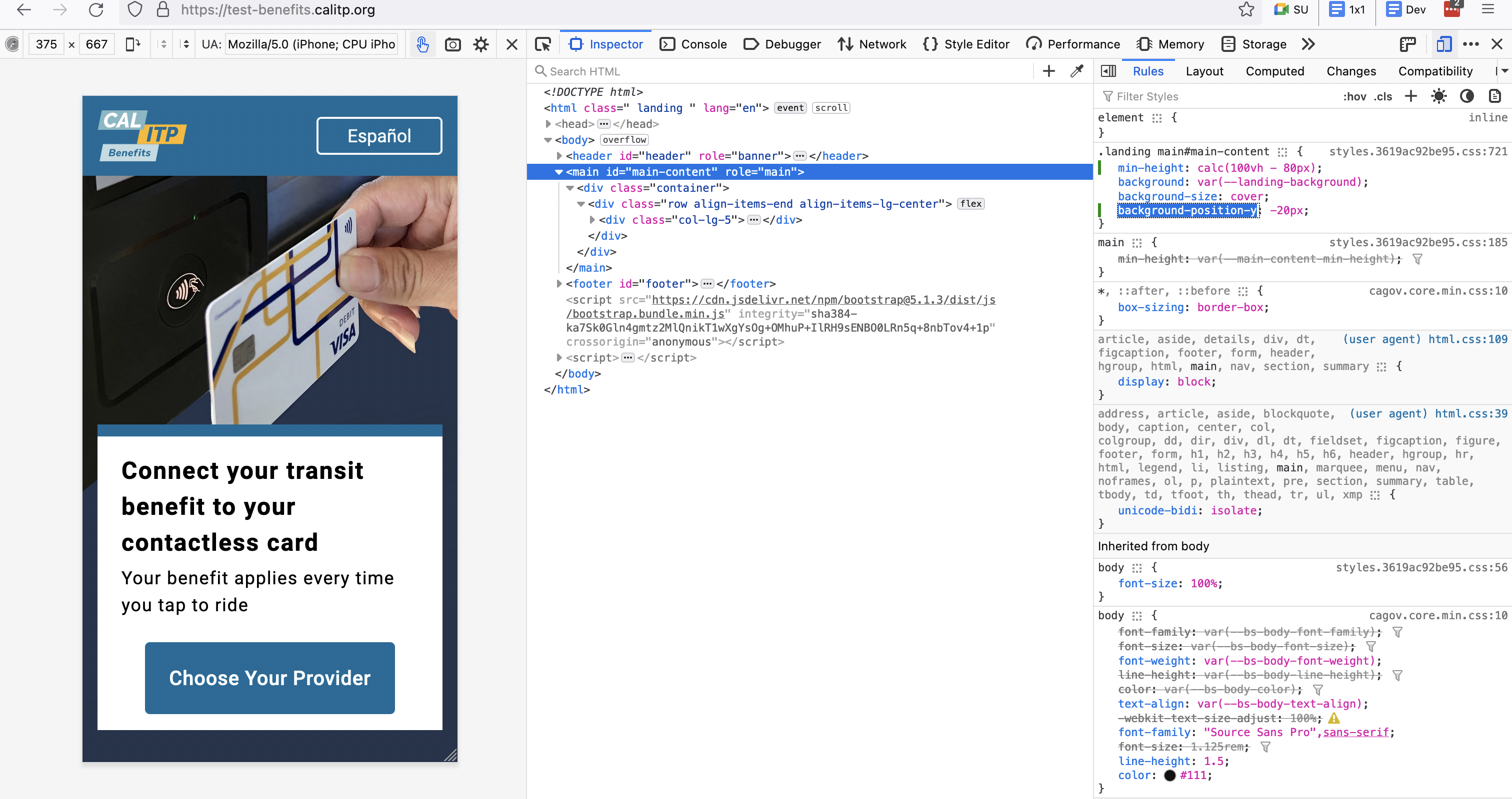
iPhone 12 mini, iPhone SE vertical iPhone SE horizontal Note: This will cover up more parts of the background image. Image position could be tweaked a little vertically so the image starts in a different position, like this - position moved up 20px to bring the card up higher |


|
@machikoyasuda do you have some time to follow up on this one? Maybe it's a simple fix we can it in for the SacRT release? |
|
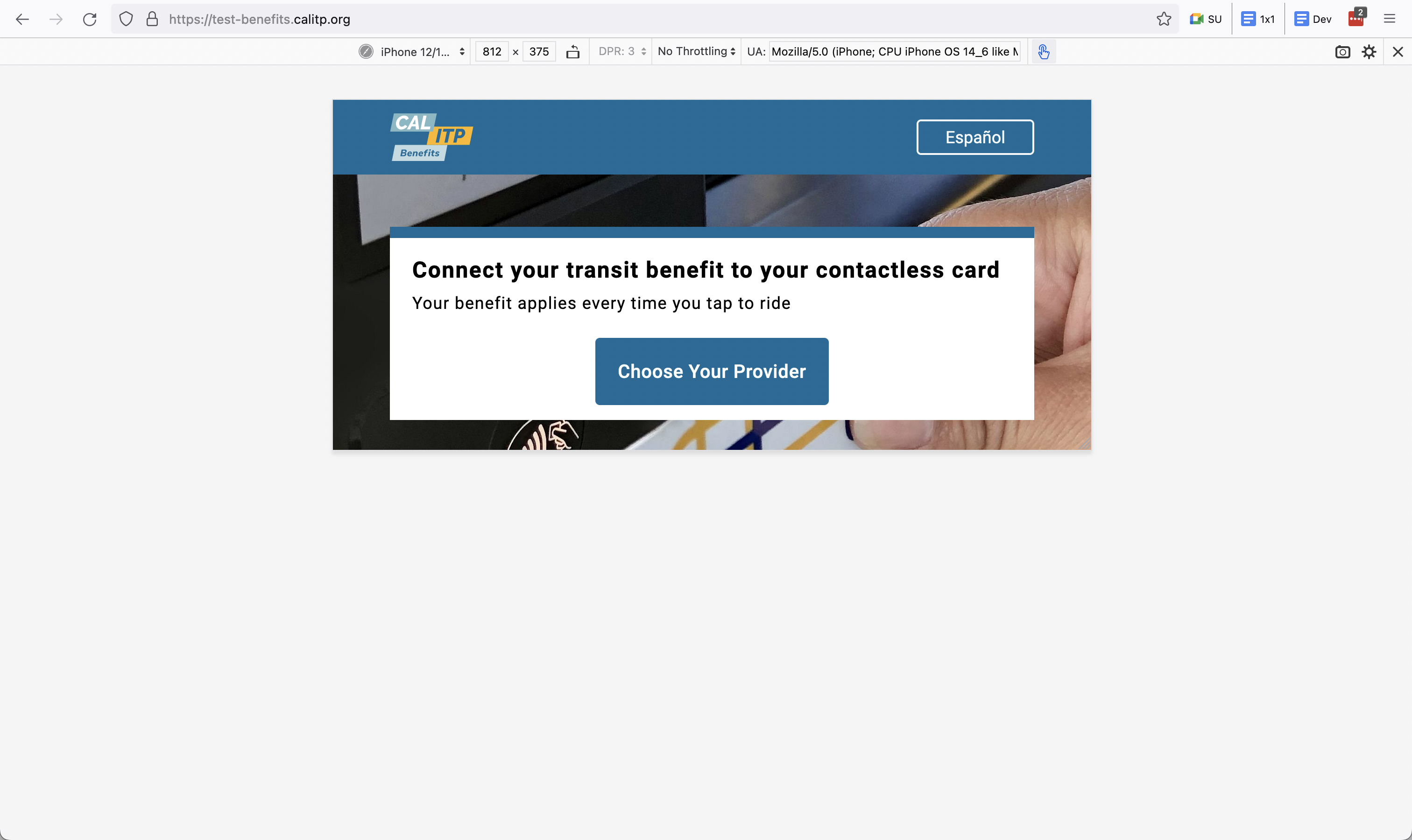
Sorry everyone! I just got a notification and realized I hadn't responded. If there's a time crunch either of those two options is fine. My preference would be option 2--scroll to the footer (based on the smaller screens having more of the hero image available). Both of those options work though, so this preference is not a blocker. |
Originally posted by @srhhnry in #1206 (comment)
The text was updated successfully, but these errors were encountered: