Improve OptionCard selections #139
Comments
|
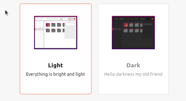
IMHO the gray one looks disabled. Also, if we want to mimic the real world, a toggle button is pressed down. It would be the unselected one that pops up with a shadow, right? |
|
I would suggest to adapt to elevated buttons. We can try opacity change depending on state but maybe not as drastically as Wayne proposed |
|
I think the elvation stuff does not work well at this size. How about a full flat widget? And only indicate hover / selected with text color and border? Reducing the opacity of the picture looks indeed disabled, so I would prefer to skip this
|
|
@Feichtmeier Completely agree with you! I think it's clear now what you have selected and the font colour works much better. Looks good to me :) |
|
jpnurmi wrote:
+1, I still think the gray text looks disabled. Are you sure the orange border isn't sufficient for indicating which card is selected @waynecrosby ?
|
|
@madsrh Ok, let's just try with the orange border and the text remains the same to avoid the disabled state issue. Thanks |
|
opacity for unselcted cards when one card is selected is now on 0.65 Or rather no text color change at all? |
|
@madsrh @Feichtmeier I think it's probably simpler and will raise less issues if we have it with no text change :) |
|
@waynecrosby we have one more question on this topic for you :) Would you like the border to be 1px thick, like in the following gif? (CLICK TO ENLARGE) |
|
How about 1px gray border & 2px orange border like TextField? |
|
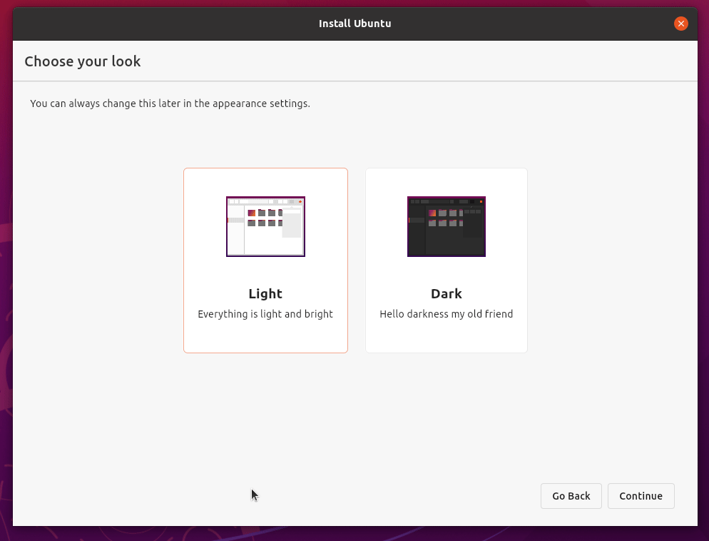
@Feichtmeier I think that the 1px looks ok in light mode, but when you switch to dark it gets totally lost. So to be consistent, I would be happy to use 2px for selected states in both light & dark mode. We are also in the install phase and settings realm where we need to be quite specific in what has been selected and 1px in my opinion is too thin. |
@Feichtmeier I really like the animation transitions but I'm not sure the orange text is working and it isn't explicitly obvious which selection you have made. I would suggest just using white and dark grey text and just use the orange to outline the box. Below are a couple of examples with the text and visual knocked back (when not selected) and a small shadow to emphasise your choice. There is also a text update but I'm not sure it's better than what we have, let me know what you think?


Text change?
Originally posted by @waynecrosby in #84 (comment)
The text was updated successfully, but these errors were encountered: