Validate empty inputs and allow flag and dial code to be shown when field is empty #27
Comments
I'm glad you like the package, stay tuned as @emri99 made some nice contributions which I hope to release this week |
That's awesome to hear! This package definitely deserves more likes. I can see it's fairly new. Hope it starts to appear higher in the search results on pub.dev soon! |
 davidjaldred
changed the title
davidjaldred
changed the title
|
So this should be added for when the floatingLabelBehavior is set to |
|
WIP PR for But the grayed out flag won't look good on background like yours, so I'm trying to figure out an alternative solution |
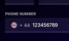
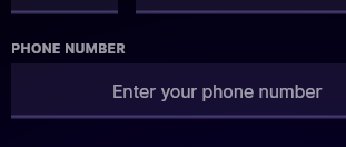
Oh no, that isn't a real label, just a text widget I'm using as a custom label. It can be ignored 😊 My real concern is just that I want to always show the dial code and flag, even if the input is empty. When I enter anything into the field, the dial code and flag are always shown, and it would be perfect if it was always like that, even when empty. Here's a mockup of how I'd like to be able to get it to look when empty (the 'Enter your phone number' is hint text, and the field is not focused): |

|
Can you try out the branch |
Just tested and this has exactly the behaviour I was looking for 😁 Only problem now is that the alignment is off (which you initially mentioned was a problem). The alignment is also off when the field isn't empty too (which was okay before).
Widget inspector in devtools shows this: Thanks for all your help with this issue so far! |


|
hmm weird, that's not the behavior I'm having. Could you share the code for the phone input so I can try to reproduce ? There might be a padding around it or something affecting the end result ? |
|
Sure. Maybe I'm not grabbing the package from github properly. Here's a simplified version in a fresh Flutter project, which is still showing the issue (even removing the theme and surrounding widgets doesn't seem to affect the alignment unfortunately): pubspec.yaml dependency phone_form_field:
git:
url: https://github.com/cedvdb/phone_form_field.git
ref: fixed_dialcodephone_form_field_test.dartimport 'package:flutter/material.dart';
import 'package:phone_form_field/phone_form_field.dart';
class PhoneFormFieldTest extends StatelessWidget {
const PhoneFormFieldTest({Key? key}) : super(key: key);
@override
Widget build(BuildContext context) {
return Container(
margin: const EdgeInsets.only(bottom: 24),
child: Column(
crossAxisAlignment: CrossAxisAlignment.start,
children: [
Container(
margin: const EdgeInsets.only(bottom: 4),
child: Text(
'Phone Number'.toUpperCase(),
style: Theme.of(context).textTheme.overline!.apply(
color: Colors.white.withAlpha(153),
),
),
),
PhoneFormField(
defaultCountry: 'GB',
errorText: 'Enter a valid phone number',
selectorNavigator: const ModalBottomSheetNavigator(),
decoration: const InputDecoration(
hintText: 'Enter your phone number',
),
),
],
),
);
}
}main.dartimport 'package:flutter/material.dart';
import 'phone_form_field_test.dart';
void main() {
runApp(const MyApp());
}
class MyApp extends StatelessWidget {
const MyApp({Key? key}) : super(key: key);
@override
Widget build(BuildContext context) {
return MaterialApp(
title: 'Flutter Demo',
theme: ThemeData(
brightness: Brightness.dark,
visualDensity: VisualDensity.adaptivePlatformDensity,
primarySwatch: const MaterialColor(
0xff3305ff,
{
50: Color(0xffebe5ff),
100: Color(0xffdad1ff),
200: Color(0xffb09eff),
300: Color(0xff866bff),
400: Color(0xff5d38ff),
500: Color(0xff3305ff),
600: Color(0xff2600d1),
700: Color(0xff1d009e),
800: Color(0xff14006b),
900: Color(0xff0a0038),
},
),
accentColor: const Color(0xffffb53d),
errorColor: const Color(0xffff3d6e),
toggleableActiveColor: const Color(0xffffb53d),
canvasColor: Color.alphaBlend(
const Color(0xffb09eff).withAlpha(26),
Colors.black,
),
scaffoldBackgroundColor: Colors.black,
textSelectionTheme: TextSelectionThemeData(
cursorColor: const Color(0xffffb53d),
selectionColor: const Color(0xffffb53d).withAlpha(102),
selectionHandleColor: const Color(0xffffb53d),
),
fontFamily: 'Inter',
textTheme: Theme.of(context)
.textTheme
.copyWith(
headline1: const TextStyle(
fontSize: 4.209 * 16,
fontWeight: FontWeight.w700,
letterSpacing: -0.03 * 16,
height: 1.25,
leadingDistribution: TextLeadingDistribution.even,
),
headline2: const TextStyle(
fontSize: 3.157 * 16,
fontWeight: FontWeight.w700,
letterSpacing: -0.03 * 16,
height: 1.25,
leadingDistribution: TextLeadingDistribution.even,
),
headline3: const TextStyle(
fontSize: 2.369 * 16,
fontWeight: FontWeight.w700,
letterSpacing: -0.02 * 16,
height: 1.375,
leadingDistribution: TextLeadingDistribution.even,
),
headline4: const TextStyle(
fontSize: 1.777 * 16,
fontWeight: FontWeight.w700,
letterSpacing: -0.02 * 16,
height: 1.375,
leadingDistribution: TextLeadingDistribution.even,
),
headline5: const TextStyle(
fontSize: 1.333 * 16,
fontWeight: FontWeight.w700,
letterSpacing: -0.01 * 16,
height: 1.5,
leadingDistribution: TextLeadingDistribution.even,
),
headline6: const TextStyle(
fontSize: 16,
fontWeight: FontWeight.w700,
letterSpacing: -0.01 * 16,
height: 1.5,
leadingDistribution: TextLeadingDistribution.even,
),
subtitle1: const TextStyle(
fontSize: 16,
fontWeight: FontWeight.w400,
letterSpacing: -0.01 * 16,
height: 1.5,
leadingDistribution: TextLeadingDistribution.even,
),
subtitle2: const TextStyle(
fontSize: 14,
fontWeight: FontWeight.w700,
letterSpacing: 0,
height: 1.5,
leadingDistribution: TextLeadingDistribution.even,
),
bodyText1: const TextStyle(
fontSize: 16,
fontWeight: FontWeight.w400,
letterSpacing: -0.01 * 16,
height: 1.5,
leadingDistribution: TextLeadingDistribution.even,
),
bodyText2: const TextStyle(
fontSize: 14,
fontWeight: FontWeight.w400,
letterSpacing: 0,
height: 1.5,
leadingDistribution: TextLeadingDistribution.even,
),
button: const TextStyle(
fontSize: 16,
fontWeight: FontWeight.w700,
letterSpacing: 0,
height: 1.5,
leadingDistribution: TextLeadingDistribution.even,
),
caption: const TextStyle(
fontSize: 14,
fontWeight: FontWeight.w400,
letterSpacing: 0,
height: 1.5,
leadingDistribution: TextLeadingDistribution.even,
),
overline: const TextStyle(
fontSize: 12,
fontWeight: FontWeight.w700,
letterSpacing: 0.03 * 16,
height: 1.5,
leadingDistribution: TextLeadingDistribution.even,
),
)
.apply(
displayColor: Colors.white,
bodyColor: Colors.white,
),
inputDecorationTheme: InputDecorationTheme(
labelStyle: TextStyle(
color: Colors.white.withAlpha(153),
),
helperStyle: TextStyle(
color: Colors.white.withAlpha(153),
),
hintStyle: TextStyle(
color: Colors.white.withAlpha(153),
),
errorMaxLines: 9,
filled: true,
fillColor: const Color(0xffb09eff).withAlpha(26),
hoverColor: const Color(0xffb09eff).withAlpha(13),
errorBorder: UnderlineInputBorder(
borderSide: BorderSide(
color: const Color(0xffff3d6e).withAlpha(128),
width: 3,
),
borderRadius: BorderRadius.zero,
),
focusedBorder: const UnderlineInputBorder(
borderSide: BorderSide(
color: Color(0xffffb53d),
width: 3,
),
borderRadius: BorderRadius.zero,
),
focusedErrorBorder: const UnderlineInputBorder(
borderSide: BorderSide(
color: Color(0xffff3d6e),
width: 3,
),
borderRadius: BorderRadius.zero,
),
disabledBorder: const UnderlineInputBorder(
borderRadius: BorderRadius.zero,
),
enabledBorder: UnderlineInputBorder(
borderSide: BorderSide(
color: const Color(0xffb09eff).withAlpha(77),
width: 3,
),
borderRadius: BorderRadius.zero,
),
border: UnderlineInputBorder(
borderSide: BorderSide(
color: const Color(0xffb09eff).withAlpha(77),
width: 3,
),
borderRadius: BorderRadius.zero,
),
alignLabelWithHint: true,
),
),
home: const MyHomePage(),
);
}
}
class MyHomePage extends StatefulWidget {
const MyHomePage({
Key? key,
}) : super(key: key);
@override
State<MyHomePage> createState() => _MyHomePageState();
}
class _MyHomePageState extends State<MyHomePage> {
@override
Widget build(BuildContext context) {
return const Scaffold(
body: PhoneFormFieldTest(),
);
}
}And here's the result:
|

|
Ho, the alignment needs to be different when there is no label. It should be fixed, but your image seems different from what I have, so could you try again ? |
|
I think I understand what you're saying. That alignment is correct if the input has a label, here's what I get:
But I don't want to use a label, and I get the misalignment shown before without one. The alignment was perfect initially, I just wanted the flag and dial code to be shown when the input was empty. Is there a way to change the alignment back to what it was before? |

|
This should now be fixed for next release (with and without label) |
|
Awesome, thanks for the help! 😁 |
|
Hello, I'm reopening the issue because apparently it was still misaligned on the latest commits of If that does not work I will give up as flutter does not furnish a nice way to align things in the textfield. It is a nightmare and you won't believe the time I spent on that ( I can barely believe it myself). It seems the alignment changes from platform to platform, if there is a label or not, if the border is outline or not, if a prefix is used or a prefixIcon this is too much cases to cover faithfully imo but maybe it will work. |
|
Sure. First things first. Turns out the Flutter channel I was on had completely messed up and was using one of the Flutter developer's forks - I have no idea how this could have happened as I'm pretty meticulous about this stuff and never switched it from the stable channel. Switching back to stable, the alignment on that fixed_dialcode
So I tried the dev
I can believe it and I feel your pain! Honestly, thanks for all the work you've put towards this issue. Out of interest, how is the alignment so good in the current version 3.0.1? Sorry I haven't had the time to look at the code yet. I just find it interesting that I can insert a character into the field and it gives the desired functionality (I started to think of a hacky solution where I insert a character if the field is empty and then hide it somehow and show the hint text instead haha). The horizontal alignment and text color for the dial code looks nice in 3.0.1 too. 3.0.1
|


|
So to answer your question of why it is so hard and why it was looking good before is:
A better fix that I could introduce is to allow the user to align the dial code himself but I'd rather the widget to be a set and done type than needing configuration. Maybe setting an empty |
|
Ahh okay, so the underlying issue is with Flutter. I remember reading about an issue with the alignment of prefixIcon before, think it was: flutter/flutter#42651 Thanks for your explanation, suggestions, and work on the issue. |
|
I reverted the changes I made for this to release v4.0.0 but posted an issue on flutter. Hopefully feedback from their side or even a fix will lead to something here. In the meantime there is nothing I can do |
|
I'm closing this one since it is partially resolved and opening a new one which is about the unresolved part |
Hey, love the package, best I've found for a phone input in Flutter.
2 things:
Thanks.
The text was updated successfully, but these errors were encountered: