storybook chakra-ui themes addon #2190
Comments
 with-heart
added
Topic: Integrations ♾️
with-heart
added
Topic: Integrations ♾️
|
That's an interesting idea. We could certainly create an addon to enable that but with our current team capacity, that'll have to be low priority. If anyone would like to take the time to investigate though and attempt to implement something similar, we can see how we can integrate that into the Chakra UI tooling ecosystem. |
I believe you wouldn't need to create one from scratch, you could just fork the addon i mentioned here:
I would say someone with TypeScript knowledge and good understanding of Chakra would be able to fork and change that addon to work with chakra in less than 2 hours?
I'm new to typescript and very new to chakra ( and even more knew to the @next version ), so i'm still wrapping my head around the differences in the implementation From my understanding We would have to fork that addon i mentioned and then replace the |
|
Actually it seems that library already accepts a |
|
One issue that is happening on my application is that if i use const config = {
useSystemColorMode: false,
initialColorMode: 'dark'
}
// 3. extend the theme
const customTheme = extendTheme({ config, styles })
....
<ChakraProvider theme={customTheme}>
// my app
</ChakraProvider>My application still starts in <ColorModeScript initialColorMode="dark" />Which in turn made this part of the code irrelevant: const config = {
useSystemColorMode: false,
initialColorMode: 'dark'
}
// 3. extend the theme
const customTheme = extendTheme({ config, styles })
....
<ChakraProvider theme={customTheme}>I'm not sure if that's the intended behaviour or if it's a problem with my implementation, but in the end when trying out on my app i found out this is what needed to be done: I still did not try toggling the Theme tough. If i manage to understand / test everything better here i might be able to implement a |
|
I did manage to progress quite a lot, by using the aforementioned preview.jsconst themes = [{name: 'dark',},{name: 'light',}]
const customProvider = (props) => {
const mode = props.theme.name
console.log("settig theme ->", mode)
return (<>
<ColorModeScript initialColorMode={mode} />
<ChakraProvider resetCSS={true} theme={theme} mode={mode}>
{props.children}
</ChakraProvider>
</>)
}
addDecorator(withThemesProvider(themes, customProvider))Then creating a button: #ChakraButton/index.tsx import { Button } from '@chakra-ui/core'
import { useColorMode } from '@chakra-ui/core'
export default function ChakraButton() {
const { colorMode, toggleColorMode } = useColorMode()
console.error('chakra butto says current mode ->', colorMode)
return (
<>
<Button translate="" size="sm" onClick={toggleColorMode}>
CHAKRA BUTTON
</Button>
</>
)
}And a story: ChakraButton/ChakraButton.stories.tsximport React from 'react'
import Component from './'
export default {
component: Component,
title: 'components/atoms/ChakraButton'
}
export const Primary = () => (
<>
<Component />
</>
)It all works as expected on the website context. Button when testing my Storybook the Button is being rendered two times, firs ttime
Clicking the button on StoryBook does switch the theme tough and it works as expected, so it seems there is just something wrong about the way the button is being initialized. Worth noticing on my applicaiton, the first time it also says
Any ideas? |


|
Turns out the same is happening even when i use pure #preview.js import CSSReset from "@chakra-ui/css-reset"
import theme from "../src/chakra"
import { ChakraProvider, Box } from "@chakra-ui/core"
import { addDecorator } from "@storybook/react"
import * as React from "react"
const newTheme = {
...theme,
config: {
initialColorMode: "dark",
useSystemColorMode: false,
}
}
export const Chakra = ({ children }) => (
<ChakraProvider theme={newTheme}>
<CSSReset />
<Box p={5}>
{children}
</Box>
</ChakraProvider>
)
addDecorator(StoryFn =>
<Chakra>
<StoryFn />
</Chakra>)It first renders with
|

|
I have created a new repository exclusively with |
|
As much as I'd love to add this to Chakra UI. I think we can keep the setup as-is for now. We've added a switch for light and dark more in Storybook and I think that should be enough for now considering the human resources we have. Thank you. We might look into this in the future. |
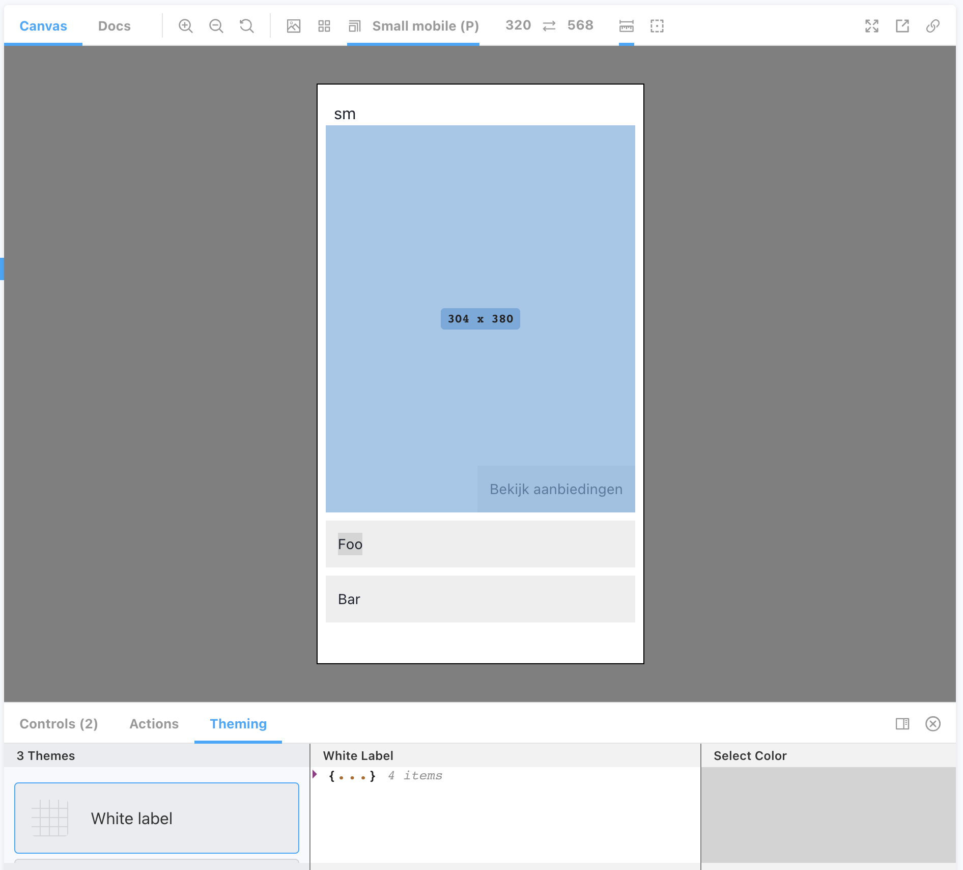
To be honest i hadn't see that switch on your storybook before, and i do think that's a very good an simple approach that solves most of the cases. The problem i see if with tough is that it breaks the design when using the "viewports" addon of Storybook, for instance on our storybook we have currently all our breakpoints pre-set on Storybook and we can preview any component in any breakpoint this way. Having the extra "Theme Switcher" from Chrakra would add an extra element to the design on Storybook which creates a discrepancy between how you see it on the storybook and how it looks like on the breakpoints. Also, considering your knowledge about Chakra and how the Storybook is implemented on Chakra it wouldn't take more than a few hours to implement the switcher on the Here is the official documentation for the Viewport addon on the storybook website Have a look at this screenshot:
|

|
For the searchers like me who end up here and think it's not possible after reading this topic. In .storybook/main you add the plugin like (see their docs): In .storybook/preview it would be like: And there you have your theme switcher.
when wondering about the first string in screenshot, 'sm' in the view comes from own hook using the useBreakpointValue hook. I used it while testing if it gave correct value :) With the theme addon i can switch between any optional given theme. |
|
@maapteh thank you! That helped, Although I had to make minor changes to your example in order to make it work for me: |
Feature request
Is your feature request related to a problem? Please describe.
Currently, there is no easy way of switching chakra-ui theme on Storybook
Describe the solution you'd like
A implementation similar to https://github.com/echoulen/storybook-addon-styled-component-theme
Describe alternatives you've considered
Forking https://github.com/echoulen/storybook-addon-styled-component-theme and hacking a chakra-ui version of the same addon
Additional context
I'm not entirely sure if the chakra-ui team is planning to release such addon for Storybook and if forking the styled-component repo would be the best way of going about it
The text was updated successfully, but these errors were encountered: