Allow linear (continuous) type in bar charts x axis #8233
Comments
|
|
|
In my data, there is a gap between 285.1301 and 430.0905 (x axis). Would you be kind and tell me why isn't it filling the axis as a continuous data type, instead of reproducing the gap from the data? What I am doing wrong? Thanks in advance. |
|
I don't probably get what you are after. Area chart instead of bar? |
|
@joanapaulaso if you wanted more bars, you'd need to add the data manually. Our view has generally been not to modify the data array passed into the chart and just display it directly. Are you able to create a fiddle with what you're looking for? Another idea would be to use an area chart but with a stepped interpolation so a value was held until the next was available. |
|
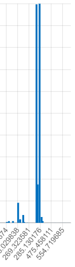
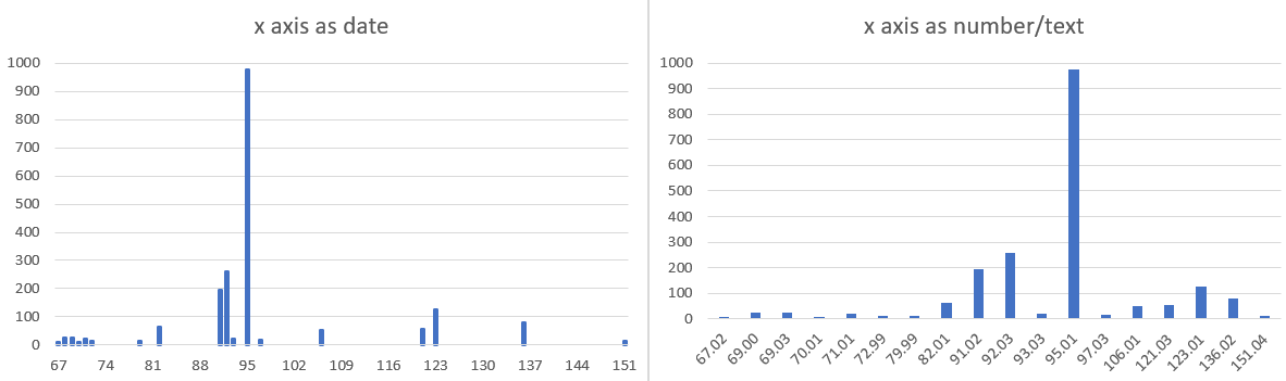
Oh, I get it. I was looking for that in bar charts, @kurkle and @etimberg, because they are traditionally used to show mass spectrum data (which I work with). If I do that in Excel, i. e., and configure the x axis as a date type, it will give me exactly what I need (the chart on the left). On the right side is what I get for treating data as text or number ~ which is the same that I get with Chart.js... I'm sorry I can't reproduce any of this in fiddle. But I hope the image makes it clear. Any chance or way this can be implemented?
And here is the data used in both charts in the figure:
|
|
This is close to the left picture. https://jsfiddle.net/ob0xc5u7/ |
|
Wonderful! That's it! Thank you so much! |
Feature Proposal
Allow linear (continuous) type in vertical bar charts x axis, by which intervals would be automatically filled, so continuous ploted data can make sense. As for now, data is treated only as categorical, also I gess temporal, on the x axis.
Feature Use Case
A lot of data traditionally ploted on bar charts use continuous data type on both x and y axes... So it would be great if Chart.js had support for this kind of data. Check out "mass spectrum" plots as exemples.
The text was updated successfully, but these errors were encountered: