Consistent color for frameworks in the benchmark plots #107
Comments
|
VegaLite sorts all the categories alphabetically, and then uses the color scale with respect to that alphabetical ordering. Think that's a reasonable solution, or would it be better to try and find out how to lose the numbers? |
Sounds reasonable to me. I guess assigning a color to each framework and giving that explicitly to the plots is also possible but might be more work. As long as the colors are consistent Im happy at least heh :) |
|
Speaking of colors though, the orange ones are pretty hard to tell apart
|
|
I agree. I've had trouble, too. Here is the function I used for plotting benchmarks. I was using category20 to define the colors. Maybe one of those is better than category20. I just tried set3, but the second yellow and last yellow are very hard for me to tell apart. I think at this point I should switch plotting libraries. I believe Gadfly should be able to work with this: julia> using Colors
julia> distinguishable_colors(12, [RGB(1,1,1), RGB(0,0,0)], dropseed=true)
12-element Array{RGB{N0f8},1} with eltype RGB{FixedPointNumbers.Normed{UInt8,8}}:
RGB{N0f8}(0.78,0.129,0.867)
RGB{N0f8}(0.82,0.29,0.0)
RGB{N0f8}(0.0,0.549,0.0)
RGB{N0f8}(0.0,0.498,0.694)
RGB{N0f8}(0.82,0.675,0.0)
RGB{N0f8}(0.529,0.0,0.212)
RGB{N0f8}(1.0,0.561,0.631)
RGB{N0f8}(0.0,0.0,0.545)
RGB{N0f8}(0.18,1.0,0.443)
RGB{N0f8}(0.404,0.322,0.0)
RGB{N0f8}(0.0,0.816,0.851)
RGB{N0f8}(0.0,0.314,0.263)Or perhaps: julia> distinguishable_colors(13, [RGB(0,0,0), RGB(1,1,1)])[2:end]
12-element Array{RGB{N0f8},1} with eltype RGB{FixedPointNumbers.Normed{UInt8,8}}:
RGB{N0f8}(1.0,1.0,1.0)
RGB{N0f8}(0.78,0.129,0.867)
RGB{N0f8}(0.82,0.29,0.0)
RGB{N0f8}(0.0,0.549,0.0)
RGB{N0f8}(0.0,0.498,0.694)
RGB{N0f8}(0.82,0.675,0.0)
RGB{N0f8}(0.529,0.0,0.212)
RGB{N0f8}(1.0,0.561,0.631)
RGB{N0f8}(0.0,0.0,0.545)
RGB{N0f8}(0.18,1.0,0.443)
RGB{N0f8}(0.404,0.322,0.0)
RGB{N0f8}(0.0,0.816,0.851)I'll try this and see how it looks. |
|
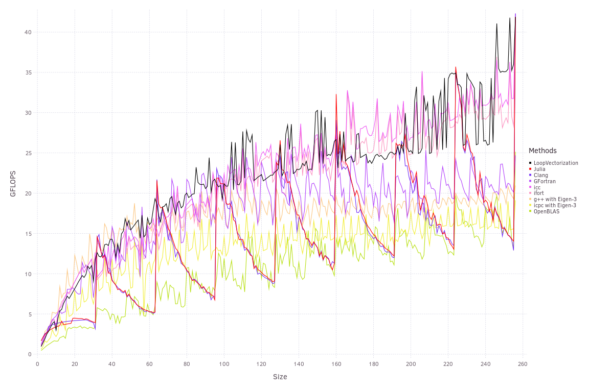
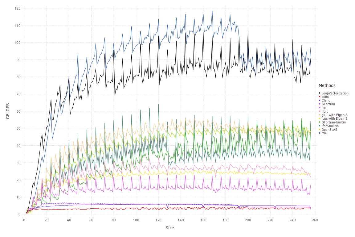
I think Julia and ifort may look a little similar. |
|
Yeah, maybe I would even say the earlier was a bit better? It is a hard problem though since there are quite many plots in each figure and each plot is quite "noisy". One possibility is to use something like PlotlyJS where you can enable disable plots interactively, would make it easier to compare e.g. LoopVectorization vs vanilla Julia by turning off the other plots. |
Can I place these plots in the assets folder, and then have them appear in the documentation in a manner users can interact with them? |
|
I think saving them as JSON (http://spencerlyon.com/PlotlyJS.jl/manipulating_plots/#saving-figures), putting them in the asset folders and then bundle the plotly js library should work....? I am many steps removed from Web development :p |
Me too. For now, I'd prefer a simpler solution. Or at least something that lets the most interesting contenders stand out. Currently, my plots (locally, haven't pushed yet) look like this:
(Also, a definite regression compared to what's on the docs now. Even though the assembly looks better: with the matmul, it The idea here was to use a perceptually accurate color map, and then add LoopVectorization as black, and pick a second color that seemed to stand out from the rest for base Julia (I chose red). The scheme I chose was This was with an official 1.4.1 binary, but I'll probably use 1.5 next time to address OpenBLAS's bad performance. |

|
The problem is really not the colors. It is the number of lines. My suggestion: plot everything as a ratio to LoopVectorization. The other lines are just there as a performance comparison for this package, we don't really care about them relative to each other or in isolation. Then if we see all the lines below 1, LoopVectorization is good. You could put the actual GFLOPS of LoopVectorization on the right y axis if you like. |
|
Hmm. That's a good idea. I think the current plots are a lot interesting to me personally, because I'm more interested in how their performance changes in absolute terms (e.g., spikes/troughs, improvement or degradation as a function of size). But that would make relative performance more clear. |
In https://chriselrod.github.io/LoopVectorization.jl/latest/examples/dot_product/, OpenBLAS is green but in https://chriselrod.github.io/LoopVectorization.jl/latest/examples/matrix_vector_ops/, LoopVectorization is green. Creates a bit of confusion when you flip between them.
The text was updated successfully, but these errors were encountered: