Character based
String
Text
Email
Phone
Number
Currency
Date
Object
Activity
Other
Static
Switch
Check
Slider
Image
Option
Picker
Subform
Template
MapView
WebLink
WebView
PagedImage
Tags
Buttons
Button
Submit
Back
Edit
All row types accept following properties:
{
  key:        :user_name,     # Unique identifier for the row
  value:      'Some Value',   # The initial value passed to the row
  title:      'Title',        # Title of the row
  subtitle:   'Subtitle',     # Subtitle of the row
  image:      nil,            # Image for the cell's imageView. Accepts a string, UIImage, URL string, or NSURL
  image_placeholder: nil      # Used only when you are loading remote images. Accpets a string or UIImage
  type:       :string,        # The type of row (string, phone, switch, etc)
  row_height: 100             # Height of the row
}
The type property will define what kind of row type will get built. It looks for any Class within the Formotion::RowType namespace that has the constantized name (e.g. Formotion::RowType::StringRow).
All character based row types accept following properties:
{
  placeholder:         'James Bond',     # Placeholder before a value exists
  auto_correction:     :no,              # Disable auto correction
  auto_capitalization: :none,            # Disable auto capitalization
  secure:              true,             # Enable secure input (Password)
  clear_button:        :while_editing,   # Enable clear button
  return_key:          :google,          # Define return key
}
{
  title: "Name",
  key: :name,
  type: :string,
  placeholder: 'James Bond',
  auto_correction: :no,
  auto_capitalization: :none,
  input_accessory: :done
}
The StringRow is a simple text input row and opens a UIKeyboardTypeDefault keyboard when editing. input_accessory can be nil or :done, and shows a toolbar with a done button above the keyboard.

{
  title: "Text",
  key: :text,
  type: :text,
  placeholder: "Enter your text here",
  row_height: 100
}
The TextRow is a multiline text input row and opens the default keyboard when editing.
To define the height of the row set the property row_height.

{
  title: "Big Text",
  key: :text,
  type: :text,
  font: {name: 'Helvetica', size: 24},
  placeholder: "Enter your big text here",
  row_height: 100
}
{
  title: "Small Text",
  key: :text,
  type: :text,
  font: {name: 'Chalkduster', size: 8},
  placeholder: "Enter your small text here",
  row_height: 100
}
{
  title: "Email",
  key: :email,
  type: :email,
  placeholder: 'me@mail.com'
}
The EmailRow is a string input row for an email address and opens a UIKeyboardTypeEmailAddress keyboard when editing.

{
  title: "Phone",
  key: :phone,
  type: :phone,
  placeholder: '+01 877 412 7753'
}
The PhoneRow is a string input row for a phone number and opens a UIKeyboardTypePhonePad keyboard when editing.

{
  title: "Number",
  key: :number,
  placeholder: "12345",
  type: :number
}
The NumberRow is a string input row for a number and opens a UIKeyboardTypeDecimalPad keyboard when editing.

{
  title: "Amount",
  key: :amount,
  placeholder: "0.00",
  type: :currency
}
The CurrentyRow is a string input row with a number keyboard that restricts users to entering valid currency without tapping the decimal key on the keyboard.
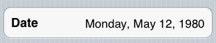
{
  title: "Date",
  value: 326937600,
  key: :date_long,
  type: :date,
  format: :full
}
The DateRow is a string input row for a date and opens a UIDatePicker when editing.
You can pass one of following formats as property:
  :no       # NSDateFormatterNoStyle - Specifies no style.
  :short    # NSDateFormatterShortStyle - Specifies a short style, typically numeric only, such as “11/23/37” or “3:30pm”.
  :medium   # NSDateFormatterMediumStyle - Specifies a medium style, typically with abbreviated text, such as “Nov 23, 1937”.
  :long     # NSDateFormatterLongStyle - Specifies a long style, typically with full text, such as “November 23, 1937” or “3:30:32pm”.
  :full     # NSDateFormatterFullStyle -Specifies a full style with complete details, such as “Tuesday, April 12, 1952 AD” or “3:30:42pm PST”.
The value is a NSDate.timeIntervalSince1970 as an integer.
Note that you can pass a :picker_mode argument to affect what kind of date picker is displayed:
  :time          # UIDatePickerModeTime
  :date_time     # UIDatePickerModeDateAndTime
  :countdown     # UIDatePickerModeCountDownTimer
If none of these are specified, UIDatePickerModeDate is used.
Note: If you use :date_time or :time for the type, :minute_interval will be applied to the time picker if you specify a value for it.
the default is the Apple default of 1.
{
  title: "My Data",
  type: :object,
  value: object       # an object
}
Same as StringRow with the difference that it would not change the row.value to string. The object needs a to_s method.
{
  title: "Share something",
  type: :activity,
  value: "Something I want to share."
}
Creates a UIActivityViewController for you with the contents of :value. You can also pass a Hash to value:
{
  title: "Share something",
  type: :activity,
  value: {
    items: "Something I want to share.", # Can be a String, NSURL, or UIImage or Array of those types
    excluded: [] # Types of activities to exclude. See the UIActivity class docs for a list of activity types.
  }
}
{
  title: "Static",
  type: :static,
}
The StaticRow has no input funcitonality and therefore needs no key property. It is used for static text display like in Settings > General > About on your iOS device.

{
  title: "Remember?",
  key: :remember,
  type: :switch,
  switch_tint_color: "#00ff88" # optional
}
The SwitchRow is a on/off switch that has the value true or false.

{
  title: "Check",
  key: :check,
  type: :check,
  value: true
}
The CheckRow is a row you can check and uncheck by tapping on it. It has either the value true or false.
You can create a radio button style group by defining a section with select_one: true like this:
{
  title: "Account Type",
  key: :account_type,
  select_one: true,
  rows: [{
    title: "Free",
    key: :free,
    type: :check,
  }, {
    title: "Basic",
    value: true,
    key: :basic,
    type: :check,
  }, {
    title: "Pro",
    key: :pro,
    type: :check,
  }]
}
This would result in a form's render as:
{
  account_type: :basic
}
{
  title: "Slider",
  key: :slider,
  type: :slider,
  range: (1..100),
  value: 25
}
The SliderRow takes a ruby range as range property that defines the min and max value of the slider.
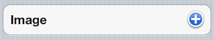
{
  title: "Image",
  key: :image,
  type: :image
}
{
  title: "Account Type",
  key: :account_type,
  type: :options,
  items: ["Free", "Basic", "Pro"]
}
{
  title: "Picker",
  key: :pick,
  type: :picker,
  items: ["Ruby", "Motion", "Rocks"],
  value: "Motion",
  input_accessory: :done
}
{
  title: "Advanced",
  type: :subform,
  key: :advanced,
  subform: {
    title: "Advanced",
    sections: [{
      title: "Advanced Settings",
      rows: [{
        title: "Server URL",
        key: :server,
        placeholder: "example.com",
        type: :string,
      }]
    }, {
      rows: [{
        title: 'Back',
        type: :back
      }]
    }]
  }
}
Use a :display_key to show the value of the subform in the row:

{
  title: "Subform",
  subtitle: "With display_key",
  type: :subform,
  display_key: :type,
  subform: {
    ...
  }
}
{
  title: 'Your nicknames',
  rows: [{
    title: "Add nickname",
    key: :nicknames,
    type: :template,
    value: ['Nici', 'Sam'],
    template: {
      title: 'Nickname',
      type: :string,
      placeholder: 'Enter here',
      indented: true,
      deletable: true
    }
  }]
}
{
  title: "Map",
  type: :map,
  value: coordinates,  # of type CLLocationCoordinate2D, CLCircularRegion, or a Hash of options
  row_height: 200      # for better viewing
}
Shows a map with a pin at the coordinates from value. If you pass a CLLocationCoordinate2D or CLCircularRegion, a pin will be placed at the coordinates. You can pass a hash of options like this:
{
  title: "Map",
  type: :map,
  value: {
    coord: coordinates,
    enabled: true, # Whether the user can interact with the map.
    type: MKMapTypeStandard, # The type of map to show. See MKMapType documentation.
    animated: true, # Whether setting the region should animate. This property also applies to annotation titles.
    pin: {
      coord: coordinates, # Must be a CLLocationCoordinate2D
      title: nil, # Title of the annotation
      subtitle: nil # Subtitle of the annotation
    }
  }
  row_height: 200 # for better viewing
}
If you pass pin: nil the map will not display an annotation. Annotations with titles will automatically pop open the annotation. Note: If you set a title on an annotation it will automatically invalidate enabled:false and the map will be interactable.
{
  title: "My Awesome Site",
  type: :web_link,
  value: "http://www.myawesomesite.com" # URL to be opened. Can also be an NSURL
}
You can also allow the user to confirm leaving your app:
{
  title: "My Awesome Site",
  type: :web_link,
  warn: true,
  # or pass a hash to :warn.
  # Here are the default values (Bubblewrap alert options):
  # warn: {
  #   title: "Leaving #{App.name}",
  #   message: "This action will leave #{App.name} and open Safari.",
  #   buttons: ["Cancel", "OK"]
  # }
  value: "http://www.myawesomesite.com", # URL to be opened
}
{
  title: "Page",
  type: :web_view,
  value: html,      # HTML code to be shown
  row_height: 200   # for better viewing
}
{
  title: "Photos",
  type: :paged_image,
  value: images,      # array of UIImage's
  row_height: 200     # for better viewing
}
Same functionality as ImageRow but you can scroll through many photos.

{
  title: "Tags",
  type: :tags,
  value: ["Beer","Dark Beer"],
  row_height: 200               # for better viewing
}
Add on_tap callback:
row.on_tap do |row|
  ... # will be called when '+' in editable mode will touched
      # add the new tag with row.object.add_tag(new_tag)
end
Show/Edit tags.
{
  title: "Any Button",
  type: :button,
  key: :some_button
}

# later...
form.row(:some_button).on_tap do |row|
  # do something when tapped
end
The SubmitRow triggers the form.submit which triggers the defined on_submit callback.

{
  title: "Submit",
  type: :submit,
}
The SubmitRow triggers the form.submit which triggers the defined on_submit callback.
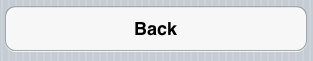
{
  title: "Back",
  type: :back,
}
The BackRow is used in subforms to go back to the parent form.
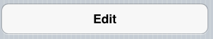
{
  title: "Edit",
  alt_title: "View",
  type: :edit,
}
The EditRow is used to switch between edit and view mode. It's mainly used for the TemplateRow.