
A customizable and easy-to-use image slider component for React Native.
You can install the @coder-shubh/react-native-image-slider package using npm or yarn:
# with npm
npm i @coder-shubh/react-native-image-slider react-native-vector-icons

# with yarn
yarn add @coder-shubh/react-native-image-slider react-native-vector-iconsimport React, {useRef} from 'react';
import ImageSlider from '@coder-shubh/react-native-image-slider';
const images = new Array(6).fill(
'https://cdn.pixabay.com/photo/2022/12/01/04/42/man-7628305_640.jpg',
);
const App = () => {
return (
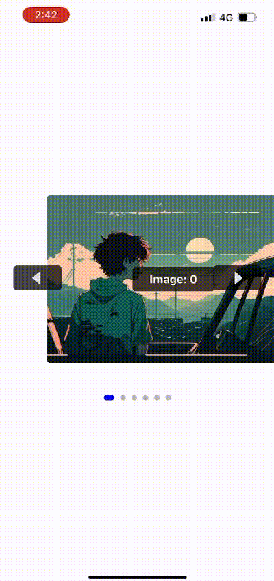
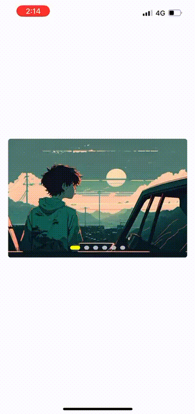
<ImageSlider
images={images}
imageHeight={250}
dotSize={10}
dotColor='silver'
activeDotColor='blue'
showNavigationButtons={true}
showIndicatorDots={true}
imageLabel={true}
label='Example Label'
extrapolate='clamp'
autoSlideInterval={5000}
containerStyle={{ marginBottom: 20 }}
radius={5}
/>
);
};
export default App;| Prop | Type | Description | Default Value |
|---|---|---|---|
images |
string[] |
Array of image URLs to display in the slider. | - |
imageHeight |
number |
Height of each image in the slider. | 250 |
dotSize |
number |
Size of the indicator dots. | 8 |
dotColor |
string |
Color of inactive indicator dots. | 'silver' |
activeDotColor |
string |
Color of active indicator dot. | 'blue' |
showNavigationButtons |
boolean |
Whether to show navigation buttons. | true |
showIndicatorDots |
boolean |
Whether to show indicator dots. | true |
imageLabel |
boolean |
Whether to display image label. | true |
label |
string |
Custom label text for images. | - |
extrapolate |
'clamp' | 'extend' | 'identity' |
Image scroll extrapolation behavior. | 'clamp' |
autoSlideInterval |
number |
Auto slide interval in milliseconds. | 3000 |
containerStyle |
any |
Custom style for the indicator container. | {} |
radius |
number |
Border radius for the image cards. | 5 |
In this table:
Prop: Name of the prop.
Type: Type of the prop.
Description: Description of what the prop does.
Default Value: Default value of the prop, if any.
This project is licensed under the MIT License - see the LICENSE file for details.
In this version, I've added:
- Title and badges centered at the top.
- Descriptive text centered.
- Table of Contents for easy navigation.
- Stylish section headings.
- Usage code block with syntax highlighting.
- More visual appeal with horizontal lines and section separators.
Feel free to adjust the styles, colors, or any other aspects to better suit your preferences or project branding.