A space tourism website project from frontend mentor, a website that challenges your frontend development skills. This website shows off semantic HTML, clear language and hidden elements for screen readers, keyboard UI controls, as well as other accessibility features such as aria-labels and limited javascript to ensure a good experience for all users. Layouts are clean, easy to read and change dynamically with screens of different sizes.
Link to project: https://so-you-want-to-travel-to-space.netlify.app/
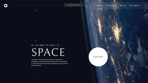
Compare the landing page results with the original design here: https://www.frontendmentor.io/solutions/space-tourism-multipage-website-BNPUS3nVYq
Tech used: HTML, CSS, JavaScript
I tried to make this as simple and clear as possible to really show off the skills in basic HTML, CSS and Javascript. The 4 pages have several tabs between them, for a total of 12 different "contents" displayed on all of them. One .css file styles all the pages and elements, dynamically hiding elements that should not be displayed, and using semantic atributes to ensure a consistent experience for users of all types. Two .js files total under 100 lines of code, one to controls the tabs of content (tabs.js) and one to control the navigation button for mobile layouts (nagivation.js).
This project was an exercise in doing the maximum you can do with HTMl, before adding CSS. Then, doing the maximum you can do with CSS, before adding JS. This keeps website accessible and also makes websites look better and more responsive on worse hardware, like older mobile phones or chromebooks with weak processors.
Using similarly names aria-labels and attributes allows the same Javascript to control all the different pages, while allowing users with different accessibility needs to access all the content on my website. Each page has a hidden "skip to content" element, try it by pressing tab on page load which will bring the selection to the tabs, which then can be selected with left and right arrow keys to control which content is displayed on the destination, crew and technology pages. This is a common feature on websites that makes it easy to use on a screen reader.
Frontend mentor supplies a figma file that let me see directly what fonts, font-sizes, colors, element sizes, etc were used and I used that to great extent to make my website match the demo website as closely as possible. Comparing the two, I think I did a pretty darn good job.
Layouts were created mostly with grid and flexbox to ensure that the website looks good on the provided mobile, tablet, and desktop sizes, as well as every size in between.
Many assets were provided in both .png and .webp formats, so I used
A .json file with all the content was provided, which I did not use in favor of a lighter JS approach that let me make a more accessible website. I'd love to be able to use that file instead to load content, as it would make a more satisfying website in the end, however I decided the speed and more readable code as a result of doing it my way was the better option.
Some pages have a small amount of element movement when changing content, which could be fixed by hard coding element sizes. The movement is minor and relatively unobtrusive however, and so I decided that I'd spent enough time on this project to move on, but I acknowledge it is not perfect.
Some elements are still slightly missized compared to the figma files, this project shows off hwo close you can get with realtively simple css but if it was production code I would have spent a little more time with the details to get it pixel perfect.
I hadn't had a chance to play with a lot of the accessibility features like aria-labels before this point, and while I'd always used things like alt tags for photos, this project showed me how much more could be done to support users with accessibility needs. For example, this was the first time using things like aria-controls, aria-expanded="false", aria-hidden="true" on span elements that are really just design. Not to mention considering tab-index and giving an option to skip right to the content. Just reading about those handful of attributes and contepts leads down a huge rabbit-hole of information, which I think I did a pretty good job on this project, but I know there's a lot more to learn in that domain.
I also learned a lot about grid. Before I relied a lot on flexbox for things that I'd probably do in grid at this point. It's much more flexible, especially for changing where elements are when the screen sizes change a lot from mobile, to tablet, to desktop sizes. Combine that with new logical CSS functions like min, max, and clamp and I realize all those times before I'd been fighting layouts could have been a lot easier.
Using only the basics: HTML, CSS and JS helped me see the value of frameworks, but at the same time I have a newfound respect for how much you can do with just the basics.