Change z-score calculations to incorporate begins_distribution_change
#473
Comments
|
A few options we discussed in #383, but with more summary and polish here: We could (and IMHO should) treat the step-change markers we have from #472 and #574 as known-mean shifts in the distribution. We currently use two measures of history: the mean of the measure (for tracking central tendency) and the standard deviation. If we centered all of our measures around the means from their segments before calculating the standard deviation for the whole set, we will have our measure of variability that is independent from the mean shifts. IIRC, @alistaire47 called this the standard deviation of the residuals (where the model is the mean of the segment). I'm happy to throw some code together that shows this off (in the style of what's in #383), but need to do that later. We also should consider adding an exponential weighting so that past history has less (or effectively no) influence on recent measures. But IMO we should put that as a separate ticket and not try and tackle it here. I also think even with just this scaling, we probably are at the point that we want (or possibly even need) to pull these calculations out of being executed exclusively in the database. Finally, we should consider what this looks like in the UI + how we message to folks about this. I think improvements to the plots (some of #477) to show the area of uncertainty and if bots fall outside of it is absolutely critical. After that, we should describe why we're using history for this. And finally, ideally we would also have a robust and detailed document describing the approach + math for folks that want to dive that deeply |
|
To summarize my thoughts on how to do this:
An alternative way to do (3) would be to weight entire segments together instead of points. Ontologically this is a more attractive way to do it, but the math is more complicated since you care about both how recent a segment is plus how many commits come after. You could mix two segments with a conjugate prior (normal-normal might work, though sd follows a chi distribution, I think? Could maybe use a beta distribution to parameterize mixing?), but if segments are short we'd have to chain that somehow. If we want to go this route, we should nerd-snipe a Bayesian statistician with it. |
|
Here's some more code demonstrating this:
|
|
Okay I finally understand this approach. That's a lot simpler than I thought, and I agree that we can tackle "weighting by recency" later. |
|
Another facet of this that I didn't realize until I wrote out that simulation (discovered only because a bug in an earlier implementation 😬 !): with the possible exception of every-single-commit-is-its-own-segment (though even that may be fine, actually!), having an "extra" segment by labelling a commit that doesn't have a big difference as being the start of a new segment doesn't negatively impact that standard deviation bands. |
|
That example assumes standard deviation is constant across segments, though. The reason for weighting is when it's not—it will adjust smoothly (otherwise the old width will last until the old data ages out) and more quickly to the new spread, hopefully without too many false positives in the case where spread increases (though that's still a possibility). ...but we can hold off on weighting if we're not too concerned about spread changes, because eliminating the jumps from the computation does fix the artificially big bounds |
Totally, even without weighting, the shift will (very slowly!) reduce over time if we go from a high variability regime (back) to a low variability regime. But the time it would take to do that is quite long. And like you said: weighting will help smooth that out more quickly in a nice way so we should do it. If we can "easily" do the weighting here let's do it — but I don't want to get too distracted with perfecting the weighting that we delay (even by a little bit) getting out the long-awaited other more basic improvements we can get without it. |
|
I think we should try to
(maybe the proposals above are compatible with that perspective!) The following paragraph is meant half serious half funny (I have not read all of above in all detail, and hope that my comment is not perceived as unfair!). After skimming through the paragraphs above I'd love to share an impression. In my life I've done and seen my fair share of advanced data analysis. I have the feeling (I might be wrong) that our space of business here does not really need super advanced data analysis. Before doing Bayesian Principal Component Analysis of the Fourier Transform of the exponentially weighted chi distribution (conjugated, of course 🚀!) -- my intuition is that we should focus on improving the raw data first (reduce noise, inspect distribution properties qualitatively, etc), and then apply really basic means for regression detection :). I know this is provocative, and over time I'd love to learn and convince myself how delicate and intricate our regression detection algorithms really need to be. |
|
Agreed, simple is good, provided it works. The question is how to mix data across segments when calculating the bounds so they adjust smoothly and responsively. To what extent it matters how well we do it depends on how big of shifts in spread between segments we see—if spread mostly doesn't change that much, we can do very little and be fine. If spread sometimes increases significantly, we'll see some noise alerts right after shifts unless we improve our mixing method. Historically we've avoided these noise alerts because we include the jump in the calculating the bounds, blowing them out for a while anyway. Since we're going to stop doing that, we'll see soon if we need more sophistication. And even then, just weighting for recency might be good enough! |
|
I'm looking deeper at the examples above. I'm not super comfortable with centering the band around the mean of the entire segment, because that's affected by future data in the same segment, which could cause weird alerts. For example, I could see a scenario where we send a regression alert, but we don't see it in the webapp later, because the band's center drifted upwards after new data came in. So I propose we center the band around the rolling mean that excludes data from before the segment started. That code might look like this: data_proc <- data %>%
mutate(segment = cumsum(data$step_change)) %>%
group_by(segment) %>%
mutate(
segment_mean = mean(time),
rolling_mean = slider::slide_dbl(time, mean, .before = 1000, .after = 0)
) %>%
ungroup() %>%
mutate(
scaled = time - segment_mean,
rolling_sd = slider::slide_dbl(scaled, sd, .before = 1000, .after = 0)
)
ggplot(data_proc) +
aes(x = num, y = time) +
geom_line() +
geom_linerange(mapping = aes(ymin = rolling_mean - rolling_sd * 5, ymax = rolling_mean + rolling_sd * 5), alpha = 0.2, color = "blue") +
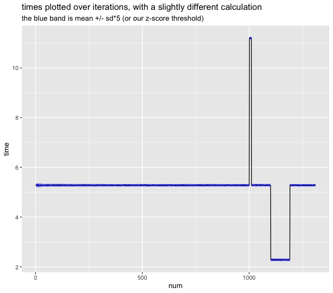
ggtitle("times plotted over iterations, with a slightly different calculation", subtitle = "the blue band is rolling_mean +/- rolling_sd*5 (or our z-score threshold)")While we're at it, we could do the same thing with the standard deviation: use the rolling standard deviation that excludes data from before the segment started. This solves Ed's problem of when the spread looks different between two segments. That would look like this: data_proc <- data %>%
mutate(segment = cumsum(data$step_change)) %>%
group_by(segment) %>%
mutate(
rolling_mean = slider::slide_dbl(time, mean, .before = 1000, .after = 0),
rolling_sd = slider::slide_dbl(time, sd, .before = 1000, .after = 0)
) %>%
ungroup()
ggplot(data_proc) +
aes(x = num, y = time) +
geom_line() +
geom_linerange(mapping = aes(ymin = rolling_mean - rolling_sd * 5, ymax = rolling_mean + rolling_sd * 5), alpha = 0.2, color = "blue") +
ggtitle("times plotted over iterations, with a slightly different calculation", subtitle = "the blue band is rolling_mean +/- rolling_sd*5 (or our z-score threshold)")Of course this has the issue where the first few points per segment are missing z-score. Time for some plots. I used the same data-generating code you did except:
Jon's option: My option 1: My option 2: |


|
After typing that whole comment, I sorta convinced myself that maybe it's okay to use the segment mean as the center of the band, even if it uses future data. Justification:
|
Yes, absolutely. I meant to say this in my previous comment that my quick-and-dirty code notably doesn't do this, and it really should be done only ever looking back like you say here.
I'm very strongly ➖ on only using SD data from the current segment (if that's what you mean by "excludes data from before the segment started). In the current architecture, we really should be using as much SD information as we can (especially from recent, but possibly different segments). As we evolve our alerting mechanisms we might change this to be smarter, or include other more simple difference calculations (that's ok!) but for now I don't think we can afford to basically say after any deviation "we have no idea what the spread could be, we can't possibly alert on anything (or worse: we continue to alert and use samples that have a small N to alert when that might not be valid)" which is effectively the current regime we are in when we blow out the SDs. One of the biggest new features of this project is (copied from https://github.com/conbench/conbench/milestone/1)
Resetting each distribution after a segment is effectively similar to using the same data and waiting for it to age out after 100 commits: you're left with a period after a change where you're not sure enough that you can alert even though we do actually have data that can help with that (we're just not calculating things in a way that can show that). |
|
If the mean is drifting, something is probably wrong with the benchmark or setup. Slightly off-topic but related in "bounds look weird": We might consider eventually calculating the upper and lower bounds separately so they're asymmetric, because it's not that unusual for benchmarks to have higher upward erraticity than downwards, and we really don't want any bounds that go negative. I may have made an issue for this at some point? I forget. But in terms of what we want bounds to look like after a shift, I think the first option is a little too perfect, and assumes more knowledge about the new segment than we actually have. So ideally they'd blow out a little (not as much or as long as the old method) to capture the new uncertainty, then zoom back in as more data is collected, kind of like these two happened to end up: |

💯 this is something we actually should automatically be monitoring and then alert separately that something is up. This is a classic death-by-a-thousand-slow-downs trap where no individual change makes things perceptibly slower, but over time you've introduced enough overhead with each change that you're now 2x or 3x slower (or something is wrong with your entire benchmark itself, or something is wrong with your running environment like you mention). Conbench is in some ways uniquely positioned to catch these. But that's a project for after we do this + have more facility to calculating things like the slope of the mean over time. Would you mind making an issue for this @alistaire47 so we can brainstorm there | figure out where to slot that in to new project(s)? |
|
Thanks for the issue Ed! I agree with you both that the middle plot is probably our best option here. It uses out-of-segment SD data but not out-of-segment (or future!) mean data. I'm working on implementing that now. |
begins_distribution_change
See comments below for full discussion. Current plan: when calculating the z-score of a BenchmarkResult
Bon commitC,BBbegins_distribution_changeis True, whichever is laterCbegins_distribution_changeBfor the z-score calculationThe text was updated successfully, but these errors were encountered: