An <AwesomeButton /> component that creates a button depicting different states in terms of e.g. color and label text. When a new buttonState is passed to the component the button will animate transition to the new appearance specified upon initiation. You can also pass in different functions to be called on touch depending of the current state of the button.
npm install react-native-awesome-button --save- Whenever you want to use it within React Native code now you can:
const AwesomeButton = require('react-native-awesome-button')
To use <AwesomeButton>, you need to require react-native-awesome-button to your module and insert <AwesomeButton> tag inside render function with the required properties as it's done below:
import React, { Component } from 'react';

import {
  AppRegistry,
  View,
  StyleSheet
} from 'react-native';

import AwesomeButton from 'react-native-awesome-button';


const styles = StyleSheet.create({
  container: {
    flex: 1,
    flexDirection: 'row',
    margin: 20,
    alignItems: 'center',
    justifyContent: 'center'
  }
})


class Simple extends Component {

  handleButtonPress() {
    console.log('I was pressed')
  }

  render() {
    return (
      <View style={styles.container}>
        <AwesomeButton states={{
                        default: {
                          text: 'Press me',
                          onPress: this.handleButtonPress,
                          backgroundColor: '#1155DD'
                        }
                       }} />
      </View>
    )
  }

}


AppRegistry.registerComponent('Simple', () => Simple)
In this example, a simple button with only one appearance and onPress-function will be rendered. This would produce something like this:

To run this example yourself, you need to do the following:
- Clone the full source code from github:
git clone git@github.com:larsvinter/react-native-awesome-button.git - Change to the proper directory of the simple example:
cd react-native-awesome-button/examples/Simple - Install dependencies:
npm install - Open the project in Xcode and hit 'run' (the project is inside 'ios' folder) (remember to restart the packager)
This shows how you might implement an animated button that transitions to a new state upon e.g. a user press. Notice that you create an object that specifies the different states and then pass the prop buttonState to the button, when you want it to transition to a new appearance. You can have an unlimited number of possible states for a button.
const React = require('react-native')
const AwesomeButton = require('react-native-awesome-button')
const {
AppRegistry,
Component,
View,
StyleSheet
} = React
const styles = StyleSheet.create({
container: {
flex: 1,
flexDirection: 'row',
alignItems: 'center',
justifyContent: 'center',
margin: 20
},
loginButtonBackground: {
flex: 1,
height: 40,
borderRadius: 5
},
loginButtonLabel: {
color: 'white'
}
})
class Advanced extends Component {
constructor(props) {
super(props)
this.state = {
buttonState: 'idle'
}
this.logIn = this.logIn.bind(this)
}
logIn() {
this.setState({ buttonState: 'busy' })
setTimeout(() => {
this.setState({ buttonState: 'success' })
}, 2000);
}
render() {
return (
<View style={styles.container}>
<AwesomeButton backgroundStyle={styles.loginButtonBackground}
labelStyle={styles.loginButtonLabel}
transitionDuration={200}
states={{
idle: {
text: 'Log In',
onPress: this.logIn,
backgroundColor: '#1155DD',
},
busy: {
text: 'Logging In',
backgroundColor: '#002299',
spinner: true,
},
success: {
text: 'Logged In',
backgroundColor: '#339944'
}
}}
buttonState={this.state.buttonState}
/>
</View>
)
}
}
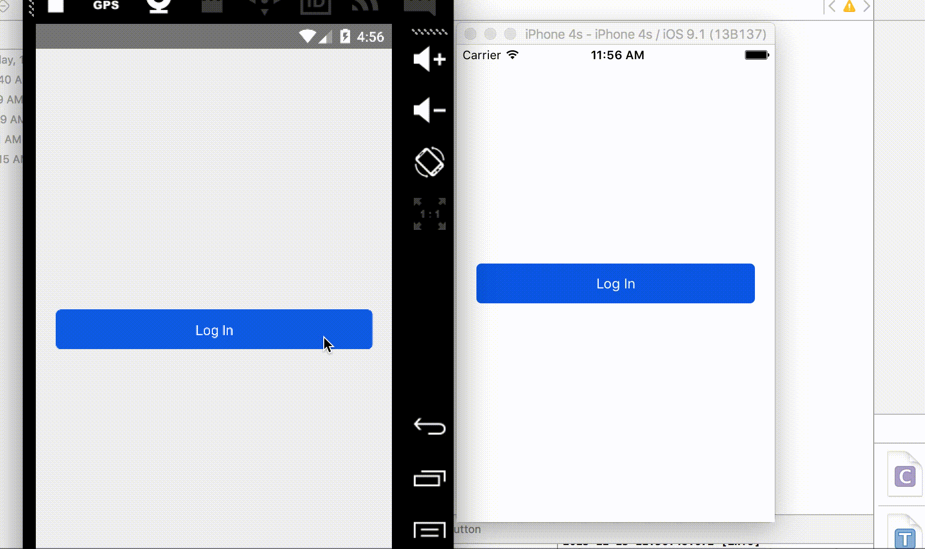
AppRegistry.registerComponent('Advanced', () => Advanced)In this example, a login-button with three different appearances will be rendered. This would produce something like this (in 3 steps):
To run this example yourself, you need to do the following:
- Clone the full source code from github:
git clone git@github.com:larsvinter/react-native-awesome-button.git - Change to the proper directory of the advanced example:
cd react-native-awesome-button/examples/Advanced - Install dependencies:
npm install - Open the project in Xcode and hit 'run' (the project is inside 'ios' folder) (remember to restart the packager)
### Component properties
| Prop | Type | Description |
|---|---|---|
states |
object |
Includes a nested object for each possible state and the parameters for this state. The key used for the nested object will be the name for that specific state |
buttonState |
string |
The key used to tell the button what apparance and functionality to take on. Changing this will trigger an animation to the new state given |
backgroundStyle |
stylesheet object |
A standard style object for the button (with same style properties as for a <View> component. Possible to reference a StyleSheet object |
labelStyle |
stylesheet object |
A standard style object for the button label (with same style properties as for a <Text> component. Possible to reference a StyleSheet object |
Each state in the states object should have a unique key. For each of these keys you need to specify the parameters for the button when it is in that specific state. A buttonstate can have one or more of the following parameters:
| Key | Type | Description |
|---|---|---|
onPress |
function |
The function fired when the button is pressed. If not defined the button has no press functionality and simply renders as a view |
spinner |
bool |
If true the button will show a spinner on the left hand side of the label when in this state |
text |
string |
The label of the button when in this state |
backgroundColor |
string |
A color for the background of the button when in this state |
- Improve transition animation (i.e. cross-fade the text label)
If you would like to refactor or help with new features, please create a separate branch, make your changes, commit, push and submit a pull-request.