/
vis-xmaps.Rmd
255 lines (212 loc) · 10.1 KB
/
vis-xmaps.Rmd
1
2
3
4
5
6
7
8
9
10
11
12
13
14
15
16
17
18
19
20
21
22
23
24
25
26
27
28
29
30
31
32
33
34
35
36
37
38
39
40
41
42
43
44
45
46
47
48
49
50
51
52
53
54
55
56
57
58
59
60
61
62
63
64
65
66
67
68
69
70
71
72
73
74
75
76
77
78
79
80
81
82
83
84
85
86
87
88
89
90
91
92
93
94
95
96
97
98
99
100
101
102
103
104
105
106
107
108
109
110
111
112
113
114
115
116
117
118
119
120
121
122
123
124
125
126
127
128
129
130
131
132
133
134
135
136
137
138
139
140
141
142
143
144
145
146
147
148
149
150
151
152
153
154
155
156
157
158
159
160
161
162
163
164
165
166
167
168
169
170
171
172
173
174
175
176
177
178
179
180
181
182
183
184
185
186
187
188
189
190
191
192
193
194
195
196
197
198
199
200
201
202
203
204
205
206
207
208
209
210
211
212
213
214
215
216
217
218
219
220
221
222
223
224
225
226
227
228
229
230
231
232
233
234
235
236
237
238
239
240
241
242
243
244
245
246
247
248
249
250
251
252
253
254
255
---
title: "Visualising Crossmap Transformations"
output:
rmarkdown::html_vignette:
toc: yes
vignette: >
%\VignetteIndexEntry{Visualising Crossmap Transformations}
%\VignetteEngine{knitr::rmarkdown}
%\VignetteEncoding{UTF-8}
---
## Alternative representations of Crossmaps
Crossmaps aim to encode dataset integration and harmonisation choices separately to the code used to apply those such designs to data. It follows that visualisations and plots of the candidate crossmaps could be useful during the design process. For instance, Sankey diagrams are sometimes used to visualise schema crosswalks.
This article provides a few ggplot2 code examples for visualising crossmaps. The package will offer functions for generating these visualisations from `xmap` objects in future releases.
```{r message=FALSE}
library(ggplot2)
library(dplyr)
library(stringr)
library(patchwork)
library(ggbump)
library(xmap)
```
### Table
Let's start with visualising a section of the ANZSCO22 to ISCO8 crosswalk published by the Australian Bureau of Statistics:
```{r}
anzsco_cw <- tibble::tribble(
~anzsco22, ~anzsco22_descr, ~isco8, ~partial, ~isco8_descr,
"111111", "Chief Executive or Managing Director", "1112", "p", "Senior government officials",
"111111", "Chief Executive or Managing Director", "1114", "p", "Senior officials of special-interest organizations",
"111111", "Chief Executive or Managing Director", "1120", "p", "Managing directors and chief executives",
"111211", "Corporate General Manager", "1112", "p", "Senior government officials",
"111211", "Corporate General Manager", "1114", "p", "Senior officials of special-interest organizations",
"111211", "Corporate General Manager", "1120", "p", "Managing directors and chief executives",
"111212", "Defence Force Senior Officer", "0110", "p", "Commissioned armed forces officers",
"111311", "Local Government Legislator", "1111", "p", "Legislators",
"111312", "Member of Parliament", "1111", "p", "Legislators",
"111399", "Legislators nec", "1111", "p", "Legislators"
)
links <- anzsco_cw |>
dplyr::group_by(anzsco22) |>
dplyr::summarise(n_dest = dplyr::n_distinct(isco8)) |>
dplyr::ungroup() |>
dplyr::transmute(anzsco22, weight = 1/n_dest) |>
dplyr::left_join(anzsco_cw, by = "anzsco22")
## get code tables
table_anzsco <- anzsco_cw |>
dplyr::distinct(anzsco22, anzsco22_descr)
table_isco8 <- anzsco_cw |>
dplyr::distinct(isco8, isco8_descr)
## make xmap
anzsco_xmap <- links |>
as_xmap_df(anzsco22, isco8, weight)
```
The included `print()` method for `xmap_df` objects:
```{r}
print(anzsco_xmap)
```
### Bigraph
Visualisation as a bigraph is particularly useful for seeing the relations between the two nomenclature.
```{r message=FALSE}
.bigraph_add_link_style <- function(edges, x_attrs, ...) {
## generate out link type
style_out_case <- tibble::tribble(
~out_case, ~line_type, ~font_type,
"unit_out", "solid", "bold",
"frac_out", "dashed", "italic")
edges |>
dplyr::mutate(out_case = dplyr::case_when(.data[[x_attrs$col_weights]] == 1 ~ "unit_out",
.data[[x_attrs$col_weights]] < 1 ~ "frac_out")) |>
dplyr::left_join(style_out_case,
by = "out_case") |>
dplyr::ungroup()
}
.bigraph_add_node_positions <- function(edges, x_attrs, pos_from, pos_to, ...) {
## attach node positions
edges |>
dplyr::left_join(pos_from, by = setNames("from_set", x_attrs$col_from)) |>
dplyr::left_join(pos_to, by = setNames("to_set", x_attrs$col_to)) |>
dplyr::mutate(from_x = 0,
to_x = 5) |>
dplyr::mutate(idx = dplyr::row_number())
}
plt_xmap_bigraph <- function(x, ...) {
stopifnot(is_xmap_df(x))
x_attrs <- attributes(x)
edges_short <- tibble::as_tibble(x)
df_out_style <- .bigraph_add_link_style(edges_short, x_attrs)
## generate node positions
from_nodes <- tibble::tibble(from_set = x_attrs$from_set) |>
dplyr::mutate(from_y = dplyr::row_number())
to_nodes <- tibble::tibble(to_set = unique(x[[x_attrs$col_to]])) |>
dplyr::mutate(to_y = dplyr::row_number() - 1 + 0.5)
df_gg <- .bigraph_add_node_positions(df_out_style, x_attrs,
from_nodes, to_nodes)
## build ggplot
ggplot2::ggplot(data = df_gg,
aes(x = from_x, xend = to_x,
y = from_y, yend = to_y,
group = idx)) +
## edges
ggbump::geom_sigmoid(aes(linetype = I(line_type))) +
ggplot2::geom_label(data = dplyr::filter(df_gg, out_case == "unit_out"),
aes(x = (from_x + to_x) / 4,
y = from_y,
label = round(.data[[x_attrs$col_weights]], 2))) +
ggplot2::geom_label(data = dplyr::filter(df_gg, out_case == "frac_out"),
aes(x = (((from_x + to_x) / 2) + to_x) / 2,
y = to_y,
label = round(.data[[x_attrs$col_weights]], 2))) +
## from nodes
ggplot2::geom_text(aes(x = from_x - 0.5, y = from_y,
label = .data[[x_attrs$col_from]],
fontface=I(font_type)),
## drop idx groups to avoid duplicate labels
stat = "unique", inherit.aes = FALSE) +
## to nodes
ggplot2::geom_label(aes(x = to_x + 0.5, y = to_y,
label = .data[[x_attrs$col_to]]),
fill = "black",
alpha = 0.1) +
ggplot2::scale_y_reverse() +
ggplot2::theme_minimal() +
theme(legend.position = "bottom",
panel.grid.major = element_blank(),
panel.grid.minor = element_blank(),
axis.text.y = element_blank(),
axis.text.x = element_blank(),
plot.background = element_rect(fill = "white")) +
labs(x = NULL, y = NULL)
}
```
```{r message=FALSE, echo=FALSE}
gg_bigraph <- anzsco_xmap |>
plt_xmap_bigraph()
```
```{r message=FALSE, echo=FALSE, out.width="100%"}
# print bigraph and code tables
gg_bigraph
```
```{r message=FALSE, echo=FALSE}
knitr::kable(list(table_anzsco, table_isco8))
```
This visualisation also has benefits over the traditionally used Sankey diagram. Sankey diagrams are often used to illustrated "flows" between nodes. However, variable link widths can actually clutter the visualisation of crosswalks. Consider this simple crossmap that might be used to harmonise national accounts data (e.g. GDP) across two time periods.
```{r}
edges <- tribble(~ctr, ~ctr2, ~split,
"BLX", "BEL", 0.5,
"BLX", "LUX", 0.5,
"E.GER", "DEU", 1,
"W.GER", "DEU", 1)
```
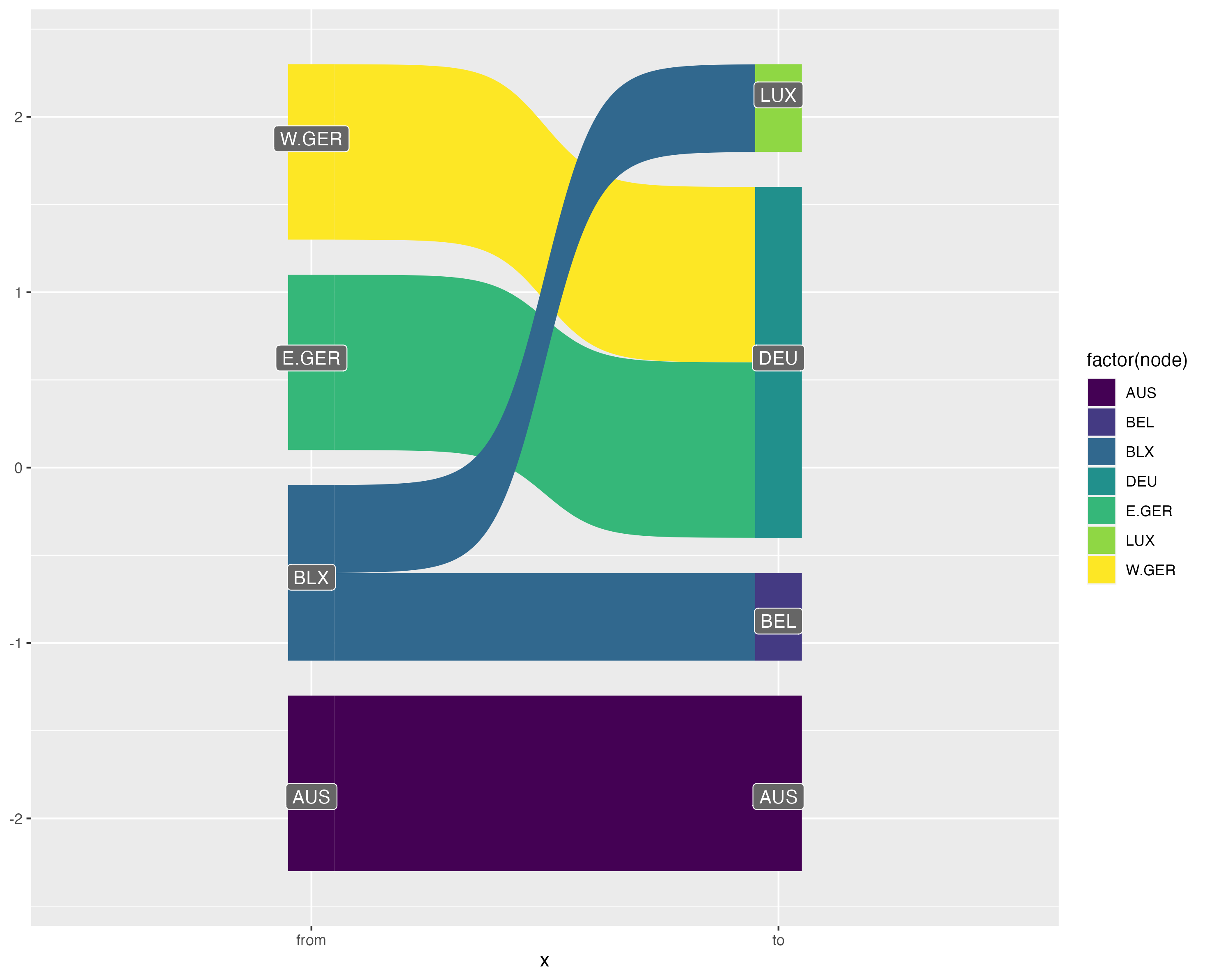{width="100%"}
On the other hand, the bigraph visualisation shows more clearly how data is modified (or not) when harmonising between nomenclature. The solid lines show when a link does not modify the source values, whilst the dotted line style indicates that data will be split up. Furthermore, by using fixed width links, there is room to place labels on-top of each curve indicated the transformation weights.
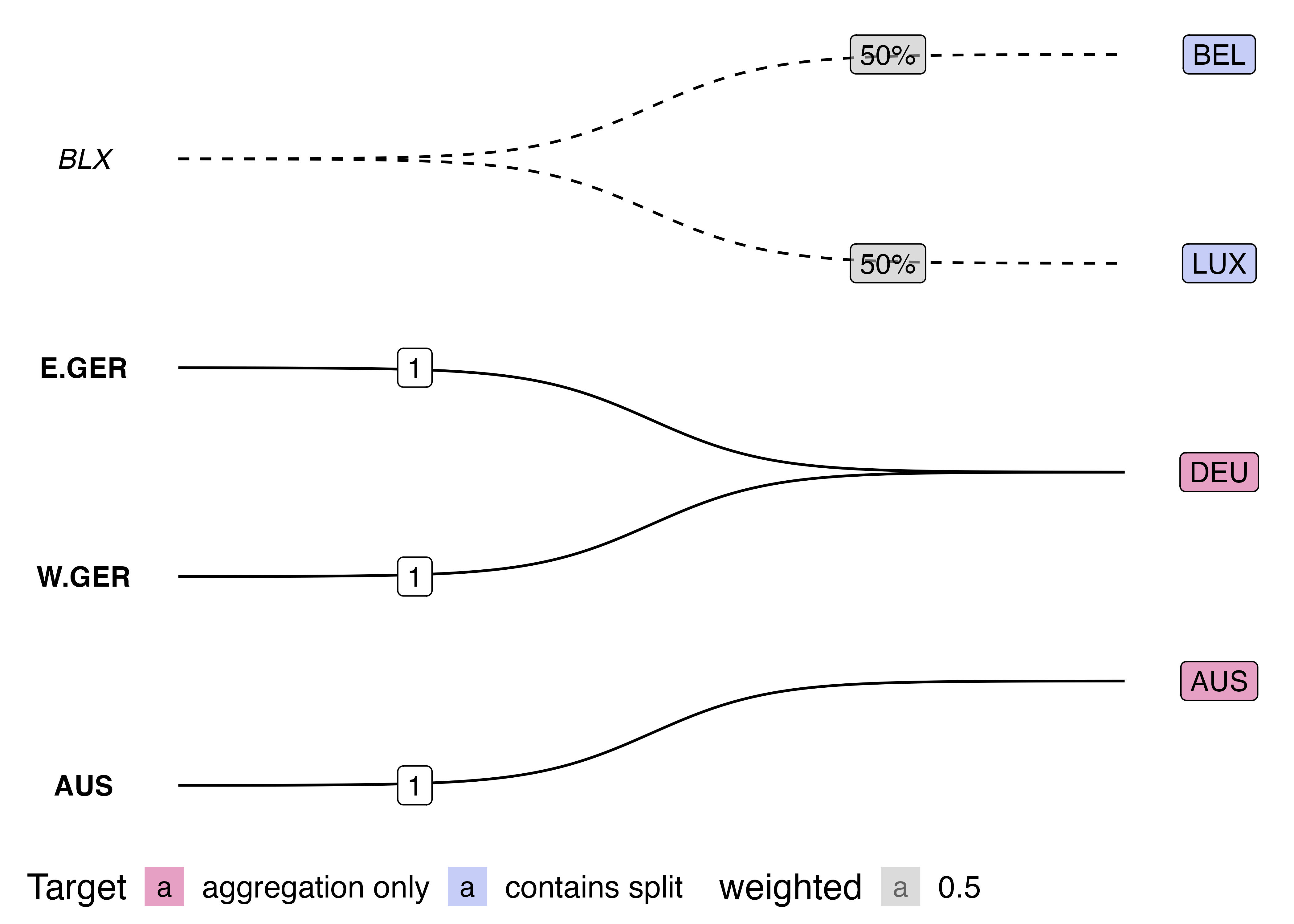{width="100%"}
### Matrix
Another useful visualisation or representation of a crossmap is as an incidence matrix with the source nomenclature indexed along the rows and the target nomenclature indexed on the columns:
```{r xmap-as-matrix}
plt_xmap_ggmatrix <- function(x, ...){
stopifnot(is_xmap_df(x))
x_attrs <- attributes(x)
edges_complete <- tibble::as_tibble(x) |>
tidyr::complete(.data[[x_attrs$col_from]], .data[[x_attrs$col_to]])
## add link-out type
gg_df <- edges_complete |>
dplyr::mutate(out_case = dplyr::case_when(.data[[x_attrs$col_weights]] == 1 ~ "one-to-one",
.data[[x_attrs$col_weights]] < 1 ~ "one-to-many",
is.na(.data[[x_attrs$col_weights]]) ~ "none")
)
## make plot
gg_df |> ggplot(aes(x=.data[[x_attrs$col_to]],
y=.data[[x_attrs$col_from]])) +
geom_tile(aes(fill=out_case), col="grey") +
scale_y_discrete(limits=rev) +
scale_x_discrete(position='top') +
scale_fill_brewer() +
coord_fixed() +
labs(x = x_attrs$col_to, y = x_attrs$col_from, fill="Outgoing Link Type") +
theme_minimal() +
geom_text(data = dplyr::filter(gg_df, !is.na(.data[[x_attrs$col_weights]])), aes(label=round(.data[[x_attrs$col_weights]], 2))) +
theme(legend.position = "bottom",
panel.grid.major = element_blank(),
panel.grid.minor = element_blank()
)
}
```
```{r}
plt_xmap_ggmatrix(anzsco_xmap)
```
Notice that the requirement that a valid crossmap has outgoing weights which sum to 1 for each source node is equivalent to a requirement that the total of weights across each row sums to 1.
{width="100%"}
## Visualising Types of Mapping Relations
```{r, echo=FALSE}
veg_1a <- c("eggplant", "capsicum", "zucchini")
veg_1b <- c("aubergine", "pepper", "courgette")
veg_2 <- c("vegetables")
fruit_1a <- c("peach", "raspberry", "kumquat")
fruit_2 <- c("fruits")
pb_1a <- c("salt", "sugar", "peanuts")
pb_2 <- c("peanut butter")
pb_1a_w <- c(0.02, 0.05, 0.93)
recode <- data.frame(au = veg_1a, uk = veg_1b, link = 1) |>
as_xmap_df(au, uk, link)
gg_recode <- recode |> plt_xmap_bigraph()
agg <- data.frame(item = fruit_1a, group = fruit_2, link = 1) |>
as_xmap_df(item, group, link)
gg_agg <- agg |> plt_xmap_bigraph()
disagg <- data.frame(group = pb_2, item = pb_1a, link = pb_1a_w) |>
as_xmap_df(group, item, link)
gg_disagg <- disagg |> plt_xmap_bigraph()
```
```{r}
library(patchwork)
gg_recode + gg_agg + gg_disagg
```