Extended Permissions Bar #79
Comments
|
You can also consider reducing the number of icons currently showing up to make the UI cleaner, if the above is implemented. |
|
I think this is too much. If the user has to click an overflow menu, the user can also just click the whole entry and go to the details screen. |
|
I don't see how this will make it complicated for anyone. The whole idea behind the app started with the need to have a snapshot of the status of those 30 or so permissions (these will henceforth be referred to as Core permissions) which are configurable by the user. The Permissions Tab, in its current form (as of v.0.4.2), is very complicated for the average user, who easily constitutes over 90% of your user-base. They don't see things the way a developer or an advanced user sees. It is recommended to present things in their most simplest form, which the user is likely to be familiar with. As mentioned earlier, the Permissions Tab on my phone is currently listing 690 permissions, and users have no control over most of those. At best, they are information for the advanced users only. This is the reason I have been insisting on displaying those core permissions in the same way that they are presented under System Settings, to make it easier for the average user to understand. This post is only meant to be an alternative to the other post referenced in the OP, which you are reluctant to implement. It also serves to clean up the UI a bit, since the Permissions Bar can make the UI look a little cluttered for apps that request too many permissions. Please feel free to implement anything that you are most comfortable with. :) |
|
To clarify, this is all about this bar?
If so, then I don't think adding popup interaction to it is good UI / UIX. |
|
Yes, this is the Permissions Bar that OP is referring to. I hope you would make the Permissions Tab user friendly, from the perspective of the average user. It must be simple to understand, as well as familiar with what most users are used to. |
|
The bar is "to look at", showing something when pressing the icons, as we currently do it, was more of a quick hack that I did, and I'd rather remove even that than expand on it more. The click targets are just to small (and miss clicking changes the screen), so suggesting to the user (by adding more features there) that these are things he/she should interact with, just makes for a frustrating experience.
The whole permissions TAB, is still a work in progress, and not related to the tag bar. |
Today is not a good day for you to make big decisions (due to frustrations caused by Google Bots). 🤣🤣
That was only an alternative suggested, since I wasn't sure what your plans are for the Permissions Tab.
Not just the Permissions Tab, but also the App Details page. Both need to be made in a way that the average user is 'familiar' with. For example, the average user prefers App Name over Package Name. Likewise, 'Files and Media' over 'Read External Storage', 'Write External Storage', 'Manage External Storage', etc. |
That's difficult to display as "Files and Media" is not a permission but a name for a group of permissions. Theoretically we could make it a new type of permisison list entry, that can be expanded? 🤔 |
|
Under System Settings, user has a maximum of 3 options for storage related permission:
Even I don't know the specifics of each permission. But I guess, 1 is safest to grant (app has access to its own folder in internal storage), then 3 (app has access to all media files, i.e. files with specific extensions). Permission 2 is probably the most privacy risk because it allows the app requesting it to have full access to internal storage as well as external storage. Whatever it is, this in itself is quite confusing. Now if you display permissions using the permission name that the user has probably never seen, it will be even more confusing. The primary objective should be to show the user what the status of each permission under System Settings is, using just the names that the user is already familiar with. For advanced users, the other information could be useful. But the average user is unconcerned with much of it. As I mentioned before, my Samsung phone lists 917 permissions in the Permissions Tab. And the user is only aware of those 30 or so permissions, which I refer to as Core Permissions. Pretty much everything else is just for information, and that too only for advanced users. The main reason for this being those permissions are not controlled/ controllable by the user. Hence the suggestions made in #86 and #89. |
This idea is an alternative to the one suggested in #37 .
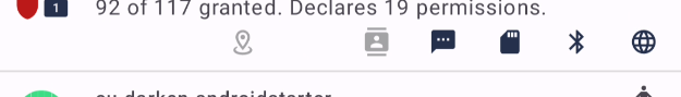
How about adding a 'More' (can be replaced with an icon) button on the existing Permissions Bar (at the rightmost end) that will open a pop-up window which will list all the permissions (from those 30 or so permissions that users can configure) requested by each app in a vertical list?
The implementation will be similar to the horizontal bar in terms of the following:
All permissions requested AND granted will have the coloured icon.
All permissions requested BUT denied will be greyed out.
Permissions not requested won't be shown.
These will be the features:
At some point in future, these buttons can also act as actual toggles that the user can use to toggle permissions.
The text was updated successfully, but these errors were encountered: