Skip to content
This repository has been archived by the owner on Jan 15, 2024. It is now read-only.

Fixes #98: Redesigned and scrollable AppDetails page #131

Merged
merged 3 commits into from
Sep 1, 2017
Merged

Fixes #98: Redesigned and scrollable AppDetails page #131

merged 3 commits into from
Sep 1, 2017

Conversation

bobheadxi
Copy link
Collaborator

@bobheadxi bobheadxi commented Aug 30, 2017

Issues

#98: If description is long or while in landscape mode, the bottom part of AppDetails is cropped and inaccessible

Changes

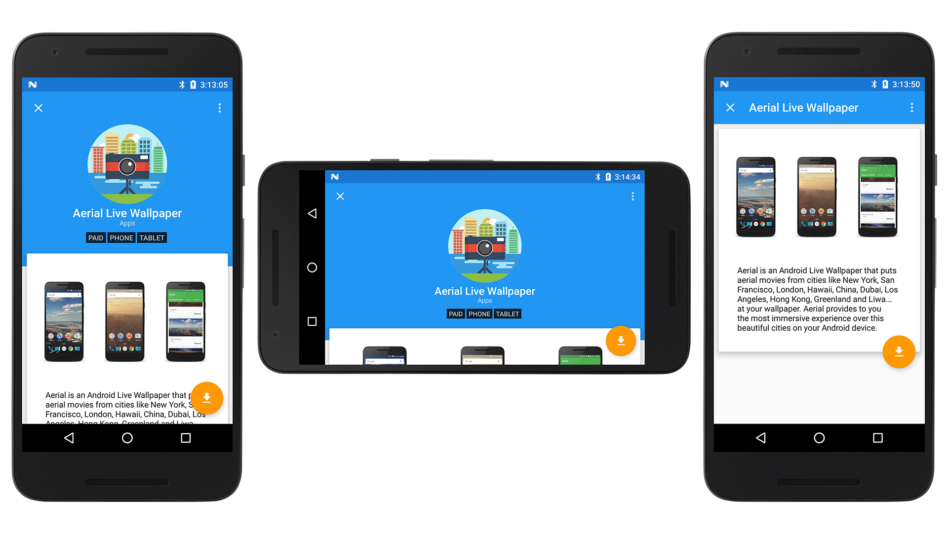
  • New AppDetails page layout

  • Screenshots and details area now vertically scrollable

  • Contact button now in the overflow menu

  • Updated support libraries

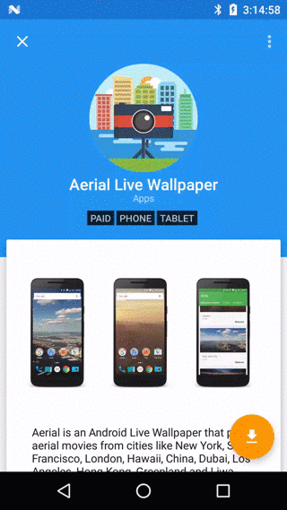
Original PR (151e24b):
newappdetails

A few commits later (0a4735b):
newappdetails2

Final (2f329eb):
newappdetails3

device-2017-08-31-151554

@bobheadxi bobheadxi requested a review from d4rken August 30, 2017 00:37
Copy link
Member

@d4rken d4rken left a comment

Choose a reason for hiding this comment

The reason will be displayed to describe this comment to others. Learn more.

Code looks good, but I'm not sure whether hiding the toolbar by default is a good pattern. It looks good visually, but how do users know about using this pattern? Isn't it cumbersome to require an extra scroll action to make the scrollbar visible to press the close button?

@bobheadxi
Copy link
Collaborator Author

@d4rken yeah I was thinking that too, should I change it back to expanded by default?

While the design docs has an example where it’s okay to have both the toolbar and the title underneath, i think it looks a bit strange

Also, I’ve always found the existence of close buttons itself strange as well, given that every android phone has a far more accessible back button to use instead. Considered removing the toolbar entirely and placing the options and stuff under the description

Another option is to squeeze the app icon, name, etc into the toolbar but that’s problematic for longer names

@d4rken
Copy link
Member

d4rken commented Aug 30, 2017

@d4rken yeah I was thinking that too, should I change it back to expanded by default?

Up to you.

While the design docs has an example where it’s okay to have both the toolbar and the title underneath, i think it looks a bit strange

I agree, the expanded view on your 3rd screenshot looks weird.

Also, I’ve always found the existence of close buttons itself strange as well, given that every android phone has a far more accessible back button to use instead. Considered removing the toolbar entirely and placing the options and stuff under the description

I think it's complex. For starters the back button is not always located in the same position or rather same distance. Think tablets. Reaching it may be more cumbersome than accessing the toolbar. There are also different things happening in some cases depending on whether the toolbar "back" and the backbutton is used (lookup backstacknavigation).
The "X" as icon might not be appropriate, the action we are doing is changing screens, "navigating", the "X" is more of a discard/delete icon (at least on Android).

Another option is to squeeze the app icon, name, etc into the toolbar but that’s problematic for longer names

Just thinking out loud:

  • Moving the toolbar actions below the blue header frame, at the beginning of the of the white frame.
  • Move the title into the toolbar, if it's longer than the full width of the toolbar, tough luck
  • Putting the app icon as collapsing header background

Maybe we could also look at Google Play. I wonder if we could pull the header graphic from Google Play somehow... Some more graphics would give us more to work with design wise...

@bobheadxi
Copy link
Collaborator Author

bobheadxi commented Aug 31, 2017

@d4rken what do you think about 0a4735b? Updated the PR with new screenshots

Moving the toolbar actions below the blue header frame, at the beginning of the of the white frame.

Looked weird when I tried it because of how close to the FAB the buttons end up. I don't think many people actually attempt to contact developers, so perhaps the overflow menu is a better home for it, and the toolbar ends up looking neater.

title into the toolbar, if it's longer than the full width of the toolbar, tough luck

When the title is long, it gets broken into two lines. Makes the toolbar a tad crowded but it works

Putting the app icon as collapsing header background

I tried this, but with the icon inconsistencies and the fact that icons typically aren't designed to be displayed at the size needed to fill the header, it didn't look too great. The header with the category, tags and icon does collapse now though, which I demonstrate in one of the screenshots

@d4rken
Copy link
Member

d4rken commented Aug 31, 2017

Looked weird when I tried it because of how close to the FAB the buttons end up. I don't think many people actually attempt to contact developers, so perhaps the overflow menu is a better home for it, and the toolbar ends up looking neater.

1st and 3rd looks good, middle not due to cutoff. What would look cool here would be fade out the icon and allow the header to collapse to a 1 toolbarheight. The FAB could detach and move to the bottom right of the screen...

Or maybe the toolbar collapses to 1 tlb height and the icon + app name appear in the toolbar.

Ellipsizing a too long title and limiting it to 1 line is okay in my opinion when we just have 1 tlb height of space.

I think the title should have gravity START, not CENTER.

I tried this, but with the icon inconsistencies and the fact that icons typically aren't designed to be displayed at the size needed to fill the header, it didn't look too great. The header with the category, tags and icon does collapse now though, which I demonstrate in one of the screenshots

Okay.

@d4rken what do you think about 0a4735b? Updated the PR with new screenshots

Code looks good to me.

@bobheadxi
Copy link
Collaborator Author

middle not due to cutoff. What would look cool here would be fade out the icon and allow the header to collapse to a 1 toolbarheight

That’s what happening in the middle screenshot, it’s using the parallax collapse so when you scroll up you only end up seeing the toolbar at the very top (3rd screenshot). The snap flag could force the animation to snap into place and avoid the cropping effect

I think the title should have gravity START, not CENTER.

I centered it to match the centering of the other header elements

Or maybe the toolbar collapses to 1 tlb height and the icon + app name appear in the toolbar.

This could be cool, I’ll give it a try

@d4rken
Copy link
Member

d4rken commented Aug 31, 2017

Oh that looks fancy! 👌

@bobheadxi
Copy link
Collaborator Author

bobheadxi commented Aug 31, 2017

Will open a new issue (#138) for animating the app icon, for now I think this looks nice enough:
newappdetails3

Animation has the header elements fade:
device-2017-08-31-151554

Thoughts?

Copy link
Collaborator Author

@bobheadxi bobheadxi left a comment

Choose a reason for hiding this comment

The reason will be displayed to describe this comment to others. Learn more.

'

@d4rken
Copy link
Member

d4rken commented Sep 1, 2017

Looks awesome 👌 👌 👌

@bobheadxi bobheadxi merged commit 269d4fa into d4rken-org:dev Sep 1, 2017
@bobheadxi
Copy link
Collaborator Author

bobheadxi commented Sep 1, 2017

When a lot of revisions happen from opening a PR to closing (ie the design changing significantly), is it best practice to keep the original post updated with the latest commit or post the changes in comments below?

@d4rken
Copy link
Member

d4rken commented Sep 1, 2017

I'd say comments below, i.e. chronological, just like commits appear in the feed.

That way someone following the PR can also understand the changes chronologically.

Always editing the OP kinda means some information is lost, right?

You made some nice screenshots, you could make a PR against README.md and add them. They look way more fancy then what we currently have 😄

@bobheadxi
Copy link
Collaborator Author

Yeah that makes sense, will stick to that in the future

Screenshots added in #139

@bobheadxi bobheadxi deleted the pr/appdetails branch September 2, 2017 15:22
bobheadxi added a commit that referenced this pull request Sep 6, 2017
* Redesigned AppDetails page

* Updated support libraries
bobheadxi added a commit that referenced this pull request Sep 6, 2017
Sign up for free to subscribe to this conversation on GitHub. Already have an account? Sign in.
Labels
None yet
Projects
None yet
Development

Successfully merging this pull request may close these issues.

None yet

2 participants