In high contrast mode all themes look the same and diff is colorless #17191
Comments
|
@hiiamboris Thank you for the report! We are currently underway with accessibility improvements. However, at this time, our focus with theming is to ensure that are base themes meet WCAG contrast standards and it will likely be some time before we look into how system theme impacts our software. Is the theme you mention a custom theme applied to windows? The reference makes me think it is not what naturally occurs when you select high contrast theme on windows? Do you mind sharing if you regularly use your system's high contrast settings? |
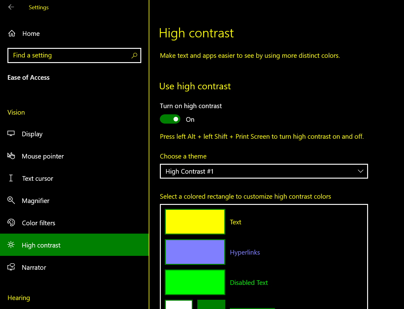
It's customized but not a hack of any kind. Here's the out of the box "High Contrast #1" theme:
100.0% of the time. |
|
Workaround I found online: Disable the high contrast mode/them on specific applications To do this, go to the properties of the .exe of your program, Then add --disable-features=ForcedColors at the end of the target field. Example: C:\Users\PC\AppData\Local\GitHubDesktop\GitHubDesktop.exe --disable-features=ForcedColors |
|
Since this issues basically come down to "test and support" high-contrast themes, I thought I can add this high-contrast issue: When I apply the theme "Abenddämmerung" (sorry for the German) translates to "Dusk" or "sunset".
I get zero contrast between the the selected and the unselected choice in some of the dialogs: There is no perceptible difference when I click the two choices. I do not use high contrast themes regularly, only when testing my own app for compatibility. But then I run it for a couple of hours at a time. (Highly recommended!) |


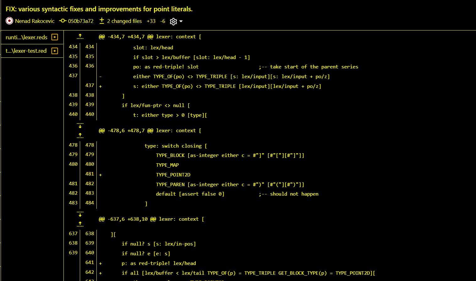
The problem
Impossible to read the diff without colors.
Release version
Version 3.2.7 (x64)
Operating system
W10
Steps to reproduce the behavior
Use this theme
Log files
No response
Screenshots
Additional context
No response
The text was updated successfully, but these errors were encountered: