[Dev](User Profile) Create Onboarding Card Component #982
Assignees

Labels
Comments
|
Please contact me before starting this as this is dependent on: #978.
|
This was referenced Apr 2, 2023
Sign up for free
to join this conversation on GitHub.
Already have an account?
Sign in to comment
User Story:
As Nancy Newbie
I want uniformly designed "cards" that outline the steps I need to complete to finish the onboarding process
So that I can better understand what is expected of me
Acceptance Criteria:
Given the onboarding step is NOT completed
when I am viewing the onboarding modal main page
then the onboarding card will be white, have drop shadow, and an empty circle on the right
Given the onboarding step is completed
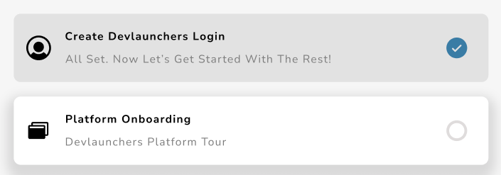
when I return to the onboarding modal main page
then the onboarding card will be greyed out, and the circle will be filled with a checkmark.
Note:
Component in either variation should have a configurable photo on the left, to the right of the photo should be a heading text and a subheading text.
The text was updated successfully, but these errors were encountered: