/
cirpa-r-workshop-2018 slides.Rmd
1346 lines (1005 loc) · 32.1 KB
/
cirpa-r-workshop-2018 slides.Rmd
1
2
3
4
5
6
7
8
9
10
11
12
13
14
15
16
17
18
19
20
21
22
23
24
25
26
27
28
29
30
31
32
33
34
35
36
37
38
39
40
41
42
43
44
45
46
47
48
49
50
51
52
53
54
55
56
57
58
59
60
61
62
63
64
65
66
67
68
69
70
71
72
73
74
75
76
77
78
79
80
81
82
83
84
85
86
87
88
89
90
91
92
93
94
95
96
97
98
99
100
101
102
103
104
105
106
107
108
109
110
111
112
113
114
115
116
117
118
119
120
121
122
123
124
125
126
127
128
129
130
131
132
133
134
135
136
137
138
139
140
141
142
143
144
145
146
147
148
149
150
151
152
153
154
155
156
157
158
159
160
161
162
163
164
165
166
167
168
169
170
171
172
173
174
175
176
177
178
179
180
181
182
183
184
185
186
187
188
189
190
191
192
193
194
195
196
197
198
199
200
201
202
203
204
205
206
207
208
209
210
211
212
213
214
215
216
217
218
219
220
221
222
223
224
225
226
227
228
229
230
231
232
233
234
235
236
237
238
239
240
241
242
243
244
245
246
247
248
249
250
251
252
253
254
255
256
257
258
259
260
261
262
263
264
265
266
267
268
269
270
271
272
273
274
275
276
277
278
279
280
281
282
283
284
285
286
287
288
289
290
291
292
293
294
295
296
297
298
299
300
301
302
303
304
305
306
307
308
309
310
311
312
313
314
315
316
317
318
319
320
321
322
323
324
325
326
327
328
329
330
331
332
333
334
335
336
337
338
339
340
341
342
343
344
345
346
347
348
349
350
351
352
353
354
355
356
357
358
359
360
361
362
363
364
365
366
367
368
369
370
371
372
373
374
375
376
377
378
379
380
381
382
383
384
385
386
387
388
389
390
391
392
393
394
395
396
397
398
399
400
401
402
403
404
405
406
407
408
409
410
411
412
413
414
415
416
417
418
419
420
421
422
423
424
425
426
427
428
429
430
431
432
433
434
435
436
437
438
439
440
441
442
443
444
445
446
447
448
449
450
451
452
453
454
455
456
457
458
459
460
461
462
463
464
465
466
467
468
469
470
471
472
473
474
475
476
477
478
479
480
481
482
483
484
485
486
487
488
489
490
491
492
493
494
495
496
497
498
499
500
501
502
503
504
505
506
507
508
509
510
511
512
513
514
515
516
517
518
519
520
521
522
523
524
525
526
527
528
529
530
531
532
533
534
535
536
537
538
539
540
541
542
543
544
545
546
547
548
549
550
551
552
553
554
555
556
557
558
559
560
561
562
563
564
565
566
567
568
569
570
571
572
573
574
575
576
577
578
579
580
581
582
583
584
585
586
587
588
589
590
591
592
593
594
595
596
597
598
599
600
601
602
603
604
605
606
607
608
609
610
611
612
613
614
615
616
617
618
619
620
621
622
623
624
625
626
627
628
629
630
631
632
633
634
635
636
637
638
639
640
641
642
643
644
645
646
647
648
649
650
651
652
653
654
655
656
657
658
659
660
661
662
663
664
665
666
667
668
669
670
671
672
673
674
675
676
677
678
679
680
681
682
683
684
685
686
687
688
689
690
691
692
693
694
695
696
697
698
699
700
701
702
703
704
705
706
707
708
709
710
711
712
713
714
715
716
717
718
719
720
721
722
723
724
725
726
727
728
729
730
731
732
733
734
735
736
737
738
739
740
741
742
743
744
745
746
747
748
749
750
751
752
753
754
755
756
757
758
759
760
761
762
763
764
765
766
767
768
769
770
771
772
773
774
775
776
777
778
779
780
781
782
783
784
785
786
787
788
789
790
791
792
793
794
795
796
797
798
799
800
801
802
803
804
805
806
807
808
809
810
811
812
813
814
815
816
817
818
819
820
821
822
823
824
825
826
827
828
829
830
831
832
833
834
835
836
837
838
839
840
841
842
843
844
845
846
847
848
849
850
851
852
853
854
855
856
857
858
859
860
861
862
863
864
865
866
867
868
869
870
871
872
873
874
875
876
877
878
879
880
881
882
883
884
885
886
887
888
889
890
891
892
893
894
895
896
897
898
899
900
901
902
903
904
905
906
907
908
909
910
911
912
913
914
915
916
917
918
919
920
921
922
923
924
925
926
927
928
929
930
931
932
933
934
935
936
937
938
939
940
941
942
943
944
945
946
947
948
949
950
951
952
953
954
955
956
957
958
959
960
961
962
963
964
965
966
967
968
969
970
971
972
973
974
975
976
977
978
979
980
981
982
983
984
985
986
987
988
989
990
991
992
993
994
995
996
997
998
999
1000
---
title: "Data Carpentry: Using R to Analyze and Visualize Data"
author: "Evan Cortens, PhD and Stephen Childs"
date: "October 21, 2018"
output:
revealjs::revealjs_presentation:
incremental: true
theme: serif
transition: slide
reveal_options:
width: 1000
height: 900
---
```{r setup, include=FALSE}
knitr::opts_chunk$set(echo = TRUE)
```
# Introductions
## Introductions
* Who are you/where do you work?
* What software/tools do you spend most time with? (Excel? SPSS? Tableau? etc)
* Do you have any programming experience? (Python? C? Javascript?)
* What do you hope to get out of this workshop? How do you see yourself using R in an IR environment?s
# Why use R?
## Why use R?
* Free
* Open-source
* A "statistical" programming language
* Generally accepted by academic statisticians
* Thoroughly grounded in statistical theory
* A great community
* Help and support
* Innovation and development
* R is a stable, well-supported language
* Major corporate backing, e.g., Microsoft
## Growing fast!
```{r,eval=FALSE,echo=FALSE,message=FALSE}
# devtools::install_github('metacran/cranlogs')
# cran_R_downloads <- cranlogs::cran_downloads('R', from = '2012-10-01', to = '2018-09-30')
# readr::write_rds(cran_R_downloads, 'cran_R_downloads.rds', compress = 'gz')
cran_R_downloads <- read_rds('cran_R_downloads.rds')
cran_R_downloads %>%
group_by(lubridate::year(date), lubridate::month(date)) %>%
summarise(date = first(date), count = sum(count)) %>%
ggplot(aes(date, count)) +
geom_line() +
geom_smooth()
# R downloads not a great indicator, dependent on when releases are, etc
```
```{r,echo=FALSE,message=FALSE}
# crandl <- cran_downloads(from = '2012-10-01', to = '2018-09-30')
# write_rds(crandl, 'crandl.rds', compress = 'gz')
library(tidyverse)
library(lubridate)
crandl_monthly <- read_rds('crandl.rds') %>%
group_by(year(date), month(date)) %>%
summarise(date = first(date), count = sum(count))
ggplot(crandl_monthly, aes(date, count/1e6)) +
geom_line() +
geom_smooth(method = 'loess') +
theme(axis.title.x = element_blank()) +
labs(
title = 'CRAN Package Downloads (Monthly)',
y = 'Package Downloads (Millions)')
```
## Growing fast!

https://stackoverflow.blog/2017/10/10/impressive-growth-r/
## Some history
* Based on the S programming language
* Dates from the late 1970s, substantially revised in the late 1980s
* (there is still a commercial version, S-PLUS)
* R was developed at the University of Auckland
* Ross Ihaka and Robert Gentleman
* First developed in 1993
* Stable public release in 2000
* RStudio
* IDE, generally recognized as high quality, even outside R
* Development began in 2008, first public release in February 2011
* Version 1.0 in Fall 2016
* There have been other IDEs for R in the past, but since RStudio came on the scene, most are no longer seriously maintained
## Some history
Why is this relevant?
* You'll likely notice some quirks in R that differ from other programming languages you make have worked in--the unique history often explains why.
* Explains R's position as a "statistical programming language":
* Think stats/data first, programming second.
# Today's approach/Learning outcomes
## Today's approach/Learning outcomes
In learning R today, we'll take an approach, used in *R for Data Science* (Wickham & Grolemund, 2016), diagrammed like this:
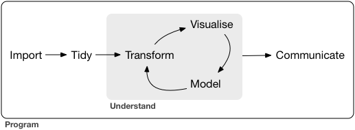
One of the strengths of R: every step of this workflow can be done using it!
## Import
* Loading the data!
* For IR-type tasks, this will generally be from data files or directly from databases.
* Other possibilities include web APIs, or even web scraping
## Tidy
* "Tidy data" (Wickham, 2014)
* Each column is a variable, each row is an observation.
* Doing this kind of work up front, right after loading, lets you focus on the modelling/analysis/visualization problem at hand, rather than having to rework your data at each stage of your analysis.
## Transform/Visualize/Model
>* Repeat these three steps as necessary:
## Transform
* Together with tidying, sometimes called _data wrangling_
* Filtering (selecting specific observations)
* Mutating (creating new variables)
* Summarizing (means, counts, etc)
## Visualise
>* For both exploratory purposes and production/communication
## Model
>* Complementary to visualisation
>* For the "precise exploration" of "specific questions"
## Communicate
* The final output, whether it's just for yourself, your colleagues, or a wider audience
* Increasingly, there's a trend toward "reproducible research" which integrates even the communciation step (final paper, report, etc) into the code/analysis.
# Housekeeping
## Installing R and RStudio
* https://cran.r-project.org/
* https://www.rstudio.com/products/rstudio/download3/#download
* `install.packages('tidyverse')`
## Basic R
* An interpreted language (like Python)
* Code can be run as:
* scripts (programatically/non-interactively)
* from the prompt (interactively)
* R uses an REPL (Read-Evaluate-Print Loop) just like Python
* Using R as a calculator (demonstration)
# Outline
## Outline
1. Visualisation
2. Transformation
3. Importing and 'wrangling'
4. Hands-on portion using what we've learned
# Visualisation
## Let's load our package
```{r}
library(tidyverse)
```
A package only needs to be *installed* once (per major version, e.g. 3.3.x to 3.4.x), but must be *loaded* every time.
## The 'mpg' data set
Data on the fuel efficiency of 38 models of cars between 1999 and 2008 from the US EPA:
```{r}
mpg
```
## The Grammar of Graphics
* Layers
* Inheritance
* Mapping (`aes`)
## Our First Plot
* A car's highway mileage (mpg) vs its engine size (displacement in litres).
* What might the relationship be?
## Our First Plot
```{r}
ggplot(data = mpg) +
geom_point(mapping = aes(x = displ, y = hwy))
```
* As engine size increases, fuel efficiency decreases, roughly.
## Exercises
* The first scatterplot was highway mileage vs displacement: how can we make it city mileage vs displacement?
* Make a scatterplot of `hwy` vs `cyl`.
* What about a scatterplot of `class` vs `drv`?
## Hwy vs cyl
```{r}
ggplot(data = mpg) +
geom_point(mapping = aes(x = hwy, y = cyl))
```
## Class vs drv
```{r}
ggplot(data = mpg) +
geom_point(mapping = aes(x = class, y = drv))
```
What's going on here? Is this useful? How might we make it more useful?
## Additional aesthetics
What about those outliers? Use the `color` aesthetic.
```{r}
ggplot(data = mpg) +
geom_point(mapping = aes(x = displ, y = hwy, color = class))
```
## 'Unmapped' aesthetics
What's happening here?
```{r}
ggplot(data = mpg) +
geom_point(mapping = aes(x = displ, y = hwy), color = "blue")
```
## What's gone wrong?
What's happened here? What colour are the points? Why?
```{r}
ggplot(data = mpg) +
geom_point(mapping = aes(x = displ, y = hwy, color = "blue"))
```
## Exercises
>* `mpg` variable types: which are categorical, which are continuous?
>* `?mpg`
>* Map a continuous variable to colour, size, and shape: how are these aesthetics different for categorical vs continuous?
>* What happens if you map an aesthetic to something other than a variable name, like `aes(color = displ < 5)`?
## Facets: One Variable
```{r}
ggplot(data = mpg) +
geom_point(mapping = aes(x = displ, y = hwy)) +
facet_wrap(~ class, nrow = 2)
```
**TODO: This might be a good point to talk about formulas - since we use the
formula notation with facets.
## Facets: Two Variables
```{r}
ggplot(data = mpg) +
geom_point(mapping = aes(x = displ, y = hwy)) +
facet_grid(drv ~ cyl)
```
## Other "geoms" (geometries)
```{r}
ggplot(data = mpg) +
geom_point(mapping = aes(x = displ, y = hwy))
```
## Smooth
```{r}
ggplot(data = mpg) +
geom_smooth(mapping = aes(x = displ, y = hwy))
```
## Smooth aesthetics
```{r}
ggplot(data = mpg) +
geom_smooth(mapping = aes(x = displ, y = hwy, linetype = drv))
```
## Which aesthetics do geoms have?
`?geom_smooth`
## Clearer?
```{r}
ggplot(data = mpg) +
geom_point(mapping = aes(x = displ, y = hwy, color = drv)) +
geom_smooth(mapping = aes(x = displ, y = hwy, color = drv, linetype = drv))
```
## Reducing Duplication
```{r}
ggplot(data = mpg, mapping = aes(x = displ, y = hwy, color = drv)) +
geom_point() +
geom_smooth(mapping = aes(linetype = drv))
```
## Exercise: Recreate:
```{r,echo=FALSE}
ggplot(mpg, aes(x=displ, y=hwy)) +
geom_point() +
geom_smooth(se=FALSE)
```
## Exercise: Recreate:
```{r,echo=FALSE}
ggplot(mpg, aes(x=displ, y=hwy, color=drv)) +
geom_point() +
geom_smooth(aes(color=NULL), se=FALSE)
```
## Exercise: Recreate:
```{r,echo=FALSE}
ggplot(mpg, aes(x=displ, y=hwy, color=drv)) +
geom_point() +
geom_smooth(se=FALSE)
```
## One last visualization
A common scenario:
```{r}
ggplot(data = diamonds) +
geom_bar(mapping = aes(x = cut, fill = clarity), position = "dodge")
```
# Coding basics
## R as a calculator
```{r}
1 / 200 * 30
```
```{r}
(59 + 73 + 2) / 3
```
```{r}
sin(pi / 2)
```
## Assignments
```{r}
x <- 3 * 4
```
## Calling functions
Calling R functions, in general:
```
function_name(arg1 = val1, arg2 = val2, ...)
```
An example function, `seq`:
```{r}
seq(1, 10)
```
# Data wrangling with `dplyr` and `tidyr` (`tidyverse`)
## Create RStudio project
1. File | New Project...
2. New Directory
3. Empty Project
4. Under "Directory name:" put in "CIRPA 2018", under "Create project as a subdirectory of:", pick somewhere you'll remember.
5. Click "Create Project", and RStudio will refresh, with your new project loaded.
## Download the data
We'll look at CANSIM Tables 0477-0058 and 0477-0059 which cover university revenues and expenditures, respectively.
<!---
1. Search Google for: cansim 477-0058
2. Follow the first result: "CANSIM - 477-0058 - Financial information of universities and degree ..."
3. Click the "Download" tab
4. At the bottom of the page, "Download entire table"
5. Click "Download file from CANSIM (CSV Version, 714.2 kb)" and save where your RStudio project is
6. Repeat steps 1 to 5 for cansim 477-0059.
--->
To save time, I've already downloaded the data from CANSIM. You can get it here:
http://evancortens.com/cirpa/
## Load the data
We'll use `read_csv()` from `readr`, which I prefer to the base R function, as it has some more sensible defaults, and it's faster.
```{r}
# http://www20.statcan.gc.ca/tables-tableaux/cansim/csv/04770058-eng.zip
# make sure the zip file is in the same directory as your RStudio project
revenue_raw <- read_csv('04770058-eng.zip')
```
The `read_csv()` function tells us that it guessed the types of the various columns. In this situation, the default guesses are fine, but of course we can force it to treat columns certain ways if we wish.
## What does the data look like?
```{r}
revenue_raw
```
We have 8 columns and 122,240 rows of data. `read_csv()` brings the data in as a `tibble`, which is just an R "data frame", but with some handy defaults, some of which we're seeing here. For instance, it gives us the size of the data frame in rows and columns, the types of the columns (e.g., "<chr>" for character) and only prints the first 10 rows, instead of overwhelming us with all of the data.
## What does the data look like?
```{r,eval=FALSE}
View(revenue_raw) # in RStudio
```
Or click the icon in the `Environment` tab.
## What does the data look like?
```{r,eval=FALSE}
head(revenue_raw, 1) # show just the first row
```
>* *Ref_Date*: fiscal year
>* *GEO*: province or whole country
>* *SCHOOL*: Direct participation in CAUBO survey, or via Statistics Canada, or combined (we'll just look at this)
>* *REVENUE*: Type of income (e.g., tuition, provincial government, SSHRC, etc)
>* *FUND*: Classification of income "in accordance with activities or objectives as specified by donors, ... regulations, restrictions, or limitations" (We're just going to look at "Total funds (x 1,000)", but the distinctions are important for full analysis)
>* *Vector*: a CANSIM unique identifier
>* *Coordinate*: ditto
>* *Value*: the actual dollar value (x 1,000, per the FUND heading)
## What makes data "tidy"?
>1. Each variable must have its own column.
>2. Each observation must have its own row.
>3. Each value must have its own cell.
(See Wickham, 2014 and *R for Data Science*, chapter 12)
Is the CANSIM data tidy?
* Nope! So let's tidy it.
## dplyr basics
* Pick observations by their values (`filter()`).
* Reorder the rows (`arrange()`).
* Pick variables by their names (`select()`).
* Create new variables with functions of existing variables (`mutate()`).
* Collapse many values down to a single summary (`summarise()`).
* All can be used in conjunction with `group_by()`
## dplyr cheat sheet

https://www.rstudio.com/resources/cheatsheets/
(or Help | Cheatsheets in RStudio!)
<!---
## Cleanup To Do
* As it comes out of CANSIM, this data set contains a number of categories and columns we don't need today.
* The data is also in what's often called a "long" format, where the names of the variables are stored in one column (`REVENUE`) and the actual values are stored in another (`Value`).
* For certain types of analysis, we'll want to move into a "wide" format, where each column represents a variable.
--->
## `filter()` the rows we want
```{r}
filter(revenue_raw,
SCHOOL == 'Total universities and colleges',
FUND == 'Total funds (x 1,000)')
```
`filter()` help tells us that everything after the first argument (i.e., the "...") are: "Logical predicates defined in terms of the variables in .data. Multiple conditions are combined with &."
## Comparison operators
```{r, eval=FALSE}
> # greater than
>= # greater than or equal to
< # less than
<= # less than or equal to
!= # not equal
== # equal
%in% # not quite a comparison operator, but handy
# x %in% y is true if the values of vector x are present in vector y
```
## Logical operators
Other operators we can use with `filter()`:
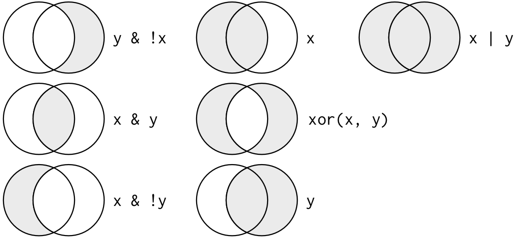
Complete set of boolean operations. `x` is the left-hand circle, `y` is the right-hand circle, and the shaded regions show which parts each operator selects.
## `filter()`
In other words, the previous command is equivalent to this:
```{r}
filter(revenue_raw,
SCHOOL == 'Total universities and colleges' &
FUND == 'Total funds (x 1,000)')
```
I prefer this notation, as it's more explicit.
## `filter()`
But, one more thing: we need to assign the return value of the `filter()` function back to a variable:
```{r}
revenue <- filter(revenue_raw,
SCHOOL == 'Total universities and colleges' &
FUND == 'Total funds (x 1,000)')
```
Shortcut for assignment operator: Alt-Hyphen in RStudio
## Combining operations
A new variable for each step gets cumbersome, so `dplyr` provides an operator, the pipe (`%>%`) that combines operations:
```{r}
revenue_long <- revenue_raw %>%
# only rows matching this
filter(SCHOOL == 'Total universities and colleges' &
FUND == 'Total funds (x 1,000)') %>%
# remove these columns
select(-SCHOOL, -FUND, -Vector, -Coordinate) %>%
# fix up the date column
mutate(Ref_Date = as.integer(stringr::str_sub(Ref_Date, 1, 4)))
```
`x %>% f(y)` turns into `f(x, y)`, and `x %>% f(y) %>% g(z)` turns into `g(f(x, y), z)` etc.
Shortcut for pipe operator: Ctrl-Shift-M in RStudio
```{r}
head(revenue_long, 1) # looks good so far!
```
## Select helper functions
* There are a number of helper functions you can use within select():
* `starts_with("abc")`: matches names that begin with "abc".
* `ends_with("xyz")`: matches names that end with "xyz".
* `contains("ijk")`: matches names that contain "ijk".
* `matches("(.)\\1")`: selects variables that match a regular expression.
* `num_range("x", 1:3)`: matches x1, x2 and x3.
* `one_of(vector)`: columns whose names are in said vector.
## Tidy data with `tidyr`
The two main `tidyr` functions:
* `gather(data, key, value)`: Moves column names into a `key` column, with the values going into a single `value` column.
* `spread(data, key, value)`: Moves unique values of `key` column into column names, with values from the `value` column.
## `tidyr` Cheatsheet

https://www.rstudio.com/resources/cheatsheets/ (Data Import Cheatsheet)
## `spread()` CANSIM
```{r}
revenue <- revenue_long %>%
spread(REVENUE, Value)
revenue
```
## Visualizing
```{r}
revenue %>%
filter(GEO == 'Canada') %>%
# pass the result to ggplot() as the first argument
ggplot(aes(Ref_Date, `Total revenues`)) +
# now it switches to + to combine, which is ggplot's way
geom_line()
```
Not the prettiest, but it works!
## Visualizing: Labels
```{r}
revenue %>%
filter(GEO == 'Canada') %>%
ggplot(aes(Ref_Date, `Total revenues`)) +
geom_line() +
labs(title = 'Total University and Degree-Granting College Revenue',
x = 'Fiscal Year',
y = 'Revenue ($ thousands)') +
scale_y_continuous(labels = scales::comma)
```
## Inline Calculation
```{r}
revenue %>%
filter(GEO %in% c('Canada', 'Alberta', 'Ontario')) %>%
ggplot(aes(Ref_Date, `Tuition and other fees` / `Total revenues`, color = GEO)) +
geom_line() +
labs(title = 'Tuition and fees as a share of total revenue') +
scale_y_continuous(labels = scales::percent)
```
## Exercises
>1. Visualize another variable
>2. Set some appropriate labels and scales
>3. Graph a time subset (e.g., between 2005 and 2010)
## Other `dplyr` "verbs"
Which province took in the most tuition revenue in 2010?
```{r}
revenue %>%
filter(GEO != 'Canada', Ref_Date == 2010) %>%
select(GEO, `Tuition and other fees`) %>%
arrange(desc(`Tuition and other fees`))
```
## Create a new variable
```{r}
revenue %>%
select(Ref_Date, GEO, `Tuition and other fees`, `Total revenues`) %>%
mutate(tuition_share = `Tuition and other fees` / `Total revenues`)
```
Keeps the same number of rows
## Useful "mutations"
* Arithmetic: `+, -, *, /, ^`
* Modular arithmetic: `%/%` (integer division), `%%` (remainder)
* Logs: `log(), log2(), log10()`
* Offsets: `lead()`, `lag()`
* Cumulative and rolling aggregates: `cumsum()`, `cumprod()`, `cummin()`, `cummax()`, `cummean()`
* Logical comparisons: `<, <=, >, >=, !=, ==`
* Ranking: `min_rank()`, `row_number()`, `dense_rank()`, `percent_rank()`, `cume_dist()`, `ntile()`
* `ifelse()`
* `recode()`
* `case_when()`
## Summarize (aggregate)
```{r}
revenue %>%
group_by(GEO) %>%
summarise(avg_endowment_revenue = mean(Endowment)) %>%
arrange(-avg_endowment_revenue)
```
## Useful summarising functions:
* `mean(x)`, `median(x)`
* `sd(x)`, `IQR(x)` (interquartile range), `mad(x)` (median absolute deviation)
* `min(x)`, `max(x)`, `quantile(x, 0.25)`
* `first(x)`, `nth(x, 2)`, `last(x)`
* `n(x)`, `n_distinct(x)`
* Counts and proportions of logical values: `sum(x > 10)`, `mean(y == 0)`
* `TRUE` is converted to `1` and `FALSE` to `0`
## Exercise:
Compute the total tuition revenue of the three western-most provinces in 2007.
```{r}
revenue %>%
filter(GEO %in% c('British Columbia', 'Alberta', 'Saskatchewan'), Ref_Date == 2007) %>%
summarise(sum(`Tuition and other fees`))
```
## Group by new variable
These three provinces compared to all other provinces and national average.
```{r}
revenue %>%
filter(Ref_Date == 2007) %>%
mutate(category = case_when(
GEO %in% c('British Columbia', 'Alberta', 'Saskatchewan') ~ '3 Western Provinces',
GEO == 'Canada' ~ GEO,
TRUE ~ 'All Other Provinces'
)) %>%
group_by(category) %>%
summarise(sum(`Tuition and other fees`))
```
## Change relative first year
```{r}
tuition_relative_change <- revenue %>%
arrange(Ref_Date, GEO) %>%
group_by(GEO) %>%
mutate(rel_change = (`Tuition and other fees` - first(`Tuition and other fees`)) / first(`Tuition and other fees`)) %>%
select(Ref_Date, GEO, `Tuition and other fees`, rel_change)
ggplot(tuition_relative_change, aes(Ref_Date, rel_change, color = GEO)) +
geom_line()
```
## Logical sums
Count years with positive endowment income by province
```{r}
revenue %>%
group_by(GEO) %>%
summarise(num_pos_endow = sum(Endowment > 0))
```
## Exercises
* Compare the Maritimes to the rest of Canada on one or more variable
* Between 2005 and 2007, which provinces received more than $100 M in Total grants?
* Which provinces, other than Nova Scotia and Ontario, had more than $20 M in Endowmennt income in 2003?
* Which province was in "third place" in total revenue in 2012?
## `purrr` (quickly)
(There's a lot going on here, just in the slides for your quick reference.)
```{r}
revenue %>%
filter(GEO != 'Canada') %>%
group_by(Ref_Date) %>%
summarise(revenue_quantiles = list(quantile(`Total revenues`, c(0.25, 0.5, 0.75)))) %>%
mutate(
low_25 = map_dbl(revenue_quantiles, "25%"),
mid = map_dbl(revenue_quantiles, '50%'),
high_75 = map_dbl(revenue_quantiles, '75%')
)
```
# Vectors (and other types)
## Missing data
```{r}
NA > 5
```
```{r}
10 == NA
```
```{r}
NA + 10
```
What about this?
```
NA / 2
```
## Filtering and NAs
```{r}
x <- NA
is.na(x)
```
`filter()` only includes rows where the condition is `TRUE`; it excludes both `FALSE` and `NA` values. If you want to preserve missing values, ask for them explicitly:
```{r}
test_data <- tibble(x = c(1, NA, 3))
filter(test_data, x > 1)
```
```{r}
filter(test_data, is.na(x) | x > 1)
```
## Dealing with vectors...
```{r}
c(1, 2, 3)
```
```{r}
1:3
```
## Dealing with vectors...
```{r}
1:3 + 1:9
```
What about...
```
1:3 + 1:10
```
## Dealing with vectors...
```{r}
1:3 + 1:10
```
What happened?
## Missing values
```{r}
mean(c(1,2,3))
```
What do we expect here?
```
mean(c(1,NA,3))
```
## Missing values
```{r}
mean(c(1,NA,3))
```
```{r}
mean(c(1,NA,3), na.rm = TRUE)
```
## Vectors
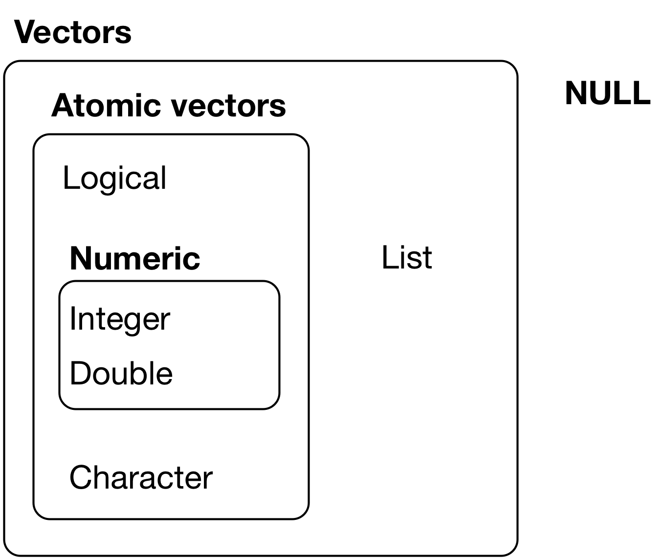
## Vectors
* Coercion (explicit and implicit)
* Type hierarchy
* Atomic vectors (homogenous) vs lists (can nest/heterogeneous)
* Names
* Subsetting
## Vectors: Naming
```{r}
c(x = 1, y = 2, z = 4)
set_names(1:3, c("a", "b", "c"))
```
## Vectors: Subsetting
```{r}
# positive values
x <- c("one", "two", "three", "four", "five")
x[c(3, 2, 5)]
# negative values
x[c(-1, -3, -5)]
#> [1] "two" "four"
# subset a named vector w/character vector
x <- c(abc = 1, def = 2, xyz = 5)
x[c("xyz", "def")]
```
## Vectors: Logical subsetting
```{r}
x <- c(10, 3, NA, 5, 8, 1, NA)
# All non-missing values of x
x[!is.na(x)]
#> [1] 10 3 5 8 1
# All even (or missing!) values of x
x[x %% 2 == 0]
#> [1] 10 NA 8 NA
```
## Lists
```{r}
x <- list(1, 2, 3)
x
str(x) # str...ucture
```
## Lists: Can contain different types of objects:
```{r}
y <- list("a", 1L, 1.5, TRUE)
str(y)
```
## Lists: Or other lists:
```{r}
z <- list(list(1, 2), list(3, 4))
str(z)
```
# Modeling
When we have the data the way we want it, we want to ask questions about it.
To determine the relationship between parts of the data.
This can range from exploratory modeling (to better understand the data) to
more formally trying to establish relationships between variables.
The process is the same for both, but the mindset is different.
## Types of Modeling
>* define a family of models - expressed as an equation - you are trying to estimate the **parameters** of the question
>* generate a fitted model that fills in the parameters
### The goal
You are trying to get the model from the family that best fits the data.
That doesn't mean it's a "good" or "true" model.
## Simulated Data
The `modelr` package has a simulated dataset called `sim1`.
```{r}
library(modelr)
sim1$x
```
## Plotting `sim1`
```{r}
ggplot(sim1, aes(x, y)) +
geom_point()
```
## Plotting `sim1`
```{r, echo=FALSE}
ggplot(sim1, aes(x, y)) +
geom_point()
```
* we can see that there is a pattern from the scatter plot
* the pattern looks like a straight line - `geom_abline` plots straight line on the graph
## Using `geom_abline`
```{r}
ggplot(sim1, aes(x, y)) +
geom_point() +
geom_abline(aes(intercept = 12, slope = 0.5))
```
## Using `geom_abline`
```{r, echo=FALSE}
ggplot(sim1, aes(x, y)) +
geom_point() +
geom_abline(aes(intercept = 12, slope = 0.5))
```
That's just one model - how can we tell if it's good or not?
## Evaluating Predictive Models
We look at the difference between the predictions and the
actual data.
```{r, echo = FALSE}
dist1 <- sim1 %>%
mutate(
dodge = rep(c(-1, 0, 1) / 20, 10),
x1 = x + dodge,
pred = 12 + x1 * 0.5
)
ggplot(dist1, aes(x1, y)) +
geom_abline(intercept = 12, slope = 0.5, colour = "grey40") +
geom_point(colour = "grey40") +
geom_linerange(aes(ymin = y, ymax = pred), colour = "#3366FF")
```
## Defining a model as an R function
We can find this for any model by creating an R function.
We take the intercept and add the slope multiplied by `x`.
```{r}
model1 <- function(data, a) {
a[1] + data$x * a[2]
}
model1(sim1, c(12, 0.5))
```
## Difference between predicted and actual
Once we have the model's prediction, we can look at the difference between those and what the actual data is.
```{r}
measure_distance <- function(data, mod) {
diff <- data$y - model1(data, mod)