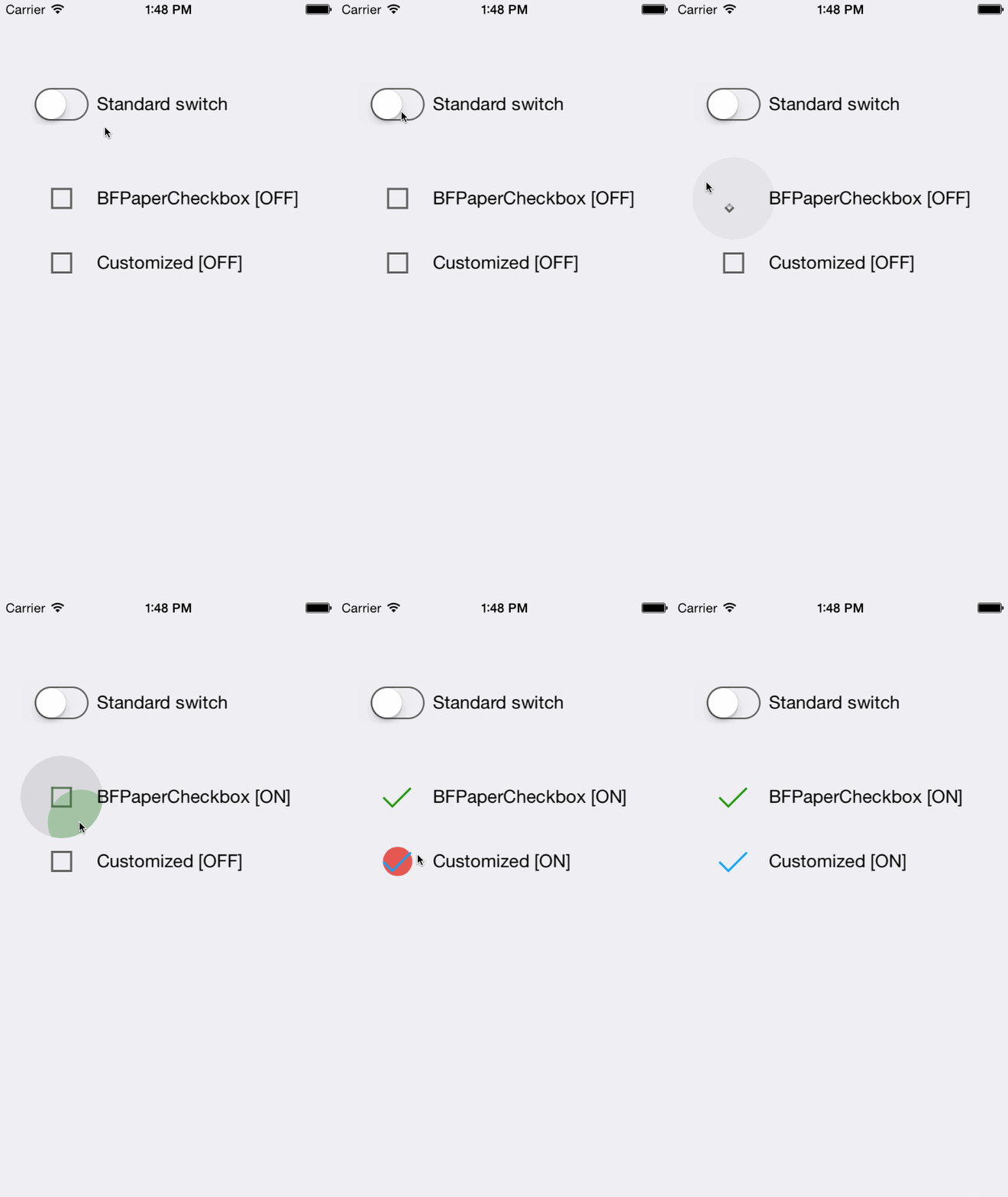
iOS Checkboxes inspired by Google's Paper Material Design.
BFPaperCheckbox is a subclass of UIButton that behaves much like the new paper checkboxes from Google's Material Design Labs. All animation are asynchronous and are performed on sublayers. BFPaperCheckboxes work right away with pleasing default behaviors, however they can be easily customized! The checkmark color and tap-circle color, both positive and negative (for checked and unchecked) are all readily customizable via public properties. You can also set whether or not the tap-circle should appear from the location of the tap, or directly from the center of the control.
By default, BFPaperCheckboxes use "Smart Color" which will match the tap-circle's positive color to the color of the checkmark (checkmarkColor).
You can set your own colors via: .tapCirclePositiveColor and .tapCircleNegativeColor. Note that setting these disables Smart Color.
UIColor *checkmarkColor
A UIColor to use for the checkmark color. Note that self.tintColor will be used for the square box color.
UIColor *tapCirclePositiveColor
The UIColor to use for the circle which appears where you tap to check the box. NOTE: Setting this defeats the "Smart Color" ability of the tap circle. Alpha values less than 1 are recommended.
UIColor *chectapCircleNegativeColorkmarkColor
The UIColor to use for the circle which appears where you tap to uncheck the box. NOTE: Setting this defeats the "Smart Color" ability of the tap circle. Alpha values less than 1 are recommended.
BOOL rippleFromTapLocation
A flag to set to YES to have the tap-circle ripple from point of touch. If this is set to NO, the tap-circle will always ripple from the center of the control. Default is YES.
- (void)paperCheckboxChangedState:(BFPaperCheckbox *)checkbox
An optional protocol method for detecting when the checkbox state changed. You can check its current state here with 'checkbox.isChecked'.
CGFloat const bfPaperCheckboxDefaultRadius
A nice recommended value for size. (eg. [[BFPaperCheckbox alloc] initWithFrame:CGRectMake(x, y, bfPaperCheckboxDefaultRadius * 2, bfPaperCheckboxDefaultRadius * 2)];)
(void)switchStatesAnimated:(BOOL)animated
Use this function to manually/programmatically switch the state of this checkbox.
@param animated A BOOL flag to choose whether or not to animate the change.
(void)checkAnimated:(BOOL)animated
Use this function to manually check the checkbox. Does nothing if already checked.
@param animated A BOOL flag to choose whether or not to animate the change.
void)uncheckAnimated:(BOOL)animated
Use this function to manually uncheck the checkbox. Does nothing if already unchecked.
@param animated A BOOL flag to choose whether or not to animate the change.
Add the BFPaperCheckbox header and implementation file to your project. (.h & .m)
BFPaperCheckbox *paperCheckbox = [[BFPaperCheckbox alloc] initWithFrame:CGRectMake(x, y, bfPaperCheckboxDefaultRadius * 2, bfPaperCheckboxDefaultRadius * 2)];(Taken directly from example project.)
BFPaperCheckbox *paperCheckbox = [[BFPaperCheckbox alloc] initWithFrame:CGRectMake(20, 150, bfPaperCheckboxDefaultRadius * 2, bfPaperCheckboxDefaultRadius * 2)];
self.paperCheckbox.tag = 1001;
self.paperCheckbox.delegate = self;
[self.view addSubview:self.paperCheckbox];(Taken directly from example project.)
BFPaperCheckbox *paperCheckbox2 = [[BFPaperCheckbox alloc] initWithFrame:CGRectMake(0, 250, 25 * 2, 25 * 2)];
self.paperCheckbox2.center = CGPointMake(self.paperCheckbox.center.x, self.paperCheckbox2.frame.origin.y);
self.paperCheckbox2.tag = 1002;
self.paperCheckbox2.delegate = self;
self.paperCheckbox2.rippleFromTapLocation = NO;
self.paperCheckbox2.tapCirclePositiveColor = [UIColor paperColorAmber]; // We could use [UIColor colorWithAlphaComponent] here to make a better tap-circle.
self.paperCheckbox2.tapCircleNegativeColor = [UIColor paperColorRed];   // We could use [UIColor colorWithAlphaComponent] here to make a better tap-circle.
self.paperCheckbox2.checkmarkColor = [UIColor paperColorLightBlue];
[self.view addSubview:self.paperCheckbox2];(Taken directly from example project.)
/*
 * Below are the two ways of programmatically setting the state of a checkbox.
 */

// (1) Swap paperCheckbox's state with the 'switchStates...' method:
[self.paperCheckbox switchStatesAnimated:animate];

// (2) Swap paperCheckbox2's state with the 'check...'/'uncheck...' methods:
if (self.paperCheckbox2.isChecked) {
  [self.paperCheckbox2 uncheckAnimated:animate];
}
else {
  [self.paperCheckbox2 checkAnimated:animate];
}CocoaPods are the best way to manage library dependencies in Objective-C projects. Learn more at http://cocoapods.org
Add this to your podfile to add BFPaperCheckbox to your project.
platform :ios, '7.0'
pod 'BFPaperCheckbox', '~> 1.1.1'BFPaperCheckbox uses the MIT License:
Please see included LICENSE file.

