You signed in with another tab or window. Reload to refresh your session.You signed out in another tab or window. Reload to refresh your session.You switched accounts on another tab or window. Reload to refresh your session.Dismiss alert
I have a file called analyze_stat.py that takes some data from a SQLite3 database.
Those data are explainable like that:
4 vectors ( with same length) : timestamps, likes, retweets, followers
Then I aggregate them per day. So I transform all the vectors in 3 Python Dictionaries (Excluding the timestamps).
Then I have 3 useful data structure. A dictionary with the likes counts, so d_likes contains as keys the days and as values the likes carried out in that day. The same for the retweets counts and the followers counts.
What I need
I use matplotlib library for visualize in a separated window the data result.
But when the days >= (20 - 30) the window is full of points and it is not understandable.
SO THE PROBLEM IS:
How to parametrize the visualization of the data?
So when there are few data, I want see stats per day, when It's too much full the screen, I want to visualize It per month. How to do that?
Alternatives I've considered
Nobody :(
Additional context
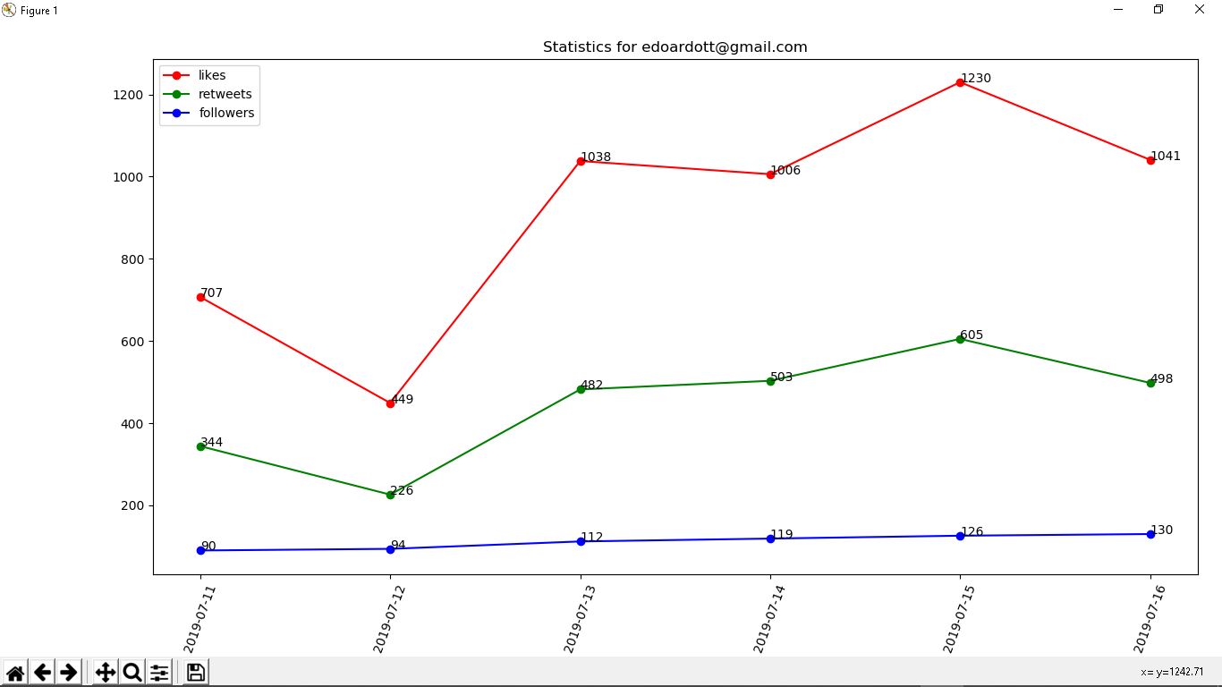
This is the data visualization per day.
Situation explained
I have a file called analyze_stat.py that takes some data from a SQLite3 database.
Those data are explainable like that:
4 vectors ( with same length) : timestamps, likes, retweets, followers
Then I aggregate them per day. So I transform all the vectors in 3 Python Dictionaries (Excluding the timestamps).
Then I have 3 useful data structure. A dictionary with the likes counts, so d_likes contains as keys the days and as values the likes carried out in that day. The same for the retweets counts and the followers counts.
What I need
I use matplotlib library for visualize in a separated window the data result.
But when the days >= (20 - 30) the window is full of points and it is not understandable.
SO THE PROBLEM IS:
How to parametrize the visualization of the data?
So when there are few data, I want see stats per day, when It's too much full the screen, I want to visualize It per month. How to do that?
Alternatives I've considered
Nobody :(
Additional context
This is the data visualization per day.
If you want I read your comment very fast, this is my website
The text was updated successfully, but these errors were encountered: