Currently, images on the web are treated as 1x resources by default, and assigned intrinsic widths and heights based solely on their pixel counts. The only way for authors to modify these intrinsic dimensions is to assign images an intrinsic density, using srcset (sometimes in combination with sizes).
This proposal allows image resources to declare their own intrinsic dimensions and density using EXIF metadata. This change gives image authoring tools and servers the ability to generate and/or serve non-1x images (e.g., 2x screenshots, or low-quality image placeholders) without asking authors to change image markup or styles, and without risking breaking layouts.
- Spec
- Implementation bugs: Blink, WebKit, Firefox
- Web platform tests
- A script for quickly setting the relevant headers
- Original proposal and conversation
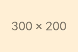
👆 Here’s a 300×200 resource that has the following EXIF headers set:
- ResolutionUnit
- inches
- XResolution
- 144/1
- YResolution
- 144/1
- ExifImageWidth
- 150
- ExifImageHeight
- 100
In supporting browsers, this image has an intrinsic density of 2x, an intrinsic width 150px, and an intrinsic height of 100px.
EXIF-based intrinsic sizing solves a number of important use cases.
EXIF-based intrinsic sizing replaces the proposed Content-DPR HTTP response header. Content-DPR was invented in conjunction with the responsive image client hints, so that servers could respond to requests which included these hints with images of varying dimensions/density, without worrying about breaking layouts.
Let’s say a page author has chosen to embed a variable-device-pixel-ratio responsive image, using srcset. Like this:
<img
	src="300x200.jpg"
	srcset="600x400.jpg 2x,
	        900x600.jpg  3x"
	alt="A DPR-responsive JPEG"
/>
No matter which resource the browser selects, the density-corrected intrinsic size of the <img> will always be the same: 300x200.
Here’s the equivalent client hints markup:
<img
	src="client-hints.jpg"
	alt="A DPR-responsive JPEG"
/>
Let’s say a request for this src goes out from a 2.6x device, with the following hint:
Sec-CH-DPR: 2.6
...but the server only has 1x, 2x, and 3x versions readily available. Reasonably, it responds with the 2x version, which includes the following EXIF headers, to ensure that the browser assigns the image a 2x intrinsic density and 300x200 intrinsic dimensions:
ResolutionUnit:  inches
XResolution:     144/1
YResolution:     144/1
ExifImageWidth:  300
ExifImageHeight: 200
Many digital images can be arbitrarily scaled across a wide range of resolutions, without impacting their usability or readability. However, some have meaningful intrinsic resolutions, and suffer when presented at sizes larger or smaller than the image creator intended.
Anyone who has tried to embed a screenshot taken on a 2x+ device in a webpage or email, only to have it appear twice as large as it “should” due to the web’s default 1x image display density, has experienced this problem. Other examples of images which can be said to have meaningful intrinsic resolutions include: pixel art, icons, and exports from drawing applications that capture and store pen input at densities other than 1x. EXIF-based intrinsic sizing would allow image authoring tools to embed a meaningful intrinsic density within image resources, and ensure proper default display on the web.
Authors commonly serve up low-quality versions of images as placeholders, so that something is visible immediately, even if the full image load has been intentionally deferred (via lazy-loading), or is simply slow.
Right now, LQIP techniques require some work on the front end to ensure that the downscaled placeholder is stretched to match the final dimensions of the full image. EXIF-based intrinsic sizing would allow servers to implement foolproof features that could respond to requests, for, say,
https://give.me/the-img.jpg?placeholder=true
with downscaled images that behaved just like their full-scale counterparts, as far as layout is concerned.
If a server has been given some signal that a given user is in a constrained-bandwidth context (perhaps an explicit signal, like Save-Data: on, or, perhaps an inferred one, based on measurements of previous response deliveries), it might want to respond to an image request with a down-scaled, lower-resolution resource. This is impossible without either risking breaking some layouts, or universal support for EXIF-based intrinsic sizing.
If a server receives a request for a very-large, very-high-density image, it might reasonably choose to respond with a smaller, lower-resolution version of the image. Twitter's native apps do this, to good effect. Currently, there is no way for web servers to accomplish this without affecting an image’s intrinsic dimensions, potentially breaking layouts. EXIF-based intrinsic sizing solves this.
Rescaling by small amounts (especially when rescaling pixel-perfected or pallete-optimized images) is often a terrible choice, as anti-aliasing blurs edges and introduces many new colors. If a server is asked to produce a 895-pixel wide version of a 900-pixel-wide original, it is in everyone's best interest for the server to deliver the original, unmodified 900-pixel-wide-image, and tell the browser just to treat it as if it's 895-pixels wide, rescaling the image on the client.
Simmilarly, some image formats (e.g., JPEG) encode images in “blocks,” and perform more efficiently when image dimensions align to block-boundaries. When cropping or rescaling to arbitrary targets, it would be nice for servers to be able to send an image whose dimensions are aligned to block boundaries – and then tell the browser to slightly scale the image up-or-down on the client side, using EXIF metadata.
EXIF allows images to be given separate resolutions in the X and Y dimensions. This proposal intentionally exposes that capability to the web; it is particularly useful for the low-quality image placeholder and avoiding small resamples use cases.
Many existing image resources on the web include one or more of the EXIF headers in question.
In order to avoid changing the intrinsic size of existing web images, while also enabling intentional EXIF-based intrinsic sizing for new web images, we require a "belt-and-suspenders" declaration of both resolution and size. For EXIF modification to take effect in browsers, the following statements must be true:
- ResolutionUnit == inches
- ( XResolution / 72 ) * ImageWidth == actual image width, in pixels
- ( YResolution / 72 ) * ImageHeight == actual image height, in pixels
- The default resolution of images within EXIF is 72dpi. Thus, even though the default resolution on the web is 96dpi, EXIF resolutions are based on a 72dpi = 1x baseline.
- Per the EXIF spec, ResolutionUnit can be either inches or centimeters. Inches are the default and we decided to limit the EXIF-modification to that case, to keep things simpler.
In order to satisfy the Same-Origin Policy, images loaded across origins must not reveal whether or not their intrinsic resolution has been modified by EXIF. Thus, modifications to intrinsic density via srcset must happen “on top” of the EXIF-based density/dimensions.
For instance, if 600x400.jpg has EXIF metadata indicating an intrinsic size/density of 300x200/2x, and it is embedded using the following markup:
<img srcset="600x400.jpg 2x">
It will end up with an intrinsic size of 150x100, and an intrinsic density of 4x.
Because browsers sometimes paint progressively-encoded images before they have finished loading the file, render-impacting metadata must come before image data, in order for it to have any effect.
This affects both this proposal, and the CSS image-orientation property.
Most common tooling for JPEG images puts EXIF information in the front of the file. However, most common tooling for PNGs and WebPs puts it in the back; browsers then ignore any EXIF resolution/orientation information.