Add a storage/export graph in 24h history #1030
Comments
|
Hi @ggaulier,
It would definitely help to "flat out" the "origin of electricity" chart a bit, so this will also show the actual "demand profile".
If we displayed all the exports as a line in the negative area below the axis and the difference of "origin minus exports" as line for "domestic demand" this could help a bit |
|
One thing to keep in mind is that exports do not change the consumption mix, which is why we don't show them. |
|
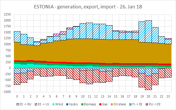
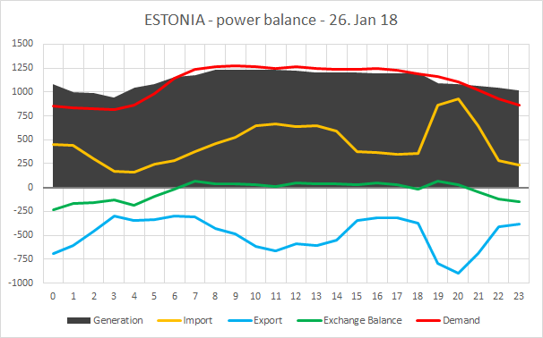
Right, this is not supposed to impact the "consumption mix" / the "CO2 intensity" of a country/region. I know you are aware of what this looks like, but I will try to outline the effects and intention of including exports in the graph using Estonia as an example: Balancing and displaying the exchanges with domestic generation and demand in a seperate graph might further improve the comphrehensibility when it comes to that. I know, adding an additional fourth graph can be "overloading" the left panel optically and is not ideal. I tried to highlight what including exports in the negative part will look like.
Including exports in the negative part as an area will mainly be another optical support. Having a simplified graph showing the calculated balanced load (or given load from the data) in a state will show how much "unrequested" generation and import is flowing over the borders.
Such a simplified graph can have a similar outcome for countries that are highly interconnected and have a relatively low demand compared to their transmission capacity, like Switzerland, Austria, for example. These countries actually don't deserve their CO2 intensity to be spoiled by "external" sources, but that's how it is. |
|
Alex, what you are seeing in your second graph is what I have been trying to describe to all... to no avail. [removed by Hans] |
|
[removed by Hans] |
1 similar comment
|
[removed by Hans] |
|
@alixunderplatz you have a valid point. Not an easy story to tell visually and simply. It might very well be that adding the negative part is the only option. |
|
Open question here: If its a bit "unfair" to attribute these imports (and the related CO2 imported) to such country, what would be the alternative? Getting back to "production-only" CO2 intensity would also be unfair for some other countries, that are clearly importing for their own consumption purposes. |
|
Hello, |
|
@brunolajoie I have no doubt, that any exports influence another region's CO2 intensity, because the grid is highly interconnected and electricity mostly follows physical laws (in AC grids). To your question "how could we ever tell that a country is importing for the purpose of exporting", I want to point at the example I gave for Estonia: by balancing load vs. generation. That particular export flow is caused by an energy input via DC cable, which is, in this special case, a 100% market-driven import of the nordpool market to cover the neighbours' demand. In this case, it might be helpful to take a look at the actual "commercial flows" of a country. I predict from my gut feeling, without having looked it up, the commercial flow for Estonia it will mostly be 0 MW for the displayed hours of that day, for Lithuania around 1000 MW import and Latvia a few hundred MW import. Again, in my opinion, it could be helpful to have a simplified overview of "total generation vs. load vs. imports vs. exports". |
|
Good point! Commercial flow might be helpful indeed to attribute "responsibility" of consumption (versus physical flow). But commercial flows are only day-ahead, not real time...so it won't responsibilize consumers based on the real time status of the grid...It's a tricky choice! Do we want to make a map close to physical reality or commercial plans? but hey interesting thoughts! Happy to discuss further if we see practical implementations potential to the EMap |
|
I was also thinking about this. My suggestion would be to draw a separate line with value of production+imports-exports on the "origin of electricity" chart when exports are more than ~5% of productions+imports. |
|
I like having a simple case to think about things. For example here, El Hierro is having a lot of wind, triggering storage units to use pumped storage. One thing I wanted to do is to have the "origin of electricity" curve represent the load curve (as right now it sums up to the total amount of incoming electricity - i.e. production + imports + discharge). For me this is a good rationale for showcasing "negative areas" (storage + exports). However, the load curve will still not be visible. There is also a challenge in colouring those areas, as exports will all have the same colour (but maybe that's not a problem). Another solution is to indeed show an area graph that sums to the load curve, and then show another graph that shows the amount of electricity stored or exported, as positive values. The wind gust will then be visible on the storage graph (not on the load, except for the % change). This will enable the axes to become more readable. Unfortunately I don't think showing a load curve on top of an area graph with positive / negative values will work due to our colours. |
|
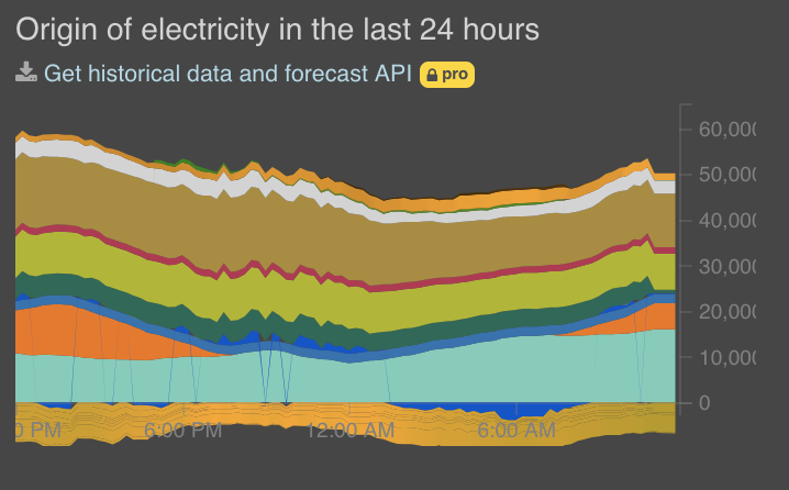
This is an example with Germany for example: There's a lot of information. Here's an idea: For the load information, I've personally come to the conclusion that it's more important to show overall volume of electricity incoming + outgoing, instead of "netting" and displaying the load. Do you agree with adding a new graph? |
|
To be honest I have started to like the idea of scaling the origin of electricity so that it matches the load curve. Currently the origin of electricity looks un-intuitive in Balkans and Baltics. The problem with that is defining what such a chart actually is and what to call it, because it's not origin of electricity in MW/GW anymore. "Fuel mix of local load" is the best I can come up with. Then we lose absolute generation values in MW/GW, which might be a good thing or a bad thing depending how you look at it. How about scaling generation+imports according to local load, and drawing exports/storage as negative on the same chart? Can it use the same units and would the overall height be "correct"? I'm not sure how the math works on this. Adding another chart is an option but then we have a lot of charts. Or we could just decide that the charts for highly interconnected regions like the Baltics are unintuitive because the system behaviour there is complicated and we value accuracy over intuitiveness. (I think the issues of fairness of scoring import-for-export brought up above are largely separate from the chart display.) |
|
Its quite an interesting idea indeed to scale the chart down, cause the two figures that matters are "total load in GW", and "percentage of each fuel/import in the consumption mix" |
|
@jarek I think that if you scale generations+imports according to load,
you've already subtracted exports/storage, so showing them as negative
doesn't really make sense anymore.
Either we show a "net" graph that scales to load, but then the
exports/storage have already been subtracted, or we show each
generation/import and exports/storage components separately (the sum of
both will be the load). The latter could be shown in one graph
(positive/negative) or in two graphs.
…On Mon, Apr 2, 2018 at 5:14 PM, Bruno Lajoie ***@***.***> wrote:
Its an interesitng idea...especially if we don't show "GW" but "%" in the
scale.
—
You are receiving this because you commented.
Reply to this email directly, view it on GitHub
<electricitymaps/electricitymaps#1030 (comment)>,
or mute the thread
<https://github.com/notifications/unsubscribe-auth/ABlEKPDsJRXa4hMdBRlJzq_IBTHAnj1yks5tkkBSgaJpZM4RvAhI>
.
|
|
No comment on showing exports, others have better & more detailed ideas. One thing I will say is that if another chart is added things will become even more cramped than they are now. It's always bugged me that the origin of electricity graph is hidden and requires scrolling to see it when a zone is clicked on, imo this is one if not the most interesting graph in the whole project yet it's hidden and small. I know that contributors can zoom in to display problems/interesting events but honestly I wouldn't rely on most people being able to do that. I think we should make the left panel expandable as well as collapsible (#1282) then we can display graphs at bigger sizes and not have to worry about space so much anymore. We could even allow a graph to be expanded into it's own tab/window for serious detail! #crazyideas. |
|
I've had an extensive chat @brunolajoie about this topic. We've tried it and negative graphs won't work due to axis values. Also it complicates the UI significantly. So if there's anything to improve: add a new graph with "outgoing power" (storage/exports). cc @jbuverud FYI |
|
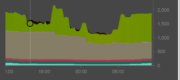
That will be clear indeed:
|
|
For what it's worth, when using the Electricity Map lately I have wished for a fourth graph for "outgoing power" as suggested by Bruno on May 4. So +1 on this for me. |
|
Hi all, Is this still relevant? Does anyone still miss showing storage / exports? Olivier |
|
We are redoing some of the UI for historical view, and things are quite cramped already so I don't think there are any direct actions here. |
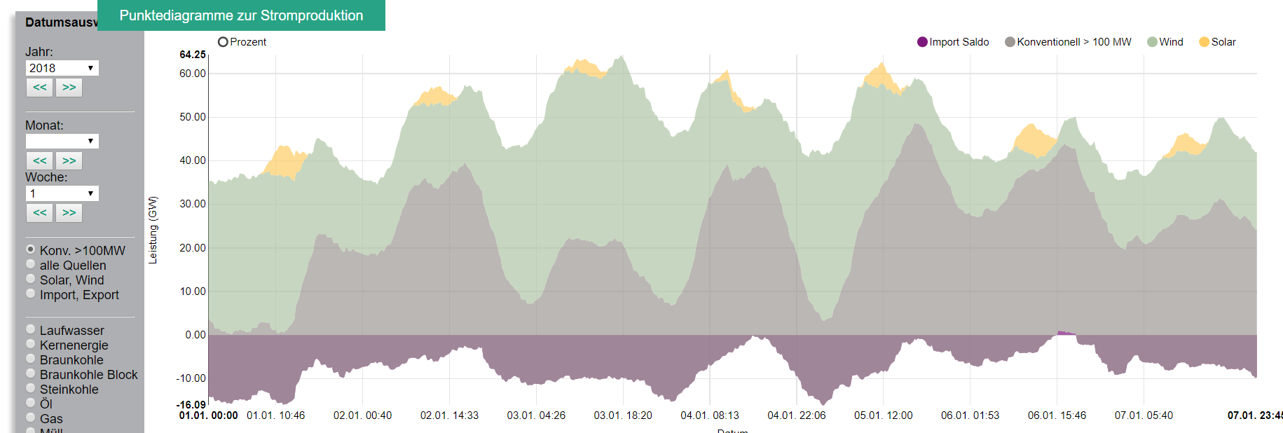
Congratulation first
A suggestion: put exports or net exports (in negative) in the graph "Origin of electricity in the last 24 hours"
Would like to know how it correlates with renewables production in Germany.
Best
The text was updated successfully, but these errors were encountered: