Sublist header menu not discoverable (was: scrolling through several hundred rooms is a bad way to see which rooms have notifications) #14349
Comments
|
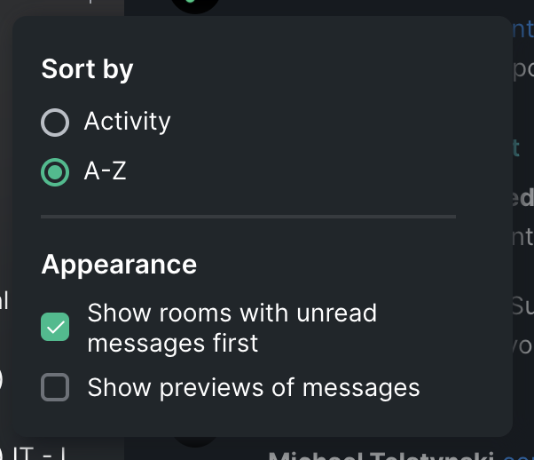
It shouldn't be random, it should be predictable based on your settings. What are your settings under the 3 dot menu next to the list name? |
|
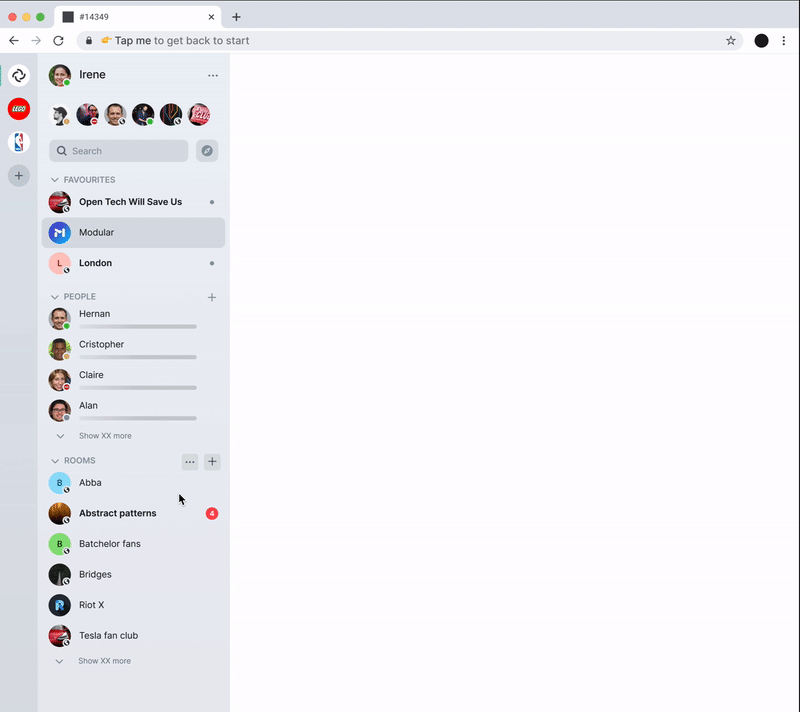
Ah, there's a three dot menu on the header - I did not find that :) I wasn't saying the sorting was random, though - my problem was primarily that I had no idea that room list ordering was configurable, and, in desperation was clicking on the badge count, which, when you have more than one notif, feels like it's picking one for you at random, which is not what I ever want :) I'm sure lots of people are feeding back on the UX, but from my personal experience I'd say that the show-on-hover three dots was not easily discoverable. |
|
judging from the number of complaints we've had about rooms changing order and people not knowing how to change it to something else, I'd agree. @vector-im/design are you able to take a look at this to see if the sublist menu can be made more discoverable? |
|
@lampholder Hi, do you think this is more discoverable? I appreciate you're more familiar with the UI now, but would be good to get an idea of if you think this would have helped you from the start, or is it feeling too subtle? Thanks.
|
|
It's certainly a big improvement :) Things that jump to mind that might have made it more discoverable for me:
We might also consider showing the cog the whole time for the next few weeks whilst people adjust (though we might have missed this window). |
We got a large volume of complaints last time we did this. |
The subtle highlighting depicted in this gif? |
No, just showing the |
|
To clarify - I did just mean on the 'Favourites', 'People' and 'Rooms' headers, not every room tile. |
|
Indeed, that is exactly what we had, just without the highlight behind it |
|
/me boggles at such a change receiving a large volume of complaints, but I don't care enough to worry about it further 😎 I'd still vote for cogs instead of ellipsis, and I think that highlight on mouseover room sub list is a big step up from where we are today in terms of discoverability and so represents a change worth making. |
|
we also got a large volume of complaints for just showing it on hovering the sublist :p |
|
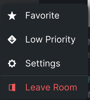
@benedikrok just want to run something by you, what do you think to the suggestion that the |
I believe having (...) in this case is correct, since the modal is mostly populated with actions (and not settings) and also contains a link to the settings (where it would look confusing if we would use the cog icon on 2 different levels of the same path). Also, I would display the "hover" state of (...) and "+" icon when you get with you cursor in their near proximity, and not on the sidebar as a whole. The main reason would be the inconsistency with the rest of the actions we have on the left panel (list item actions, search, discover, (+++) next to your profile, etc), where we would currently trigger their hover state when you get in their proximity. If we go with the proposed , then we should apply that logic to all actions in order to be consistent. And I assume that would result in something less appealing/understandable than what we have right now. |
@benedikrok I think you're describing a room tile
But this issue is referring to the room sublist header. What appears on clicking the I'd preserve the cog icon for the room Settings only. Using the same icon for different things makes a great confusion cocktail. |
The fact that clicking the notif badge drops you immediately in a random notifying room (as per #14307) goes from being a minor nuisance (the bit of UI I never use does something dumb) to a major problem (the only way to find rooms with notifications is very unhelpful).
The text was updated successfully, but these errors were encountered: