In this demo I analyzed the current trends shaping people's lives, and create charts, graphs, and interactive elements to help readers understand my findings.
I created a mock newspaper article assessing health risks facing particular demographics.
D3.js, svg elements, html, python
U.S. Census Bureau Behavioral Risk Factor Surveillance System, 2014 ACS 1-year estimates: https://data.census.gov/cedsci/
The current data set incldes data on rates of income, obesity, poverty, etc. by state. MOE stands for "margin of error".
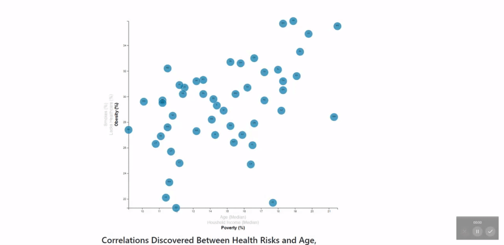
An interactive scatter plot was created using D3.js. The scatter plot has multiple parameters on each axis. When a user clicks on one of these parameters, the points in the scatterplot automatically update to show the user the selected data. The points are represented by a group of svg circle elements. The innerhtml of each circle element was coded to show the state abbreviation corresponding to that datapoint. When a user hovers over a datapoint, a tooltip appears showing that element's data.