Feature request regarding themes and tweet borders. #545
Comments
|
For borders: apply this custom CSS -> https://gist.github.com/eramdam/ab85017a7c9c07bd5b93493a21c2a0e1 For the old dark theme, you're right, the sidebar looks weird. Here's something I did quickly. I don't want to copy-paste what was in v3 because it was clunky in a lot of ways, but I think it might be an improvement (v4 on the left, v3 on the right)
|
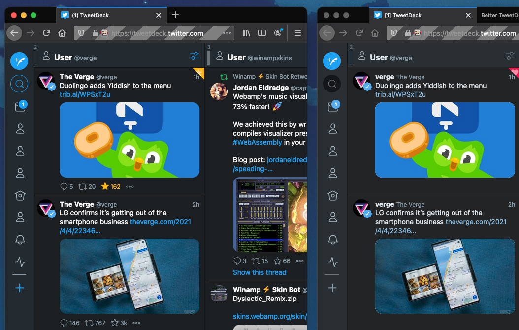
Hey thanks for this! I've applied the CSS for the borders and it already looks a lot better, so thanks again. I do like how the sidebar looks in the V4 screenshot using the old grey theme so if there is any way I can make use of that too, it'd be vastly appreciated. If it needs to be developed/added as an update then I am happy to wait but if there is also any additional code I can add via the custom CSS option then that would be great Thanks again! |
|
The tweaked version will be in 4.0.1 which I intend to ship later this week :) |
Is your feature request related to a problem? Please describe.
It's a feature request relating to a problem I have with the theme design.
Describe the solution you'd like
The ability to change the colour of the side bar (where the tweet, settings icons) to better match the previous version. I'll attach an example.
Additionally, I would like to have the ability to remove the borders below tweets like I could in versions 3.x but I can't figure out how to do that in 4.0.
https://prnt.sc/114c4pr - This is a 3.x version of TweetDeck - I would like the blue theme to still be active on the sidebar, whilst maintaining the use of the Old Grey theme for the body of the tweets etc.
https://prnt.sc/114c5hu - This is how it currently looks. I don't like that the sidebar is the same colour as the body of the tweet as it makes space look wasted etc.
As a quick edit if there is any custom CSS I could use to solve these issues then it would be appreciated. Total code noob.
Describe alternatives you've considered
Tried using other themes but they're not comfortable for me/they look too different/strange.
The text was updated successfully, but these errors were encountered: