EZP-30294: Added Modals component to UI Guidelines #551
Conversation
This file contains bidirectional Unicode text that may be interpreted or compiled differently than what appears below. To review, open the file in an editor that reveals hidden Unicode characters.
Learn more about bidirectional Unicode characters
Contributor
 inakijv
commented
inakijv
commented
Mar 12, 2019
inakijv
commented
| Question | Answer |
|---|---|
| JIRA Ticket | EZP-30294 |
| Versions | 2.2 |
|
Ping @damianz5 two things you may check:
|
damianz5
approved these changes
Mar 15, 2019
DominikaK
suggested changes
Mar 15, 2019
docs/guidelines/components/modals.md
Outdated
| @@ -0,0 +1,205 @@ | |||
| # Modals | |||
|
|
|||
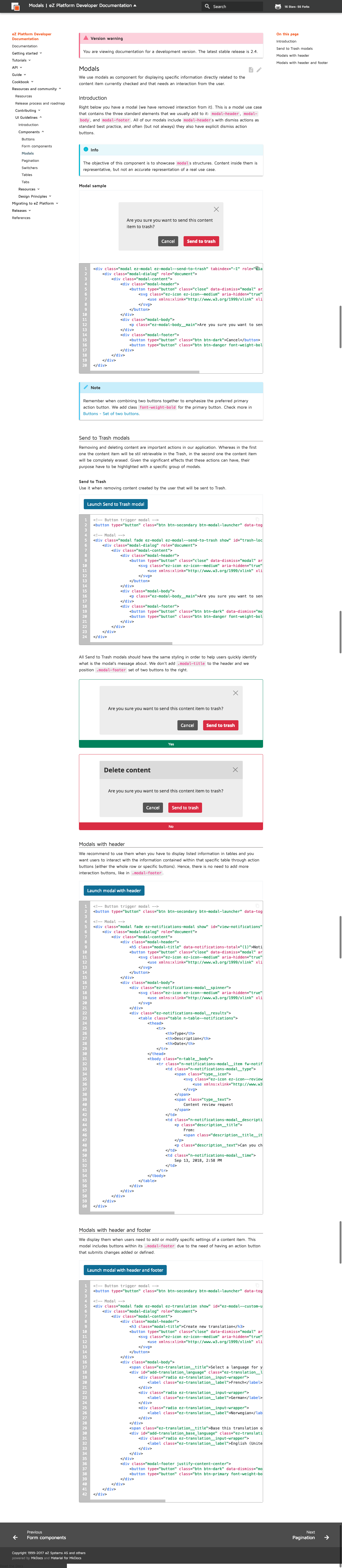
| <div>We use modals as component for displaying specific information directly related to the content item currently checked and that needs an interaction from the user.</div> | |||
There was a problem hiding this comment.
Suggested change
| <div>We use modals as component for displaying specific information directly related to the content item currently checked and that needs an interaction from the user.</div> | |
| <div>We use modals as components for displaying specific information directly related to the content item currently checked which needs interaction from the user.</div> |
docs/guidelines/components/modals.md
Outdated
| <div>We use modals as component for displaying specific information directly related to the content item currently checked and that needs an interaction from the user.</div> | ||
|
|
||
| ##<div class="mgt-3">Introduction</div> | ||
| <div class="mgt-minus-3 mgb-5">Right below you have a modal (we have removed interaction from it). This is a modal use case that contains the three standard elements that we usually add to it: `modal-header`, `modal-body`, and `modal-footer`. All of our modals include `modal-header`s with dismiss actions as standard best practice, and often (but not always) they also have explicit dismiss action buttons.</div> |
There was a problem hiding this comment.
Suggested change
| <div class="mgt-minus-3 mgb-5">Right below you have a modal (we have removed interaction from it). This is a modal use case that contains the three standard elements that we usually add to it: `modal-header`, `modal-body`, and `modal-footer`. All of our modals include `modal-header`s with dismiss actions as standard best practice, and often (but not always) they also have explicit dismiss action buttons.</div> | |
| <div class="mgt-minus-3 mgb-5">Right below you have a modal (with interaction removed). This use case contains the three standard elements that we usually add to it: `modal-header`, `modal-body`, and `modal-footer`. All of our modals include a `modal-header` with dismiss actions as standard best practice. Often (but not always) they also have explicit dismiss action buttons.</div> |
docs/guidelines/components/modals.md
Outdated
| <div class="mgt-minus-3 mgb-5">Right below you have a modal (we have removed interaction from it). This is a modal use case that contains the three standard elements that we usually add to it: `modal-header`, `modal-body`, and `modal-footer`. All of our modals include `modal-header`s with dismiss actions as standard best practice, and often (but not always) they also have explicit dismiss action buttons.</div> | ||
|
|
||
| !!! info | ||
| The objective of this component is to showcase `modal`s structures. Content inside them is representative, but not an accurate representation of a real use case. |
There was a problem hiding this comment.
Suggested change
| The objective of this component is to showcase `modal`s structures. Content inside them is representative, but not an accurate representation of a real use case. | |
| The objective of this component is to showcase `modal` structures. Content inside them is representative, but not an accurate representation of a real use case. |
docs/guidelines/components/modals.md
Outdated
| ##<div class="mgt-3">Introduction</div> | ||
| <div class="mgt-minus-3 mgb-5">Right below you have a modal (we have removed interaction from it). This is a modal use case that contains the three standard elements that we usually add to it: `modal-header`, `modal-body`, and `modal-footer`. All of our modals include `modal-header`s with dismiss actions as standard best practice, and often (but not always) they also have explicit dismiss action buttons.</div> | ||
|
|
||
| !!! info |
There was a problem hiding this comment.
Suggested change
| !!! info | |
| !!! note | |
(we do not use "info" boxes throughout our doc)
docs/guidelines/components/modals.md
Outdated
| </div> | ||
|
|
||
| !!! note | ||
| Remember when combining two buttons together to emphasize the preferred primary action button. We add class `font-weight-bold` for the primary button. Check more in [Buttons - Set of two buttons](http://127.0.0.1:8000/guidelines/components/buttons/#set-of-two-buttons). |
There was a problem hiding this comment.
Suggested change
| Remember when combining two buttons together to emphasize the preferred primary action button. We add class `font-weight-bold` for the primary button. Check more in [Buttons - Set of two buttons](http://127.0.0.1:8000/guidelines/components/buttons/#set-of-two-buttons). | |
| Remember when combining two buttons together to emphasize the preferred primary action button. We add class `font-weight-bold` for the primary button. Check more in [Buttons - Set of two buttons](buttons.md#set-of-two-buttons). |
docs/guidelines/components/modals.md
Outdated
| Remember when combining two buttons together to emphasize the preferred primary action button. We add class `font-weight-bold` for the primary button. Check more in [Buttons - Set of two buttons](http://127.0.0.1:8000/guidelines/components/buttons/#set-of-two-buttons). | ||
|
|
||
| ##<div class="mgt-3 header-line">Send to Trash modals</div> | ||
| <div class="mgt-minus-3 mgb-5">Removing and deleting content are important actions in our application. Whereas in the first one the content item will be stil retrievable in the Trash, in the second one the content item will be completely erased. Given the significant effects that these actions can have, their purpose have to be highlighted with a specific group of modals.</div> |
There was a problem hiding this comment.
Suggested change
| <div class="mgt-minus-3 mgb-5">Removing and deleting content are important actions in our application. Whereas in the first one the content item will be stil retrievable in the Trash, in the second one the content item will be completely erased. Given the significant effects that these actions can have, their purpose have to be highlighted with a specific group of modals.</div> | |
| <div class="mgt-minus-3 mgb-5">Removing and deleting content are important actions in our application. Whereas in the former case the Content item is later retrievable from the Trash, in the second case the Content item is completely erased. Given the significant effects that these actions can have, their purpose have to be highlighted with a specific group of modals.</div> |
docs/guidelines/components/modals.md
Outdated
| code_example]] | ||
| </div> | ||
|
|
||
| All Send to Trash modals should have the same styling in order to help users quickly identify what is the modal's message about. We don't add `.modal-title` to the header and we position `.modal-footer` set of two buttons to the right. |
There was a problem hiding this comment.
Suggested change
| All Send to Trash modals should have the same styling in order to help users quickly identify what is the modal's message about. We don't add `.modal-title` to the header and we position `.modal-footer` set of two buttons to the right. | |
| All Send to Trash modals should have the same styling in order to help users quickly identify what the modal's message is about. We don't add `.modal-title` to the header and we position `.modal-footer` set of two buttons to the right. |
docs/guidelines/components/modals.md
Outdated
| <div class="ez-guidelines-sample__correct-block ez-guidelines-sample__correct-block-negative">No</div> | ||
| </div> | ||
|
|
||
| ##<div class="mgt-3 header-line">Modals with header</div> |
There was a problem hiding this comment.
Suggested change
| ##<div class="mgt-3 header-line">Modals with header</div> | |
| ##<div class="mgt-3 header-line">Modals with headers</div> |
docs/guidelines/components/modals.md
Outdated
| </div> | ||
|
|
||
| ##<div class="mgt-3 header-line">Modals with header</div> | ||
| <div class="mgt-minus-3">We recommend to use them when you have to display listed information in tables and you want users to interact with the information contained within that specific table through action buttons (either the whole row or specific buttons). Hence, there is no need to add more interaction buttons, like in `.modal-footer`.</div> |
There was a problem hiding this comment.
Suggested change
| <div class="mgt-minus-3">We recommend to use them when you have to display listed information in tables and you want users to interact with the information contained within that specific table through action buttons (either the whole row or specific buttons). Hence, there is no need to add more interaction buttons, like in `.modal-footer`.</div> | |
| <div class="mgt-minus-3">We recommend using them when you have to display listed information in tables and you want users to interact with the information contained within that specific table through action buttons (either the whole row or specific buttons). Hence, there is no need to add more interaction buttons, like in `.modal-footer`.</div> |
docs/guidelines/components/modals.md
Outdated
| code_example]] | ||
| </div> | ||
|
|
||
| ##<div class="mgt-3 header-line">Modals with header and footer</div> |
There was a problem hiding this comment.
Suggested change
| ##<div class="mgt-3 header-line">Modals with header and footer</div> | |
| ##<div class="mgt-3 header-line">Modals with headers and footers</div> |
|
Added Doc review. Thank you @DominikaK! |
dew326
approved these changes
Mar 19, 2019
DominikaK
approved these changes
Mar 19, 2019
Sign up for free
to join this conversation on GitHub.
Already have an account?
Sign in to comment
Add this suggestion to a batch that can be applied as a single commit.
This suggestion is invalid because no changes were made to the code.
Suggestions cannot be applied while the pull request is closed.
Suggestions cannot be applied while viewing a subset of changes.
Only one suggestion per line can be applied in a batch.
Add this suggestion to a batch that can be applied as a single commit.
Applying suggestions on deleted lines is not supported.
You must change the existing code in this line in order to create a valid suggestion.
Outdated suggestions cannot be applied.
This suggestion has been applied or marked resolved.
Suggestions cannot be applied from pending reviews.
Suggestions cannot be applied on multi-line comments.
Suggestions cannot be applied while the pull request is queued to merge.
Suggestion cannot be applied right now. Please check back later.