06_multiclass accuracy_multi plot #281
Comments
|
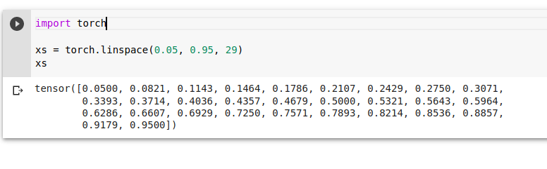
Actually the x axis are the values generated by |
|
thank you @TannerGilbert for explanations. Could you please help me answer the questions below in the form they are formulated? |
|
@grayskripko I'm not sure which questions you mean. |
|
@TannerGilbert I meant "questions above" :) |
|
No, on the x-axis there are 29 points from 0.05 to 0.95 (created with linspace).
|
|
@TannerGilbert yep, they are points. I clearly understand it. On the other hand, they have meaning. So each point is an observation of 2 features. The second dimension of each point, the y-axis, is the accuracy. The first dimension is threshold of "X". |
|
The y-axis represents the accuracy and the x-axis represents the threshold used for the e.g. if you have three classes [car, dog, human], the threshold is 0.8 and your model outputs [0.9, 0.3, 0.85] you can say that you have a car and human in your image. In the code in cell 35 we're trying out different threshold values to see which one gives the best accuracy for the task. |
So it's a threshold of activations, not a threshold of probabilities, right? |
|
I understood, finally. Out predicted activations were "sigmoided" before, so they are probabilities. |
In cell 35, there is a plot
Do I understand right that we have values of activations on the x-axis, not probabilities, as well as we pick
sigmoid=False?If so, why do limited with 0 and 1? Is it an unintentional error and they should have wide ranges?
The text was updated successfully, but these errors were encountered: