| ❗ There is also a version of this document with code samples in VB.Net ❗ |
|---|
The navigation pane project type includes a navigation menu displayed in a panel at the side of the screen and which can be expanded with the Hamburger icon.
This document covers:
- Modifying the menu items
- Using the navigation pane with command bars
- Invoke code on NavigationView
- Change the text for Settings
To update to navigation view read the following document.
The menu can be modified in the following ways.
- Change the icon for an item in the navigation panel menu
- Change the text for an item in the navigation panel menu
By default every item in the navigation pane is displayed with the symbol for a document. When every item has the same icon it is hard to differentiate between them when the navigation panel is collapsed. In almost all cases you will want to change the icon used.

Navigate to Views/ShellPage.xaml and change the NavigationViewItems in the NavigationView MenuItems property.
The code below shows the symbols used to create the app shown in the image above.
<NavigationView.MenuItems>
    <!--
    TODO WTS: Change the symbols for each item as appropriate for your app
    More on Segoe UI Symbol icons: https://docs.microsoft.com/windows/uwp/style/segoe-ui-symbol-font
    Or to use an IconElement instead of a Symbol see https://github.com/Microsoft/WindowsTemplateStudio/blob/master/docs/projectTypes/navigationpane.md
    Edit String/en-US/Resources.resw: Add a menu item title for each page
    -->
    <NavigationViewItem
        x:Uid="Shell_Main"
        Icon="Home"
        helpers:NavHelper.NavigateTo="views:MainPage" />
    <NavigationViewItem
        x:Uid="Shell_Map"
        Icon="Map"
        helpers:NavHelper.NavigateTo="views:MapPage" />
    <NavigationViewItem
        x:Uid="Shell_MasterDetail"
        Icon="DockLeft"
        helpers:NavHelper.NavigateTo="views:MasterDetailPage" />
    <NavigationViewItem
        x:Uid="Shell_Tabbed"
        Icon="Document"
        helpers:NavHelper.NavigateTo="views:TabbedPage" />
    <NavigationViewItem
        x:Uid="Shell_WebView"
        Icon="Globe"
        helpers:NavHelper.NavigateTo="views:WebViewPage" />
</NavigationView.MenuItems>
The icons are created using the Windows.UI.Xaml.Controls.Symbol enumeration. You can view all the symbols available at https://docs.microsoft.com/en-us/uwp/api/windows.ui.xaml.controls.symbol
You can also set the menu item to use an IconElement directly. Like this:
<NavigationView.MenuItems>
<NavigationViewItem x:Uid="Shell_Map" helpers:NavHelper.NavigateTo="views:MapPage">
<NavigationViewItem.Icon>
<FontIcon FontFamily="Segoe MDL2 Assets" Glyph="" />
</NavigationViewItem.Icon>
</NavigationViewItem>
</NavigationView.MenuItems>The text for a shell navigation item comes from the localized string resources. For an item which defines the x:Uid Shell_Main the value Shell_Main.Content corresponds with an entry in Resources.resw. Change the value in the resources file to alter what is displayed in the navigation menu.
The following is intended as an aid to anyone wanting to add a CommandBar to one or all pages in an app using a Navigation Pane.
Each page has a property for TopAppBar and BottomAppBar intended to hold a CommandBar. Despite their names, they put the CommandBar at the top (or bottom) of the window, not the Page that declares it. Because the NavigationPane works by putting a page within the ShellPage this causes the CommandBar to overlap with the NavigationView and is not desirable. Instead use one of the techniques shown below.
Because of the issue identified above, to add a Commandbar to the bottom of a single page, simply position it at the bottom of the grid intended for displaying content.
    <Grid
        Grid.Row="1"
        Background="{ThemeResource SystemControlPageBackgroundChromeLowBrush}">
        <!--The SystemControlPageBackgroundChromeLowBrush background represents where you should place your content.
            Place your content here.-->

        <CommandBar VerticalAlignment="Bottom">
            <AppBarButton x:Uid="AdminButton" Icon="Admin" />
        </CommandBar>
    </Grid>
If adding the bar at the top of the page it can incorporate the page's title text in the content area. Like this:
    <Grid.RowDefinitions>
        <RowDefinition x:Name="TitleRow" Height="Auto" />
        <RowDefinition Height="*"/>
    </Grid.RowDefinitions>

    <CommandBar>
        <CommandBar.Content>
            <Grid>
                <TextBlock
                    x:Name="TitlePage"
                    x:Uid="Main_Title"
                    Text="Navigation Item 2"
                    Style="{StaticResource PageTitleStyle}" />
            </Grid>
        </CommandBar.Content>
        <AppBarButton Icon="Add" Label="Add" />
</CommandBar>By adding a CommandBar to the ShellPage it is visible when navigating to any page.
To add CommandBar at the bottom of every page, modify the contents of ShellPage.xaml to add a Grid around the NavigationView and also include a CommandBar.
    <Grid>
        <Grid.RowDefinitions>
            <RowDefinition Height="*" />
            <RowDefinition Height="Auto" />
        </Grid.RowDefinitions>
        <NavigationView>
            <!--  Contents of NavigationView menu omitted to brevity  -->
        </NavigationView>
        <CommandBar Grid.Row="1">
            <AppBarButton Icon="Camera" Label="Picture" />
        </CommandBar>
    </Grid>
The above approach can be used to put the bar above the NavigationView by swapping the rows in the grid.
Alternatively, a bar can be added inside the NavigationView using the HeaderTemplate.
Remove Header property from NavigationView declaration.
MVVM Design Patterns
Header="{x:Bind ViewModel.Selected.Content, Mode=OneWay}"Code Behind
Header="{x:Bind Selected.Content, Mode=OneWay}"Adapt the HeaderTemplate setting Selected.Content to the Title TextBlock and adding the CommandBar.
<NavigationView>
    <!--  Contents of NavigationView menu omitted to brevity  -->
    <NavigationView.HeaderTemplate>
        <DataTemplate>
            <Grid>
                <Grid.ColumnDefinitions>
                    <ColumnDefinition Width="Auto" />
                    <ColumnDefinition Width="*" />
                </Grid.ColumnDefinitions>
                <CommandBar Grid.ColumnSpan="2">
                    <AppBarButton Icon="Save" Label="Save" Command="{Binding SaveCommand}" />
                </CommandBar>
                <TextBlock
                    Style="{StaticResource TitleTextBlockStyle}"
                    Margin="12,0,0,0"
                    VerticalAlignment="Center"
                    Text="{Binding Selected.Content}" />
            </Grid>
        </DataTemplate>
    </NavigationView.HeaderTemplate>
<NavigationView>
A Note about the above code examples.
Events and commands are not shown in the above code but can easily be added like any other button click event or command. Note that if using the techniques for adding the bar to every page, the events or commands should be handled by the ShellPageViewModel (or in ShellPage.xaml.cs if using CodeBehind.)
In all the above code examples the Label values have been hard-coded. This is to make the samples simpler. To use localized text, set the x:Uid value for the AppBarButton and add a corresponding resource entry for "{name}.Label".
The examples also only show a single AppBarButton being added. This is to keep the code sample as simple as possible but you can add any appropriate content to the bar, as documented here.
Extending the app to add this functionality requires making two changes.
- Add a HyperLink in the FooterTemplate.
- Add a Command to handle code on HyperLink click.
ShellPage.xaml
<NavigationView>
    <NavigationView.PaneFooter>
        <StackPanel>
            <HyperlinkButton
                x:Uid="Shell_ShowInfo"
                Margin="16,0"
                Command="{x:Bind ViewModel.ShowInfoCommand}" />
        </StackPanel>
    </NavigationView.PaneFooter>
</NavigationView>
Add a command to run the code in ShellViewModel.cs (MVVMBasic or MVVMLight) or ShellPage.xaml.cs (CodeBehind)
    private ICommand _showInfoCommand;

    public ICommand ShowInfoCommand => _showInfoCommand ?? (_showInfoCommand = new RelayCommand(OnShowInfo));

    private void OnShowInfo()
    {
        // TODO: Run command code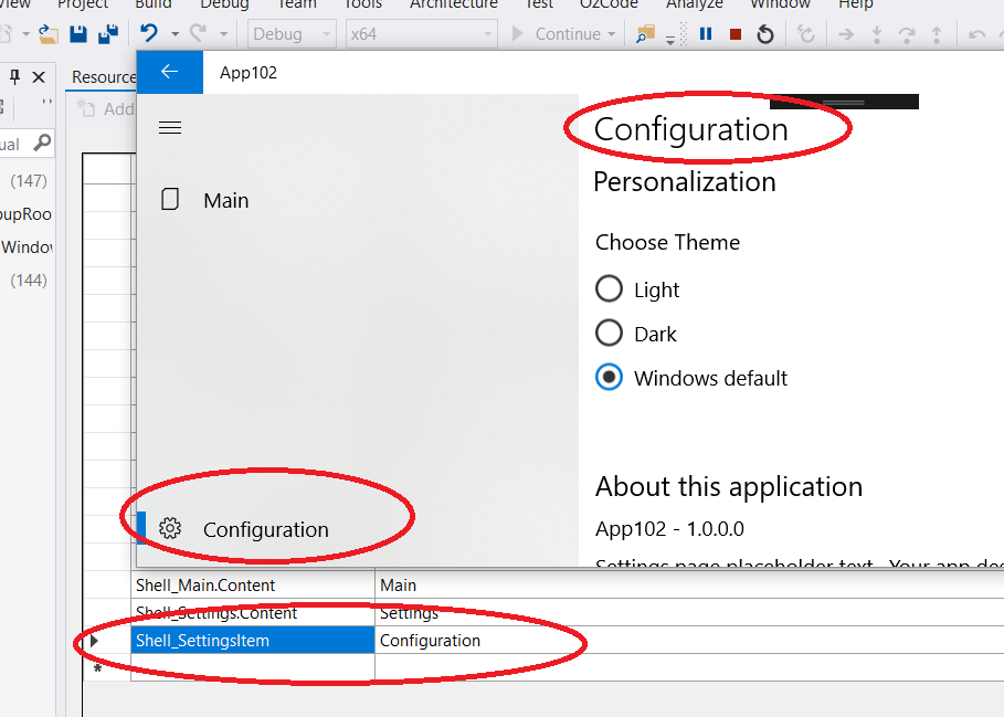
}The text label for the Settings page is supplied by the OS. This includes any translations, but it is possible to call this page something else.
Add a new resource with the name Shell_SettingsItem. (You can call it anything but it must match what's in the code below and it must not contain a period (.).)
In Shell.xaml.csmodify the constructor so it matches this (add the loaded event handler)
public ShellPage()
{
    InitializeComponent();
    HideNavViewBackButton();
    DataContext = this;
    Initialize();

    this.navigationView.Loaded += (sender, e) =>
    {
        (this.navigationView.SettingsItem as NavigationViewItem).Content = "Shell_SettingsItem".GetLocalized();
    };
}
The above will result in the text you specify being used in the app, like the one below.