Counter visualization #27
Comments
|
@arikfr any thoughts on how the dataset should look like? maybe something like: |
|
|
for the query: select 13 as "count";
|


|
|
I think the visualization is a bit confusing, my suggestion: |
|
I was inspired by @itaimiller design for tabla |

|
Itai is a great inspiration, but he tried convey different information :-) "9% ^" in this screenshot means increase of 9% over some period of time. That's not the kind of information you show... If you prefer you can show +X (green) -X (red) without the arrows. Maybe like this: First row: [VALUE] |
|
What about my second suggestion? |
|
I think we shouldn't have a predefined visualization target value but rather return both values from the query itself, allowing us to basically support both visualizations in one (a - number vs. static number and b - number vs. change coming from a time shifted query) |
|
+1 for @joeysim. |
|
how about this (pushed): select 17 as "counter", 16 as "target";
select 13 as "counter", 16 as "target";
|


|
SUPER! Just covert the column picker into a drop down... although even as is it's great. So only if you have time. |
|
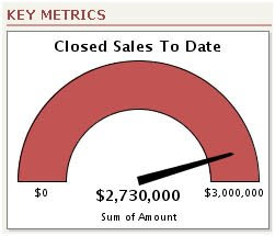
If we put a monthly target, There is no point of showing up or down. Monthly targets might be really big/can be hard to achieve. There should be a visualisation like this one here http://1.bp.blogspot.com/_XPquV_XKF1c/SSHwj6uuDzI/AAAAAAAAAbc/a5DFj7izu9Q/s400/g1.jpg
|

|
@shishirsharma makes sense. It's better if you open a new issue for it (or even better: a pull request 😉). |
…ash-table

add new visualization for regular redash table
Optional additions:
The text was updated successfully, but these errors were encountered: