Several metrics issues in Roboto Mono worth fixing together #1832
Comments
|
repasting my issue from comments in 1408 There is extra vertical spacing for ALL characters To better understand, open midnight commander inside a latest version putty in a latest version rhel 7 clone. screenshots below at 12pt normal look (Liberation Mono) roboto mono wrong look this does not seem to happen on native linux terminals (terminator, xfce terminal) On Notepad is also visible. Observe another issue that some ascii extended chars are not standard width (ascii extended 186 for example, could more more but I did not verify them all) |


|
Also the patch to make it appear in putty works (PR #1824), but it does not appear in windows console:
|

|
screenshots from windows 10.0.17134.556 |
|
To appear in windows console, it must meet these conditions |
|
Thanks for adding detail and for correcting my assumption on the windows console, @mailinglists35! Thanks also for including images related to vertical metrics. I did include that in the top comment:
... but it's definitely helpful to have the screenshots showing exactly why it's a problem. One follow-up question: I am having difficulties adding any monospace fonts to my windows console. I've tried to follow this guide to add them, but no luck. Have you had success in adding any other fonts, e.g. Fira Mono? |
|
I installed/see these non-default fonts on mine: DejaVu Sans Mono also Lucida Console but can't remember if I installed it or it came with OS |
|
Okay, thanks for confirming! It may be that the windows console checks all glyph width metrics before allowing a font, then. I've added a test in the Windows console in the top comment of the issue, to make sure it's addressed when someone has capacity for this. |
|
This issue is also related to #360. |
|
I think #1394 pull request also relates to the problem. |
|
Hi Will Google eventually simply drop roboto altogether and make a new one that is working properly this time? |
|
@mailinglists35 this is only speculation, but I’m guess this can’t really be fixed, without the risk of breaking websites/documents that may be designed using the current width of Roboto Mono Italic. So yes, basically the only two options, as I see it, are:
|
|
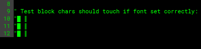
Robotomono doesnt work with block chars for making borders: In Neovim, Font: Consolas: |

|
PLEASE FIX! |
|
I eventually gave up on roboto mono and gave up hope Google fixing it. Fantasque Sans Mono no loop k is now my first choice, seconded by Microsoft's new default Cascadia Mono and macOS' SF Mono ripped from my macOS root filesystem. Recently I stumbled upon Intellij's JetBrains Mono which also looks good. RIP Google Roboto Mono...🤔😥 |
|
Is it any coincidence all 4 fonts you mentioned suck? I don't want a robotic font but neither a fun handwritten one. |
|
then good luck finding the font of your taste, what can I say. google does not seem to care how Robot looks on Windows, they just wanted something for Android and it seems to satisfy their original requirements |
|
For italics, uninstall the italic variants. You will get faux italics, but at least in code editors they're going to be the same width. |
In a pull request for a quick fix to the
isFixedPitchflag of Roboto Mono, I came across a few other bugs. I'm not the first person to notice these, but I wanted to track my notes in an issue, and combine the other issues into this one, as I believe the fixing work should be done together.Related issues:
When there is time for a designer to dedicate to fixing Roboto Mono, they should:
Roboto Mono Regular - Fontbakery fails
🔥 FAIL: Checking OS/2 usWinAscent & usWinDescent.
🔥 FAIL: Checking OS/2 Metrics match hhea Metrics.
🔥 FAIL: Checking correctness of monospaced metadata.
🔥 FAIL: Does the font have a DSIG table?
The most obvious problem for a monospace is that some glyphs are not the standard width – a few are around 8% wider than they should be:
Roboto Mono Italic
🔥 FAIL: Checking post.italicAngle value.
🔥 FAIL: Checking OS/2 usWinAscent & usWinDescent.
🔥 FAIL: Checking OS/2 Metrics match hhea Metrics.
🔥 FAIL: Checking correctness of monospaced metadata.
🔥 FAIL: Does the font have a DSIG table?
In the Italic, quite a few of the glyphs mentioned (e.g.
/hyphenare off by just 1 unit (1203 vs the standard 1202). However, quite a few are off by significantly more, which probably isn't killing anyone, but isn't ideal:Of course, the most significant problem here is that the standard width in the regular is 1229, but the standard width in the italic is 1202. This is about 2.25% different. Here's a codepen test showing the effect this has over a line of text:
There are also issues around vertical metrics which probably make display inconsistent between platforms.
The text was updated successfully, but these errors were encountered: