Glyph Extension Monetary #12
Comments
|
I think the Euro and Rupee are not quite right; the euro is now too closed in its top and tail, and the Rupee's returning construction seems important to me. I'll assign this issue to you now, so you can noodle on those 2 and arrive at a design that follows more closely what the EU and Indian governments recommend. Many of the changes are very subtle improvements for optical compensation, opening counters and adding a little contrast to moments that technically benefit from it. This is especially clear in the 2nd image where the blobbing up of many currency symbols next to numerals is clearly resolved. I guess the width proportions are working better with the default (now default proportional lining?) numerals. |
I believe I asked to set Roboto Delta's default as 12pt, but indeed I see 14pt is what is used for body sizes in https://material.io/design/typography/#type-scale so I agree with using 14pt as the default size. |
|
I’m pretty sure we selected 14 for Amstelvar because that’s what material design and many others are using as today’s text default. I thought I was following that with extremo and am glad.
|
|
...; the euro is now too closed in its top and tail...
Euro was not based on the topology of the alphabet or the figures. Now, based on the figures it is no longer confined to the narrow range of weights and widths and it is ready for more generous axes of both?
..., and the Rupee's returning construction seems important to me.
‘Returning construction’ may require an arrow pointing to it.
Glad you like the rest, it’s not cut in stone and I will take that as r]tentativ approval of the 14 point non-rupee/euro.
Opsz next.
|
|
Notes from video call with @dberlow : 14pt it is :) Euro
However, I see the Euro as needing to have a more open aperture to keep looking like, evoking, a round cap 'E', while not being an "E" per se.
Great! Rupee
Great! |
|
|
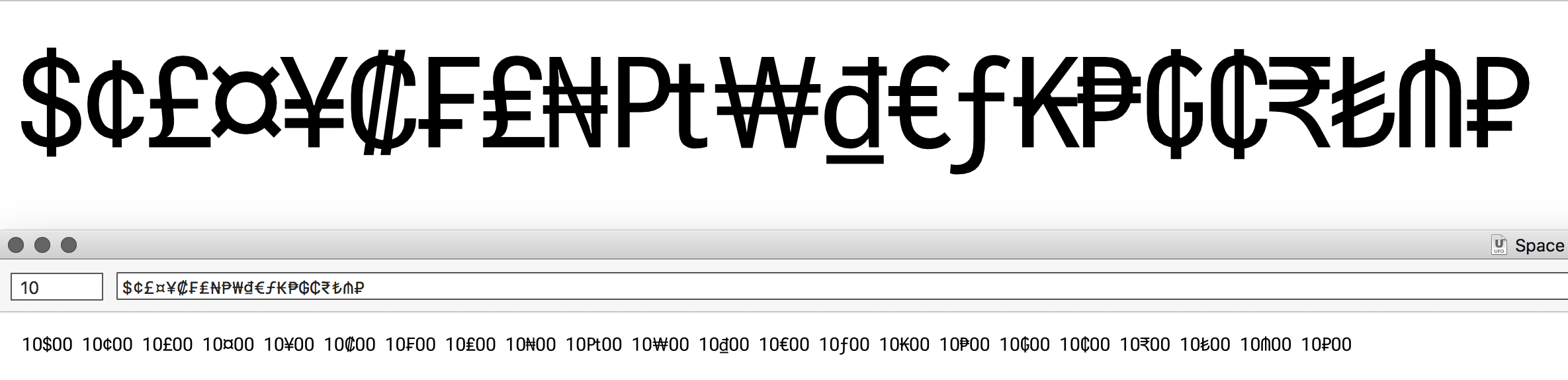
Have normalized all for 14 pt.
Smoke proofs below. Top is before, bottom is after.
Please review, and reply,

thanks.The text was updated successfully, but these errors were encountered: