Design of the error labels have changed and they don't look good #3418
Comments
|
cc @aliabid94 |
|
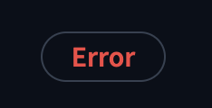
Kinda feeling the opposite lol. New light mode looks nice but dark mode looks basic to me. Fine with reverting to original though |
|
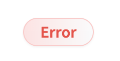
Light mode looks curved because of the gradient now, which none of the rest of UI does. Dark mode looks clean but isn't as obvious as it used to be. I didn't really like the old ones though, I'd be happy with some thing else. |
I see, good point |
|
Hmm ok so I was consolidating CSS variables and I consolidated variables between this and the error modal, so they have the same background. I'd like to keep them the same - would be happy to remove the gradient from both! wdyt?
|

|
Seems reasonable, I agree both the Error message and the Error modal should have the same background. Can we see what the error modal looks like without the gradient? |
|
I don't think they look particularly visible or error-like. I think the background should be red. The gradient looks very washed out and doesn't really fit imo. cc @gary149 |
|
Here's the error label and modal without the gradient in light and dark mode: 

I added a darker red border to the light mode error to correspond with the dark mode border. I think these look better without the gradient imo! |
|
They look good, happy to test them out if there's a PR |
LGTM from the screenshots. |
Describe the bug
Dark mode change isn't awful, although it is less noticeable. The light mode one doesn't look good at all though.
Before
After
The text was updated successfully, but these errors were encountered: