Graph/Time series panel displays too thick bars when data points are not many #154
Comments
|
@eduelias hmm I have 2 potential thoughts? Do either of those settings help? |


|
Hi @sarahzinger, thanks for your reply! We've been playing a lot with those configs and, yes, using points is the current solution we're using but as we have a dashboard with at least 30 graph panels with bars, the points can get lost and it's quite hard to really see them through all the panels. The No Value simply don't do anything at all. After all, I believe the panel should work with the given data, right? Again thanks for your time and answer! :D |
|
@eduelias strange that the no value doesn't do anything but that is also my experience when I play around with it? I wonder if there's a bug there or if we're both misunderstanding it's purpose/effect. Perhaps it would be helpful to look at messing with the interval settings? I believe it generally is used to determine the width of the bars? I haven't been able to exactly replicate your issue but I do notice them sometimes showing as too wide as I zoom in to very small time frames, it does seem like there are some known limitations potentially? grafana/grafana#7533 (comment) In terms of making the points easier to see I believe that should be fairly easy to accomplish! Mark them to show |


|
@sarahzinger The interval solution works if we put a 12h or 24h interval. This way, the bars will be small enough as they should. But the data won't help us, as we usually works with a single interval through the whole dashboard (30s is our sweet spot). The points being visible is not about the points itself. It's about the whole dashboard. When full of dots it can get a bit confusing and chaotic. With the bars is, too, a bit confusing (as we have many many different colours and sizes) but it's better to see bars then dots. Nevertheless, we're adopting the dots while we're trying to find a way to fix the bug with the bars. |

|
@eduelias maybe can you give us a sample query that you are running? When I run a time series query in the time stream datasource and select 3 data points it does not show the bars over many hours, but maybe we have our data formatted differently somehow? |
SELECT CREATE_TIME_SERIES(t,errors), statusCode FROM (
SELECT bin(time, 30000ms) as t, statusCode, (SUM(errors) /(1.0*to_milliseconds(30000ms)/30000)) as errors
FROM "db"."table"
WHERE time BETWEEN from_milliseconds(timeStart) AND from_milliseconds(timeEnd)
AND dimension1 LIKE '%somestring'
GROUP BY bin(time, 30000ms),statusCode
ORDER BY statusCode, bin(time, 30000ms)
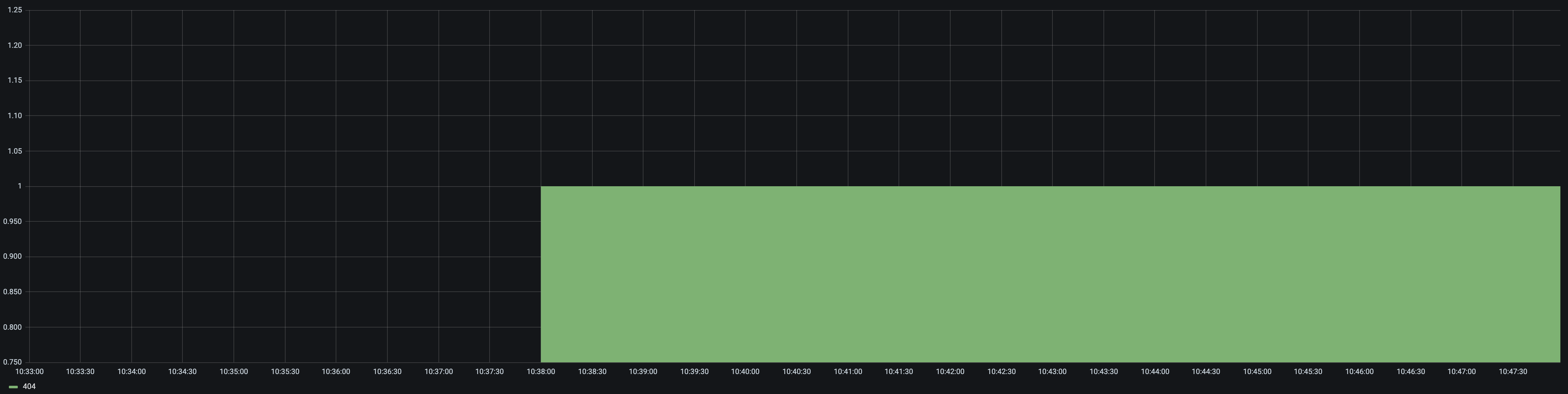
) GROUP BY statusCodeThe data returned by this query is this: The shown graph is this: We're using a multi-measure time stream table, with region, dimension1 and statusCode as dimensions and errors as measures. |

|
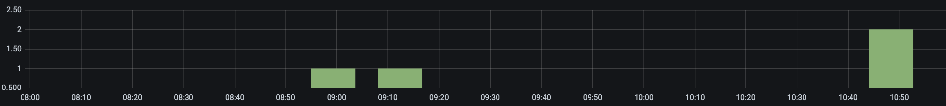
I've had a closer look at this issue and I was able to repro (I've added an extra time WHERE clause to filter results further). My findings so far: When timestream returns only one data point - bug as described in this ticket:
When timestreams returns 2+ data points - no issue:
I'm now looking at where the bug comes from. @eduelias could you confirm your issue only happens when a single data point is returned? |


|
duplicate of grafana/grafana#14130, right? |
|
Indeed! Thanks @leeoniya |
|
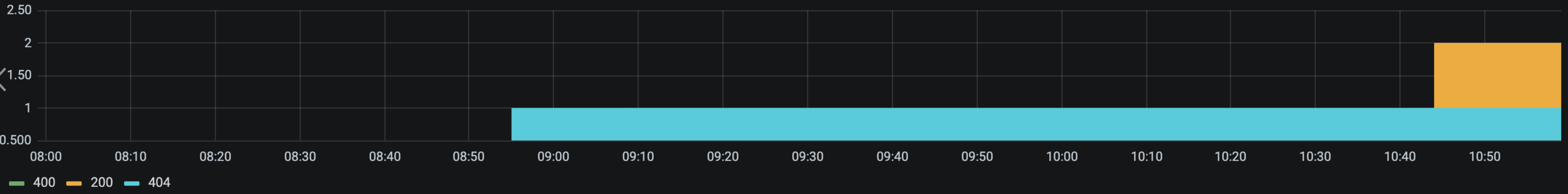
@yaelleC We've seen this behaviour with 1,2 or 3 data points. Usually with just one is the worst but, it also happens with 1 or 2 too ... I believe it has to do with the space between the points. If you add them with a lot of time between the points, the bars will get stretched. Sometimes they overlap, sometimes they don't. |
|
@yaelleC First, thanks for your help and effort on this, ok? Second, Is there any timeline when (even if) this solution will be released (or if it'll be released altogether)? Otherwise we'll need to find a different solution for this issue. Again, thanks for your time! :D |
|
I recently posted a possible fix in the other ticket that might be worth a shot, and I'm also pinging the BI team. |
|
Fix posted in the linked issue, so closing this. |
What happened:

When using the Time Series panel over Time Stream(Or the old graph panel, on both 8.4.4 and 7.5.4), when having too few data points, the graph bars extends for more than the period they were collected (What represents a 30s interval spans through 2h40m).
What you expected to happen:

Data points should be displayed on their right time, with bars that are constrained inside their own time spam. If someones wants to see thicker bars, a configuration should be available, allowing bars to "bleed out" from their timespan to X timespans (let's say: I'm willing to see 30s bars span through a whole minute, or 5min, or 10min). If such configuration is not set, the bars should be set inside said timeframe and only expand when zoomed in, as the whole timeframe would also increase in size by the zooming in.
Using ELK connector the data is displayed on the correct way, but because the ELK connector itself generate empty results to fill in the panel and, by doing this, it achieves the expected result as the image beneath
How to reproduce it (as minimally and precisely as possible):
Add a graph panel querying for two or three points only from time stream. Instead of bars you're going to see irrational big boxes (there is no reason for the bar to be that big).
Anything else we need to know?:
Environment:
The text was updated successfully, but these errors were encountered: