Note: This library might contain some small bugs but it will be fixed as soon as possible. However, it won't affect any of its funtionalities. It's planned to develop further functions that will make it more dynamic and cleaner.
Planned features:
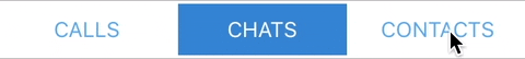
WhatsApp-Style (Android):

Or you stick to the Apple-Style but you can also change the border width, seperator lines and many other properties:

In order to use this SegmentedControl-Style properly, make sure the background of KMSelectedItemColor and KMBackgroundColor is transparent (clearColor).
![HighlightedView] (https://media.giphy.com/media/ikZbmtPHBqwcU/giphy.gif)
- Add
pod 'KMSegmentedControl'to your Podfile - Run
pod installin your Terminal - Run Project
pod 'YourApp'.xcworkspace
Import library
import KMSegmentedControlCreate KMSegmentedControl programmatically:
var segmentedControl = KMSegmentedControl(frame: CGRect(x: 0,y: 0, width: 200, height: 50))
segmentedControl.delegate = self
// further customizable properties are listed below
Create KMSegmentedControl with storyboard:
- Create a new UIView inheriting from KMSegmentedControl
- Design it according to your own preferences.
Delegate Methods
// called if an action happens. Control different behaviours by checking item.tag.
func KMSegmentedControl(selected item: UIButton)
Properties
Properties with @IBInspectable are customizable with storyboard but also in code.
// Defines which UIElement will be visible
public enum UIElement {
    case HighlightedView
    case SelectorLine
}

@IBInspectable public var KMSelectedItemColor: UIColor?  // background of selected item
@IBInspectable public var KMBorderWidth: CGFloat = 0  // border width of the segmented control
@IBInspectable public var KMBorderColor: UIColor? // color of the border
@IBInspectable public var KMBackgroundColor: UIColor? // background color of segmented control
@IBInspectable public var KMCornerRadius: CGFloat = 0 // corner radius of segmented control
@IBInspectable public var KMSelectedTitleColor: UIColor? // color of the selected item
@IBInspectable public var KMUnSelectedTitleColor: UIColor?  // default title color
@IBInspectable public var KMSelectorLineColor: UIColor? // color of the animated bottom line if defined
@IBInspectable public var KMHighlightedViewColor: UIColor? // color of the highlighted view if defined
public var KMFontSize: CGFloat = 14 // font size of each item
public var items: [String] = ["First", "Second"] // defines what items will be displayed
public var KMShowSeperatorLines: Bool? // display seperator lines between each item (Will be shown as default)
public var KMShowHighlightedView: Bool? // display highlighted view (Will be shown as default)
public var UIElements: [UIElement] = [.HighlightedView, .SelectorLine] // Define which UIElement should be displayed (Both will be as default)
public var images: [String] = [] // Add Images for each button
public var placeImageAboveTitle: Bool = false // Set 'true' if you want an image to be centered above the title/labelKMSegmentedControl is available under the MIT license. See the LICENSE file for more info.