Sankey plot #998
Comments
|
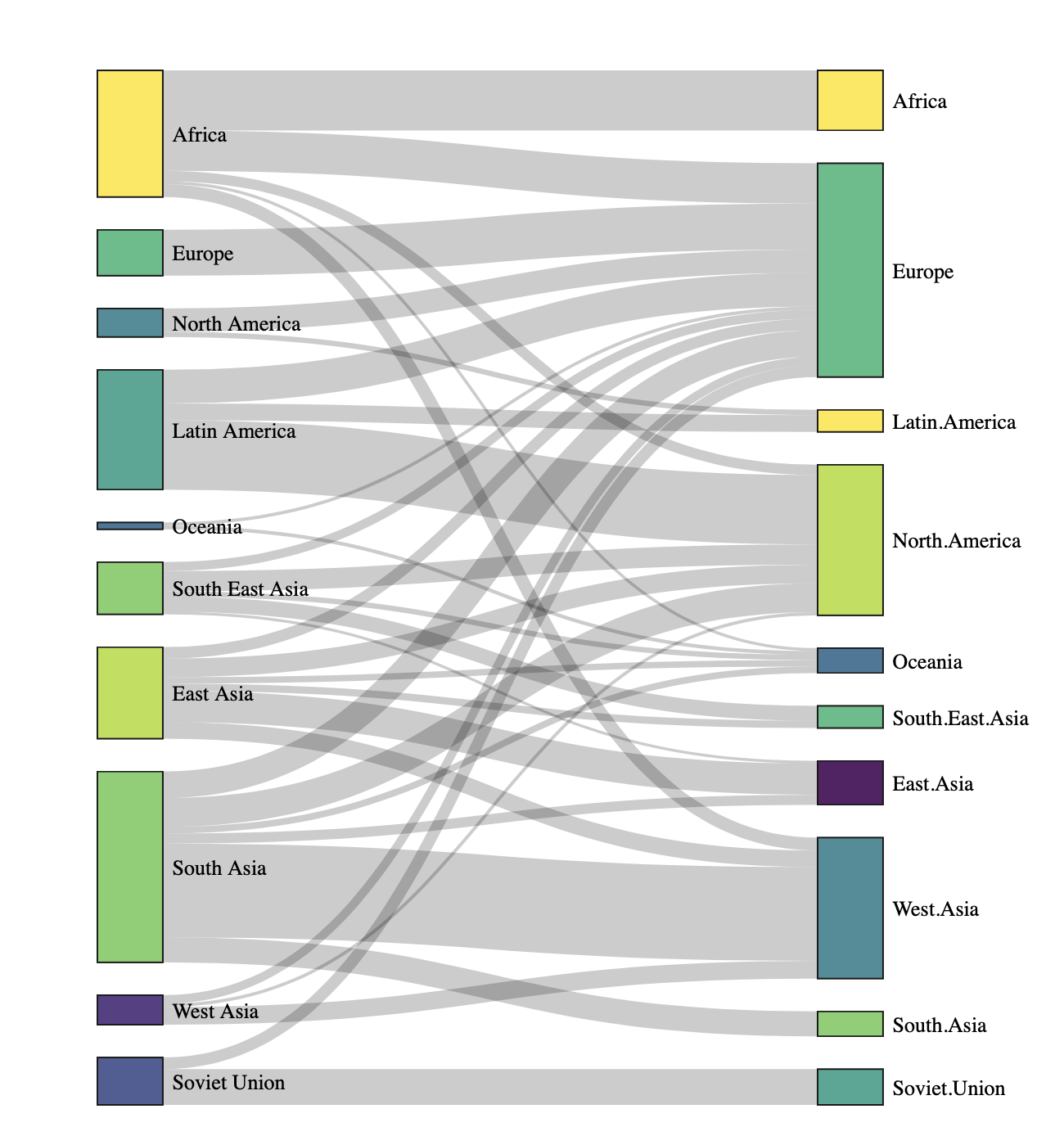
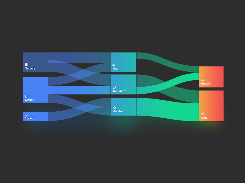
Rather than a Example of a common sankey: Data would usually be in the format of Example of a "middle" adjusted chart: Thoughts @iamabhishekmathur @mturoci |

|
@iamabhishekmathur The original funnel for filtering purposes feels weird (never seen filtering like this). The filtering functionality is already in place, just create a Deployed to column and make it @mtanco TIL this thing has an official name :) Seems like a good idea, but will definitely be a tremendous amount of work to make it right, smart and usable. It is doable, just a matter of priority as usual. cc @lo5 |
|
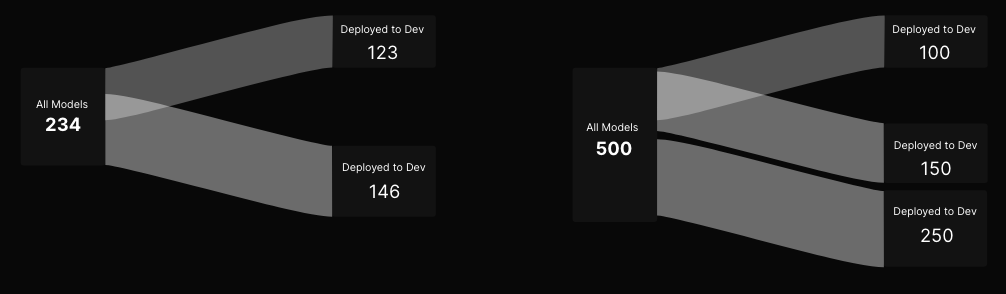
@mtanco @mturoci can we implement something like this. |
|
Yes, the design looks good IMO, just doesn't make much sense in the context of table filtering. |
|
@mtanco @mturoci this is the behaviour we are expecting. User can switch between model stages by clicking each card in the funnel and when user switch from all models to -> dev or prod funnel view should highlight and show which stage user viewing |
|
I still don't understand. The linked design only changes dropdown value upon clicking or am I missing something? |
|
@mturoci It should change the table values too |
|
Please see my comment above. What are the benefits compared to our existing table filter? The table shows total / filtered number of rows in footer so it is easy to see. I don't think users would consider the proposed component a filter. It seems more suitable for presentational purposes only, e.g. hierarchy depiction. |
|
@mturoci I want to highlight the selected stage in the funnel view. |
|
Why? |
|
@mturoci idea is to let users know which stage they look into in the page. But I discussed with @iamabhishekmathur and we are okay to have the component without filter and highlight feature |
|
The simplest and most compact way of representing whole-to-part quantities is a single 100% stacked bar, like this:
Each bar segment can be made clickable if you need to link/drill-down. A Sankey diagram is overkill, unless someone can demonstrate that there are multiple sources and destinations across multiple flow stages. |


|
@mturoci Any updates on this ticket? |
It's seems in this chart type it's difficult to display longer names, Since most models can contain longer characters @lo5 |
|
The placement of long labels can be solved with tooltips, callouts, legends, etc. It would be good to know reasons why a Sankey diagram is more appropriate here than a stacked bar. If a stacked bar solves your problem, then use ui.plot(). |
|
@lo5 in our case dev models and prod models are part of all models. In stack bar we can represent dev and prod but how can we display all models here? |
|
@lo5 your suggestion solves for single layer, but doesn't solve for multi layer visualisation
4 is straight This cannot be achieved with the whole-to-part suggestion. I also wouldn't want us to spend TOO much time on this ... @lo5 any other suggestions/work arounds that you've got? |
|
@mturoci @lo5 I have updated the design to align more with sankey plot properties (adjusted height to represent value) you can check the design here https://xd.adobe.com/view/0790f950-abbd-41fa-b372-332295fd876f-52c3/screen/60aebbe8-1cbf-4628-821f-344af82ef8ee/ |
|
The design needs work:
Per @iamabhishekmathur, there can be 2+ stages. The design above covers only the 2-stage case. What's the proposal for label positioning for intermediate stages in case there are 2+ stages? Note that the height of the destination might be smaller than the height of the label + count. |

|
Another possible solution is to just use a pie chart: |

|
@mturoci yeah, we discussed about this and we are okay to use pie chart for this scenario . Do you need a another ticket for this or already created pie chart? |
|
Great! |
Design
Design Link: https://xd.adobe.com/view/0790f950-abbd-41fa-b372-332295fd876f-52c3/screen/4ef1b0c3-50cc-4782-9400-193c438cdc41/
Features
@shihan007
The text was updated successfully, but these errors were encountered: