History chart doesn't show actual temperature #10590
Comments
|
I don't see how the red line would be more correct than the blue line, as you would rather have a transition between two points in time, than a volatile jump in temperature. And at that small scale you'd always have these minor deviations without having a higher precision sensor. Even if it doesn't look very nice I think the current implementation is perfectly fine. |
|
@cgtobi The sensor is reading 22.0, 22.0, 22.0, 22.0, 22.1. The red line is what the sensor is reading so it's correct and the blue line is wrong. The longer the sensor value stays at a constant value, the more wrong the blue line becomes. It isn't an issue that it's a volatile jump, it's an issue that the plotting value is not what the sensor said it was. If we were fitting/smoothing values, then we could discuss accuracy vs smoothness but that's not what's happening here. |
|
I agree that this behaviour is a bug in many cases. The This is a graph for the A workaround for this would be to set A better solution would be to let the user specify the behaviour for the
|

|
@skweee exact same issue here. was also trying to visualise the data of my eQ3 thermostat and saw this bug as well. think it's a general issue either (not platform-exclusive). |
|
@disrupted I agree, the |
|
I locally patched the In my opinion, there should never be any graph interpolation for devices with |

|
What would be really nice is if the history kept track of where there is no data vs where the data was constant. Then it could write a nan record to cover the interval when there is no data which would be a great addition to the graph. Fixing that would also fix the problem in the front end that only shows the last time the value changed, not the last time the value was updated which is really confusing. |
|
I am having the excact same problem for showing my graph of power usage. Hope there soon will be a fix for this. |
|
I've noticed this too with a number of my sensors. The precipitation graph from buienradar looks like a sawtooth wave on days where it's 0.0 almost all the time, but occasionally > 0. I also have some template sensors to convert another sensor which is in seconds into minutes, which also doesn't force updates. I'm not very familiar with the internal architecture of home-assistant, but wouldn't it be better to make |
|
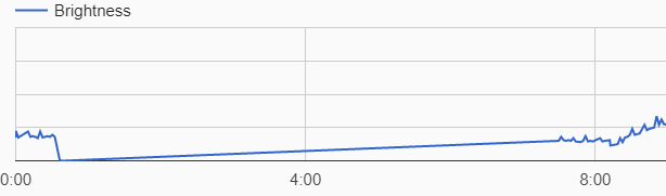
I do have the same problem with my brightness sensor, because the value stays equal to 0 during the night Right now, home assistant checks if it's about to write a value equal to the last one, and does nothing when that's the case.
Maybe it could write a maximum of 2 similar values, and just edit the time of the last one while the value doesn't change ?
|

|
I was going to file the very same bug report for a pilight weather sensor. Here are my fifty cent to the proposed solutions:
|
|
I just tried to add |
|
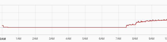
Looks like the new charts of Before
After
|
|
yes, it's fixed here too. I think this issue can be closed. |
|
@bokub that's super awesome ! big fan of the new chartJS integration |
|
Yep, can confirm that. The new charts fix this issue. |
|
@Eugen4 can you close your issue please ? |
Home Assistant release (
hass --version):0.57.2
Component/platform:
history
Description of problem:
Temperate chart doesn't show actual temperature.
When same temperature values comes from sensor by mqtt, it is ignored by history component due to no changes in state. When state changes (after minutes or hours) 2 dots on the charts connects by single straight line. This way of chart drawing is not correct because doen't represent actual temperature.
Expected:
I expect to see on the chart actual temperature - horizontal line until state is changed.
See attached example:
Problem-relevant
configuration.yamlentries and steps to reproduce:The text was updated successfully, but these errors were encountered: