How to plot EBM explain_global().data() customly: EBM Shape Plot is cut at a certain x-value. ebm_global.data(i)["names"] only features a subset of potential x values. #325
Comments
|
Hi @NicoHambauer -- Just looking at your graphs, it appears that your plotting code is drawing straight lines between points located at the center of the bins. That isn't an exact representation of how the model works which is leading to your discrepancy at the boundaries. Let's say you had 3 samples and a feature with the following values (1,2,3). The EBM binning code would separate these values into 3 bins by putting cut points at 1.5 and 2.5. When evaluating an EBM and during graphing there should be a constant score in the ranges between -inf and 1.5, between 1.5 and 2.5 and between 2.5 to +inf. We only display our graphs though between the min and max feature value since it isn't helpful to graph between -inf and +inf. I believe your graphing code is instead putting a point at 1.25 (the average between 1 and 1.5), a point at 2 (the average between 1.5 and 2.5) and a point at 2.75 (the average between 3 and 2.5). If that's true, the reason for your graph not going up to 99999 is because your upper point is located between 99999 and the highest cut value. In my example above that would be equivalent to having the graph go up to the 2.75 value instead of 3. -InterpretML team |
|
Dear interpret-ml team,
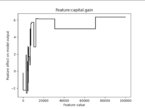
As I see therefore the problem seems to be in my plotting. Since we are publishing this document in an information systems conference we wanted to have a unified plot layout across other models. Is there any hints you could give me to improve my implementation, e.g. pointing towards where i can find the actual implementation of that plot in using show() that pyplot is using? I understood now, that the difference between my custom plot is, that instead of connecting the points (x,y) stored in the respective ebm_global.data() object, I need to ensure the same y value for the spans of the points included in the x array (ebm_global.data(i)["names"][:-1]). So this will probably fix my custom plot now, however maybe I can refer to that implementation and use it for my custom plotting Best regards and thanks in advance!! |
|
Here's the function for plotting continuous features: -InterpretML team |
|
Dear InterpretML team!
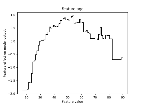
For anyone else reading this issue here is my code used for custom plotting: def make_plot_ebm(data_dict, feature_name, model_name, dataset_name, num_epochs='', debug=False):
x_vals = data_dict["names"].copy()
y_vals = data_dict["scores"].copy()
# This is important since you do not plot plt.stairs with len(edges) == len(vals) + 1, which will have a drop to zero at the end
y_vals = np.r_[y_vals, y_vals[np.newaxis, -1]]
# This is the code interpretml also uses: https://github.com/interpretml/interpret/blob/2327384678bd365b2c22e014f8591e6ea656263a/python/interpret-core/interpret/visual/plot.py#L115
# main_line = go.Scatter(
# x=x_vals,
# y=y_vals,
# name="Main",
# mode="lines",
# line=dict(color="rgb(31, 119, 180)", shape="hv"),
# fillcolor="rgba(68, 68, 68, 0.15)",
# fill="none",
# )
#
# main_fig = go.Figure(data=[main_line])
# main_fig.show()
# main_fig.write_image(f'plots/{model_name}_{dataset_name}_shape_{feature_name}_{num_epochs}epochs.pdf')
# This is my custom code used for plotting
x = np.array(x_vals)
if debug:
print("Num cols:", num_cols)
if feature_name in num_cols:
if debug:
print("Feature to scale back:", feature_name)
x = scaler_dict[feature_name].inverse_transform(x.reshape(-1, 1)).squeeze()
else:
if debug:
print("Feature not to scale back:", feature_name)
plt.step(x, y_vals, where="post", color='black')
# plt.fill_between(x, lower_bounds, mean, color='gray')
# plt.fill_between(x, mean, upper_bounds, color='gray')
plt.xlabel(f'Feature value')
plt.ylabel('Feature effect on model output')
plt.title(f'Feature:{feature_name}')
plt.savefig(f'plots/{model_name}_{dataset_name}_shape_{feature_name}_{num_epochs}epochs.pdf')
plt.show()Again huge thanks! |
Hi dear interpretML team!
I love your work!
However, i am facing an issue while I wanted to correct a plot for a paper in publishing process (conditional accept).
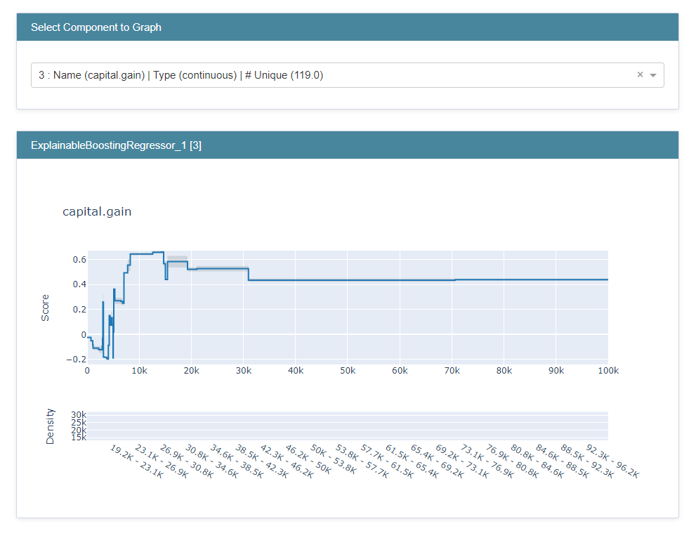
Here is an image of the plot I have (the feature capital.gain is under review):
I saw there is a dependence to the parameter max_bins which defaults to 256. If I turn that parameter up, I receive a bigger range of plot values on the x-axis, however still not the whole range for this feature is included in the shape plot.
amount of x values is 79 but only ranges to 70654.5 while the max value of this feature is 99 999 using max_bins=256 and also Gam Splines takes 99 999 as max value for this feature:
The code I use for plotting is as follows:
Defining a function that takes my data and plots my plots customly:
Data used: including a custom loader for the reknown adult dataset:
function to make the actual custom plot used above:
The text was updated successfully, but these errors were encountered: