Show Write-State on Object-View #1317
Comments
|
Why this is needed? In "non expertmode" all states that are read-only can not be set at all ... and in expert mode it is allowed ... so non expert mode should already have it indirectly. Please provide more details why this is needed? |
|
Hi Ingo, sorry - missed the answer. |
|
|

|
I'm not sure if this * is really "underatsndable" ... Dumb question: why not extending the "state value mouseover-thingy and add a writable: yes or such at the bottom, maybe after a line break or such? |
|
Instead of using the value column to reflect the changeable status of the state, put a lock (open or locked) into the settings column. If change the read/write status you can directly change it there or you just ignore this or grey it out.
|

Either that - or since we already use some colors and should think about to add a color-legend somewhere:
I don't like the asterisk as well - on the first look it looked like dirt on my monitor and was pretty confusing. |
|
I think colors are already used for quality, so they are "no option" in my eyes - we wopuld only have the background color :-) |
|
Changing of background colors looks terrifying |
It will take too much place |
|
Then maybe really makeing the tooltip with value "Longer "by adding a writeable" at the end or such |
|
Alternatively we could add it only in the "pencil dialog" where you can set a value and show a red warning "please not this state is not writeable...." |

|
I would prefer the tooltip. There is enough space and it is a not that much important information that it needs an icon or color in the object table. |
I expected that. ;)
I don't really like the idea - because you don't get the information "on first sight" - where it would be needed. It will be really annoying to hover over each and every state and wait for the tooltip to get the information. When you examine a new adapter this would take ages. What about a second - vertical standing - pencil in green und red? This would take only a few pixels. |
|
I would prefer then - and do not see the problem why the button to write is not just diabled: I get a warning in the log - but why is it possible at all to write a value? |

I want it. For tests purposes |
This is good idea: But of course it should be somehow shown in main table |

There is no place for any pencils. Read the issues and you will understand that people trying to work with admin on mobile devices and claiming, that they do not see all information |
|
maybe really a different color of the "set value" button together with a red note when it is readonly |
|
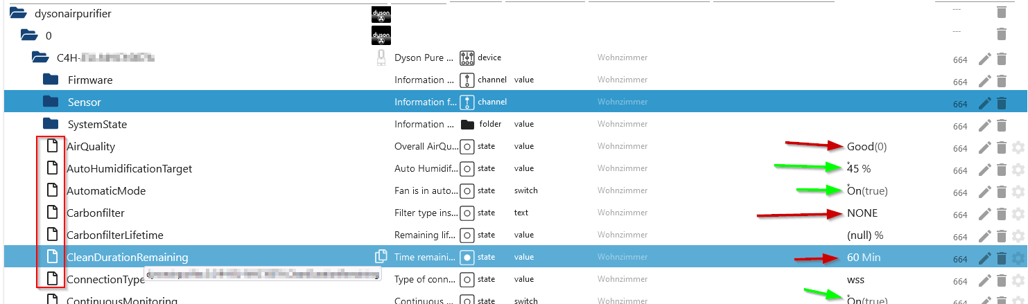
But ... wasn't the initial idea/request to get a better overview in the device tree which states are writeable or readonly? At least that's what is currently implemented. |
|
Yes you are right ... but the options are not that easy, or? So we just discuss alternatives that also "at least allow to see it when needed". In fact it is only an issue also in "expertmode" or? |
|
I'm sorry - but not from my perspective. That's awsome! A great benefit when testing/getting familiar with new adapters or connecting states to a gui.
Maybe the paper sheet in front of the states delivers an option:
|
|
+1 because it uses no additional space. And the Papericon itself contains no information yet. |
In my opinion it must not be outlined but an Icon with an "r" or lock in it and a blank icon would be sufficient as well. So no additional space is needed but is noticeable at once. |
|
Like this? |
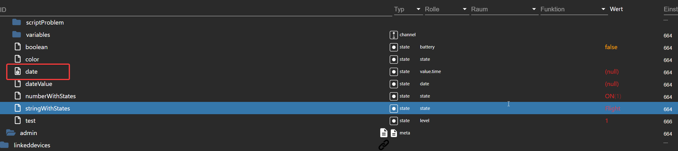
Exactly :) |
|
Not perfect - but okay. It's the most minimalistic way. And the lock looks a bit bold to me.
color is optional - I agree; but fancy. ;-) And may eventually help with the bold lock. Edit: |
|
Another option could be the state icon with the lock under type - to put a lock inside (but this disappears if you switch to the time view) - but matches probably more the meaning to visualize a "read-only" state. The advantage to have in the type or role column would be that you can filter to read-only states as well. |
|
Adjusting the icon is a great idea ... maybe turn it around? icon with a pencil icon for "editable"? and nothing for not? |
thanks. :)
Thats no turn around but exactly what I meant - since a pencil is pretty intuitive to what we like to say. |
|
I implemented it already (twice). if someone does not like it. PR is welcome. Here: https://github.com/ioBroker/ioBroker.admin/blob/master/src-rx/src/components/ObjectBrowser.jsx#L3961 |
|
@GermanBluefox |
Display the write status of a data point ("write": true/false) in the object view. A small graphic (an open lock?) would suffice.
The text was updated successfully, but these errors were encountered: