This series will give a complete description: how to get started with Flutter development, how to quickly develop a complete Flutter app from 0, supporting the high-completion Flutter open source project [A_Complete_Guide_To_Flutter] (), providing the development of Flutter Skills and problem handling, then in-depth source code and actual combat for you to fully analyze Flutter.
- This article mainly deals with: environment construction, Dart language, the foundation of Flutter. *
Flutter's environment is very worry-free, especially for Android developers, only in Android Stuido Install the plug-in on the GitHub Clone Flutter project and execute the flutter doctor command to complete the configuration. In fact, the Chinese website [Build Futter Development Environment] (flutter development environment) is already very Intimate and detailed, you won't encounter any problems from the beginning of the platform.
It is mainly necessary to pay attention here, because of some force majeure reasons, domestic users sometimes need to configure Flutter agents, and domestic users also search in https://pub.flutter-io.cn when searching for Flutter third-party packages , Below is the address that needs to be configured to the environment variable. (It is also quite interesting to run IOS under and Android Studio)
///win can be directly configured to the environment for editing, mac is configured to bash_profile or zsh
export PUB_HOSTED_URL=https://pub.flutter-io.cn //Domestic users need to set
export FLUTTER_STORAGE_BASE_URL=https://storage.flutter-io.cn //Domestic users need to set
Today, the cross-platform development field is dominated by JS, the emergence of Dart language is undoubtedly a clear stream. As a latecomer, the Dart language has many shadows of Java, Kotlin, and JS, so it is undoubtedly very friendly to Android native developers and front-end developers.
The official also provides documentation including iOS, React Native and other developers migrating to Flutter, so please don't worry, the Dart language will not be the threshold for you to master Flutter, even as a developer, you can look at the code even if you don't understand Dart Fumble.
Come on, the following mainly by comparison, briefly talk about some of the characteristics of Dart, mainly related to the use of Flutter.
-var can define variables, such as var tag = "666", which is similar to JS, Kotlin and other languages. At the same time, Dart is also a semi-dynamically typed language and supports closures.
-Dart belongs to a strongly typed language, but you can use var to declare variables, Dart will self-infer data types, so var is actually a compile-time "syntax sugar". dynamic means dynamic type. After being compiled, it is actually an object type. No type checking is performed during compilation, but type checking is performed at runtime.
-The number type in Dart is divided into int and double, where long in java corresponds to the int type in Dart, and there is no float type in Dart.
-Only bool type in Dart can be used for if and other judgments. Unlike JS, it is illegal to use var g = "null"; if(g){}.
-In Dart, switch supports String type.
-Dart does not need to set setter getter method for variables, which is similar to kotlin and other languages. All the basic types and classes in Dart inherit Object. The default value is NULL, with its own getter and setter. If it is final or const, then it has only one getter method.
-In Dart, final and const represent constants, such as final name ='GSY'; const value = 1000000; At the same time, the combination of static const represents a static constant, where the value of const is determined at compile time, and the final value must be run Only then.
-The value under Dart needs to be specified explicitly when used as a character string. For example: int i = 0; print("aaaa" + i); This is not supported, you need to use print("aaaa" + i.toString());, which is different from Java and JS, **So when using dynamic types, you need to be careful not to use the number type as a String. **
-Arrays in Dart are equal to lists, so var list = []; and List list = new List() can simply be seen as the same.
-Under Dart, ?? and ??= are operators, for example: AA ?? "999" means if AA is empty, return 999; AA ??= "999" means if AA is empty , Set AA to 999.
-Dart method can set parameter default value and specify name. For example: getDetail(Sting userName, reposName, {branch = "master"}){} method, if the branch is not set here, the default is "master". Parameter type can be specified or not specified. Call effect: getRepositoryDetailDao("aaa", "bbbb", branch: "dev");
-Dart is not like Java, there are no keywords public, private and other modifiers, _ under the horizontal directly represents private, but there is @protected annotation.
-Multiple constructors in Dart can be realized by the following code. There can only be one default constructor, and a model with empty parameters can be created through the Model.empty() method. In fact, the method name is as you like, and when the variable is initialized, you only need to pass this.name in the constructor Can be specified in:
class ModelA {
   String name;
   String tag;

   //The default constructor, assigned to name and tag
   ModelA(this.name, this.tag);

   //Return an empty ModelA
   ModelA.empty();

   //Return a ModelA with name set
   ModelA.forName(this.name);
}
Flutter supports async/await, as shown in the following code, async/await is actually just syntactic sugar, and it will eventually be compiled into a "Future" object returned from Flutter, and then through the thenGo to the next step. If it returnsFuture, then you can use then().then.()` streaming.
  ///The simulation waits for two seconds and returns OK
  request() async {
    await Future.delayed(Duration(seconds: 1));
    return "ok!";
  }

  ///After getting "ok!", modify "ok!" to "ok from request"
  doSomeThing() async {
    String data = await request();
    data = "ok from request";
    return data;
  }

  ///Print result
  renderSome() {
    doSomeThing().then((value) {
      print(value);
      ///Output ok from request
    });
  }
-SetState in Flutter is very visual of React Native, and Flutter also manages the state of the data through the state across frames, which will be discussed in detail later.
-Everything is rendered by Widget in Flutter, and the Widget is returned through the build method. This is the same mode as in React Native, which returns the component to be rendered through the render function.
-The async* / yield corresponding to Stream can also be used for asynchronous, which will be described later.
In Flutter, all displays are Widgets, and Widgets are the foundation of everything, and use responsive mode for rendering.
We can modify the data, and then set the data with setState, Flutter will automatically update the Widget with the bound data, So all you need to do is implement the Widget interface, and bind it with the data.
Widgets are divided into stateful and stateless. In Flutter, each page is a frame, and statelessness is maintained at that frame. Stateful widgets actually create new ones when the data is updated. Widget, but State realizes the synchronous saving of data across frames.
Here is a small tip. When you enter
stlin the code box, you can automatically pop up the template option for creating stateless controls, and when you enterstf, you will pop up the template option for creating stateful widgets.When the code is formatted, the commas inside and outside the brackets will affect the position of the line break during formatting.
If you feel that the default line break is too short, you can set the value you accept in Settings-Editor-Code Style-Dart-Wrapping and Braces-Hard wrap at.
Go directly to the topic, as shown in the following code is a simple implementation of stateless widget. Inherit StatelessWidget and return a laid out widget through the build method. Maybe you are still not familiar with Flutter's built-in controls, but Don't worry, take it easy, we will introduce it in detail later, you just need to know that a stateless Widget is so simple.
Widget and Widget are nested by child:. Some of the widgets can only have one child, such as the Container below; some widgets can have multiple children, that is, children, such as `Column layout, the code below is the Container Widget nested Text Widget.
import'package:flutter/material.dart';

class DEMOWidget extends StatelessWidget {
  final String text;

  //Data can be passed in through the constructor
  DEMOWidget(this.text);

  @override
  Widget build(BuildContext context) {
    //Return the control you need here
    //There is no comma at the end here, which is different for formatting code.
    return Container(
      //White background
      color: Colors.white,
      //Dart syntax, ?? means that if the text is empty, it returns the content after the trailing number.
      child: Text(text ?? "This is stateless DMEO"),
    );
  }
}
Continue to the inline theme, the following code is a simple implementation of stateful widgets. What you need to create and manage is mainly State, and build controls through State's build method. In State, you can dynamically change the data. After setState, the changed data will trigger the Widget to rebuild and refresh. In the code below, after two seconds, the text is displayed as *"This changes the value" *.
The following code can also be seen, the main declaration cycle in State are:
- initState: Initialization, theoretically only initialized once, in the second chapter, we will talk about special cases.
- didChangeDependencies: Called after initState, you can get other State at this time.
- dispose: destroyed, it will only be called once.
Did you see that Flutter is actually that simple! Your focus is only on: creating your StatelessWidget or StatefulWidget. **All you need is to stack your layout in build, then add the data to the Widget, and finally change the data through setState to achieve the screen change. **
import'dart:async';
import'package:flutter/material.dart';

class DemoStateWidget extends StatefulWidget {

  final String text;

  ////Pass the value through the constructor
  DemoStateWidget(this.text);

  ///Mainly responsible for creating state
  @override
  _DemoStateWidgetState createState() => _DemoStateWidgetState(text);
}

class _DemoStateWidgetState extends State<DemoStateWidget> {

  String text;

  _DemoStateWidgetState(this.text);

  @override
  void initState() {
    ///Initialization, this function is only called once in the life cycle
    super.initState();
    ///Time 1 second
    new Future.delayed(const Duration(seconds: 1), () {
      setState(() {
        text = "This changes the value";
      });
    });
  }

  @override
  void dispose() {
    ///destroy
    super.dispose();
  }

  @override
  void didChangeDependencies() {
    /// Called when a dependency of this [State] object changes after initState.
    super.didChangeDependencies();
  }

  @override
  Widget build(BuildContext context) {
    return Container(
      child: Text(text ?? "This is stateful DMEO"),
    );
  }
}
There are nearly 30 built-in [Layout Widgets] (https://flutterchina.club/widgets/layout) in Flutter, among which Container, Padding, Center, Flex, Stack, Row, Column, ListView, etc. are commonly used, below Briefly explain their characteristics and use.
| Type | Features | | --------- | --------------------------------------- -| | Container | There is only one child widget. The default is full, including padding, margin, color, width and height, decoration and other configurations. | | Padding | There is only one child widget. Only used to set Padding, often used to nest children, set padding for children. | | Center | There is only one child widget. Only used for centering display, often used for nesting child, and setting the center for child. | | Stack | There can be multiple child widgets. The child widgets are stacked together. | | Column | There can be multiple child widgets. Vertical layout. | | Row | There can be multiple child widgets. Horizontal layout. | | Expanded | There is only one child widget. Fill in Column and Row. | | ListView | There can be multiple child widgets. Do it yourself. |
- Container: The most commonly used default control, but in fact it is a template composed of multiple built-in controls, can only contain a
child, support padding, margin, color, width and height, decoration (general configuration border and shadow) Waiting for configuration, in Flutter, not all controls have properties such as width, height, padding, margin, color, etc., so there will be Widgets such as Padding and Center.
    new Container(
        ///4 weeks of maring
        margin: EdgeInsets.all(10.0),
        height: 120.0,
        width: 500.0,
        ///Transparent black mask
        decoration: new BoxDecoration(
            ///Radian is 4.0
            borderRadius: BorderRadius.all(Radius.circular(4.0)),
            ///If you set the color of decoration, you cannot set the color of Container.
            color: Colors.black,
            ///frame
            border: new Border.all(color: Color(GSYColors.subTextColor), width: 0.3)),
        child:new Text("666666"));
- Column and Row are absolutely necessary layouts, and horizontal and vertical layouts are also the most common scenes in daily life. As shown below, they often have these property configurations: the main axis direction is start or center, etc.; the secondary axis direction is start or center, etc.; mainAxisSize is the full size, or only the minimum size is displayed according to the child widget.
//Principal axis direction, Column's vertical direction, Row's horizontal direction
mainAxisAlignment: MainAxisAlignment.start,
//The default is the maximum full, or the minimum size is displayed according to the child
mainAxisSize: MainAxisSize.max,
//The direction of the secondary axis, the horizontal direction of Column, the vertical direction of Row My
crossAxisAlignment: CrossAxisAlignment.center,
- Expanded represents the role of average filling in Column and Row. When two exist, the default is equal to full. At the same time, you can set the
flexattribute to determine the ratio.
    new Column(
     ///The main axis is centered, that is, centered vertically
     mainAxisAlignment: MainAxisAlignment.center,
     ///The size is displayed according to the minimum
     mainAxisSize: MainAxisSize.min,
     ///Horizontal also centered
      crossAxisAlignment: CrossAxisAlignment.center,
      children: <Widget>[
        ///flex defaults to 1
        new Expanded(child: new Text("1111"), flex: 2,),
        new Expanded(child: new Text("2222")),
      ],
    );
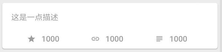
Next, let's write a more complicated control. First, we create a private method _getBottomItem and return an Expanded Widget, because later we need to fill the Widget returned by this method under Row on average.
As noted in the code, the layout is mainly a centered Icon icon and text, with a padding of 5.0 in the middle:
  ///Return an Item centered with icon and text
  _getBottomItem(IconData icon, String text) {
    ///Row full of horizontal layout
    return new Expanded(
      flex: 1,
      /// Center display
      child: new Center(
        ///Horizontal layout
        child: new Row(
          ///The main axis is centered, that is, horizontally centered
          mainAxisAlignment: MainAxisAlignment.center,
          ///The size is filled according to the maximum
          mainAxisSize: MainAxisSize.max,
          ///Vertical center
          crossAxisAlignment: CrossAxisAlignment.center,
          children: <Widget>[
            ///One icon, size 16.0, gray
            new Icon(
              icon,
              size: 16.0,
              color: Colors.grey,
            ),
            ///interval
            new Padding(padding: new EdgeInsets.only(left:5.0)),
            ///Display text
            new Text(
              text,
              //Set the font style: gray color, font size 14.0
              style: new TextStyle(color: Colors.grey, fontSize: 14.0),
              //Exceed the omission for...display
              overflow: TextOverflow.ellipsis,
              //The longest line
              maxLines: 1,
            ),
          ],
        ),
      ),
    );
  }

Then we put the above method into the new layout, the following process and code:
- The first is that
ContainercontainsCard, which is used to implement rounded corners and shadows quickly and easily. - Then the following includes
FlatButtonto realize the click, and the padding to realize the margin. - Next, two child widgets are included vertically through
Column, one isContainerand the other isRow. - The Widget returned by the
_getBottomItemmethod is used in Row. The effect is as shown below.
  @override
  Widget build(BuildContext context) {
    return new Container(
      ///Card packaging
      child: new Card(
           /// Increase click effect
          child: new FlatButton(
              onPressed: (){print("clicked");},
              child: new Padding(
                padding: new EdgeInsets.only(left: 0.0, top: 10.0, right: 10.0, bottom: 10.0),
                child: new Column(
                  mainAxisSize: MainAxisSize.min,
                  children: <Widget>[
                    ///Text description
                    new Container(
                        child: new Text(
                          "This is a little description",
                          style: TextStyle(color: Color(GSYColors.subTextColor),
                            fontSize: 14.0,
                          ),
                          ///The longest three lines, more than ... show
                          maxLines: 3,
                          overflow: TextOverflow.ellipsis,
                        ),
                        margin: new EdgeInsets.only(top: 6.0, bottom: 2.0),
                        alignment: Alignment.topLeft),
                    new Padding(padding: EdgeInsets.all(10.0)),

                    ///Three equally distributed horizontal icon text
                    new Row(
                      crossAxisAlignment: CrossAxisAlignment.start,
                      children: <Widget>[
                        _getBottomItem(Icons.star, "1000"),
                        _getBottomItem(Icons.link, "1000"),
                        _getBottomItem(Icons.subject, "1000"),
                      ],
                    ),
                  ],
                ),
              ))),
    );
  }
In Flutter, your layout is often nested layer by layer. Of course, there are other more advanced layout methods, which will not be expanded here.
In addition to the layout widgets in Flutter, there are also interactive display widgets and full page rendering widgets, among which common ones are MaterialApp, Scaffold, Appbar, Text, Image, FlatButton, etc. The following briefly introduces these Wdigets and completes a page.
| Type | Features |
| ----------- | ------------------------------------- --- |
| MaterialApp | Generally used as the homepage entrance of the top level of the APP, configurable themes, multiple languages, routing, etc. |
| Scaffold | General user page hosting Widget, including appbar, snackbar, drawer and other material design settings. |
Appbar | Appbar is generally used for Scaffold, with a title, secondary page return button, etc. Of course, more than that, tabbar, etc. will also need it. |
| Text | Display text, almost all will be used, mainly to set the font style by setting TextStyle style. |
| RichText | Rich text, by setting TextSpan, you can stitch rich text scenes. |
| TextField | Text input box: new TextField(controller: //text controller, obscureText: "hinttext");|
Image | Image loading: new FadeInImage.assetNetwork( placeholder: "Preview", fit: BoxFit.fitWidth, image: "url");|
| FlatButton | Button click: new FlatButton(onPressed: () {},child: new Container());|
Then try inserting the theme again to achieve a simple and complete page. Such as the following code:
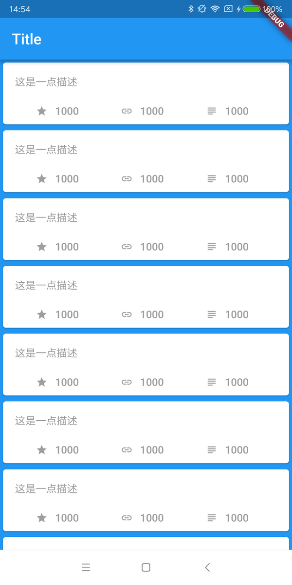
- First we create a StatefulWidget:
DemoPage. - Then in
_DemoPageState, aScaffoldwas created throughbuild. - Scaffold contains an
AppBarand aListView. - AppBar is similar to the title area, where
titleis set as Text Widget. - The body is
ListView, which returns 20 DemoItem Widgets that we created before.
import'package:flutter/material.dart';
import'package:gsy_github_app_flutter/test/DemoItem.dart';

class DemoPage extends StatefulWidget {
  @override
  _DemoPageState createState() => _DemoPageState();
}

class _DemoPageState extends State<DemoPage> {
  @override
  Widget build(BuildContext context) {
    ///Start of a page
    ///If it is a new page, it will bring back button
    return new Scaffold(
      ///Background style
      backgroundColor: Colors.blue,
      ///Title bar, of course, not just the title bar
      appBar: new AppBar(
        ///This title is a Widget
        title: new Text("Title"),
      ),
      ///Official page start
      ///One ListView, 20 items
      body: new ListView.builder(
        itemBuilder: (context, index) {
          return new DemoItem();
        },
        itemCount: 20,
      ),
    );
  }
}
Finally, we create a StatelessWidget as the entry file, implement a MaterialApp, set the above DemoPage as the home page, and execute the page through the main entry.
import'package:flutter/material.dart';
import'package:gsy_github_app_flutter/test/DemoPage.dart';

void main() {
  runApp(new DemoApp());
}

class DemoApp extends StatelessWidget {
  DemoApp({Key key}): super(key: key);

  @override
  Widget build(BuildContext context) {
    return new MaterialApp(home: DemoPage());
  }
}
Well, the first part is finally over. The main explanations here are some simple basic things, suitable for Amway to enter the pit, and more actual combat will be waiting for you to start
- Github: https://github.com/irahulcse/
- Open source Flutter complete project: https://github.com/CarGuo/GSYGithubAppFlutter
- Open source Flutter multi-case learning project: https://github.com/CarGuo/GSYFlutterDemo
- Open source Fluttre combat e-book project: https://github.com/CarGuo/GSYFlutterBook
- [Related article: GeekyAnts Fwlutter Blogs] (https://github.com/CarGuo/GSYGithubAppFlutter)
