Dynamic Form Built With
React&CSS Gridlayout
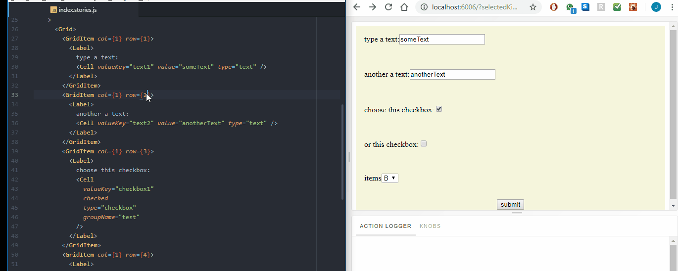


Folio has two major bases Cells for data and Grid for layout. With these components, making a form should be easier than ever. See full examples of folio 👉 https://jalal246.github.io/folio/.
Run locally:
git clone https://github.com/jalal246/folio.gitnpm installnpm run storybook- Go to http://localhost:6006/
Using npm:
npm install --save folio-forms
folio depends on
reactandprop-types. Please make sure you have those installed as well.
unpkg
https://unpkg.com/folio-forms/dist/
const myForm = ({ mySubmitFunc }) => (
  <Folio>
    <Form onSubmit={mySubmitFunc}>
      <Grid>
        <GridItem row={1} col={1}>
          <Cell valueKey="myFullName" type="text" />
        </GridItem>
        <GridItem row={2} col={1}>
          <Cell valueKey="myEmail" type="email" />
        </GridItem>
        <button type="submit">submit</button>
      </Grid>
    </Form>
  </Folio>
);

// mySubmitFunc will return: (event, {myFullName: "" myEmail: ""})import Folio, { Form, Grid, Cell, CellItem, GridItem } from "folio-forms";All components accept custom props + children which is required in all except Cell
| property | type | description | default |
|---|---|---|---|
| component | node/function | custom render-component | form |
| onSubmit | function | submit function returns values in all cells (event, {...values}) | () {} |
| property | type | description | default |
|---|---|---|---|
| component | node/function | custom render-component | div |
| col | number | number of columns in grid | |
| colWidth | string | fixed column width | |
| colMinWidth | string | column minimum width | auto |
| colMaxWidth | string | column maximum width | 1fr |
| row | number | number of rows in grid | |
| rowWidth | string | fixed row width | |
| rowMinWidth | string | row minimum width | auto |
| rowMaxWidth | string | row maximum width | 1fr |
Used for implicit grid layout.
| property | type | description | default |
|---|---|---|---|
| component | node/function | custom render-component | div |
| row | number | number of columns in grid | |
| toRow | number | column width | |
| col | number | column minimum width | 0 |
| toCol | number | column maximum width | |
| isCenter | Boolean | number of rows in grid | false |
| isHorizontal | Boolean | true |
Essential to register values in the store, return values it when submit.
| property | type | description | default |
|---|---|---|---|
| component | node/function | custom render-component | div |
| valueKey | string | key used to store value in values object | type + id + groupname (if any) |
| id | string | auto generated by function | |
| value | string | if type not button | "" |
| checked | Boolean | if type button | false |
| type | Boolean | text | |
| groupName | string | only for button toggle |
Used with list to wrap children.
| property | type | description | default |
|---|---|---|---|
| component | node/function | custom render-component | option |
Enable end-user to create, design and shape forms.
This project is licensed under the MIT License