Responsive issue on phone #101
Comments
|
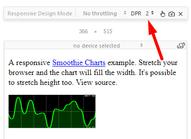
Seems to be a bug related to pixel scaling. In Firefox, setting the DPR in responsive mode triggers behaviour that seems to match what you describe.
Do you want to take a look at fixing this? Seems like the bug might be in the |
|
I don't have so much experience and the time is short. However, I'll give it a try. |
|
I found in this link https://www.quirksmode.org/blog/archives/2013/12/desktop_media_q_1.html some bugs about the Divice Pixel Ratio (DPI). There are some differences between PC and mobile browsers. In particular, new mobile phones have a DPR of 2 whereas PC browsers have a ratio of one (please read the link for further details). You were right @drewnoakes, apparently the bug is in the resize function. After the definition and declaration of the "dpr" variable, I bypassed the value of "dpr" to one, i.e: SmoothieChart.prototype.resize = function () { Likely my solution is not the best, but it works for me. I hope it'll be useful for someone else too. If there is another better solution, I'll be waiting for it. |
|
Fixed in 1.35.0. |
I've been using smoothie for a personal project. Evething was fine until I used the responsive feature.
When I open the project on the browser of my android mobile phone, the chart is placed at the left half of the screen, however in my computer the chart looks great and uses the full with of the browser window.
I figured out that is not only my project which has got this issue, but also the responsive example http://smoothiecharts.org/examples/responsive.html has the problem too. I've trying with other android phones and the behaviour is the same.
By the time being, I did a non-elegant solution by using jQuery on my .html file that changes the width of the canvas chart from 100% to 200% when the screen is less than 900px. This solution don't fix completely the problem because, even though it looks fine with the normal sizes of the pc and phone screens, the phone add a white space out of the screen (you can see the white space by scrolling to the right, in a normal operation you shouldn´t scroll to the sides) and obviously when I shrink the pc screen less than 900px the chart is out of the browser window.
I hope someone can help me out by changing some stuff in the smoothie library.
The text was updated successfully, but these errors were encountered: