There are some tutorials on DC about how to use IRIS as data provider for Power BI. Even though, I decide to did a quick tutorial, specific on how to use cubes created on FHIR schema data as data source for Power BI dashboards.
This example uses Microsoft Power BI Desktop. You can get a trial version here.
If you need more information on setting up connection between IRIS and Power BI (as Cache as well), please, search for "Power BI" in DC.
So, let's started.
Note: this document was created on a previous cube version and the dimensions shown below aren't available anymore. However, you can follow the same steps and easily adapt them to the new structure.
In this case, I've used a previous connection to IRIS. If you need help in order to create a new one, please refer to document.
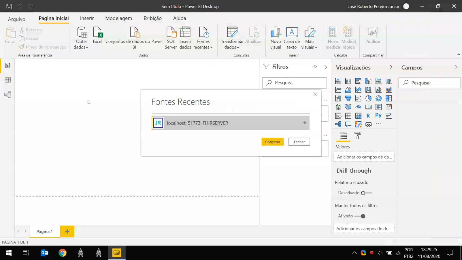
The IRIS connector for Power BI retrieves the star schema for cubes within the namespace defined in connection parameters. So, you can select the fact table and its dimensions as source for your dashboard.
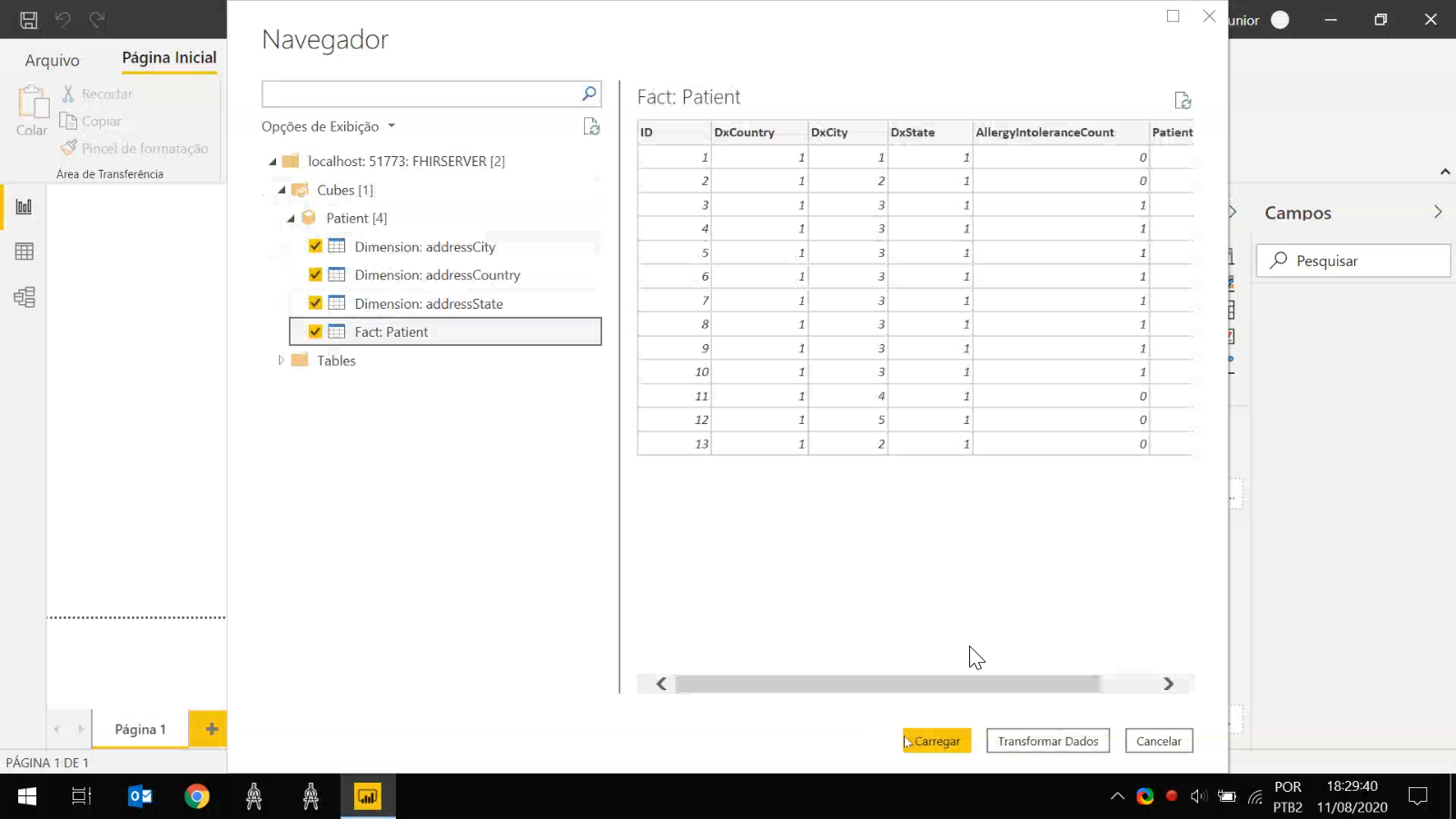
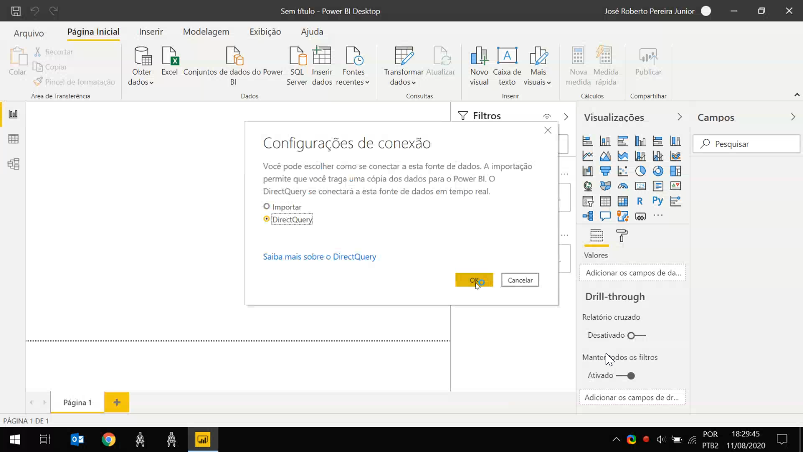
You can import data or create a link to it in IRIS server. In this case, I chose the direct link option instead of import data.
For some reason, some relations between star schema tables should not be recognized by Power BI. Without such relations, features like drill down could not work properly.
So, after connecting to IRIS, check if all expected relations were recognized by Power BI.
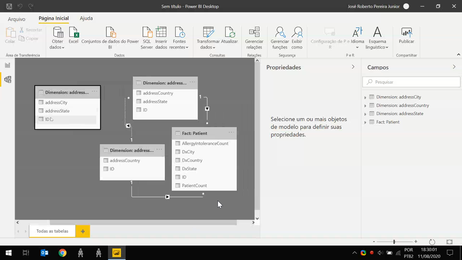
If something was missed, you can define relations manually, like shown below.
After creating and configure the connection to IRIS, it's time to setup a simple dashboard.
First, select a chart - I've selected clustered bar chart. Then, you need to define data for axis and values - the vertical and horizontal axes respectively in this type of chart.
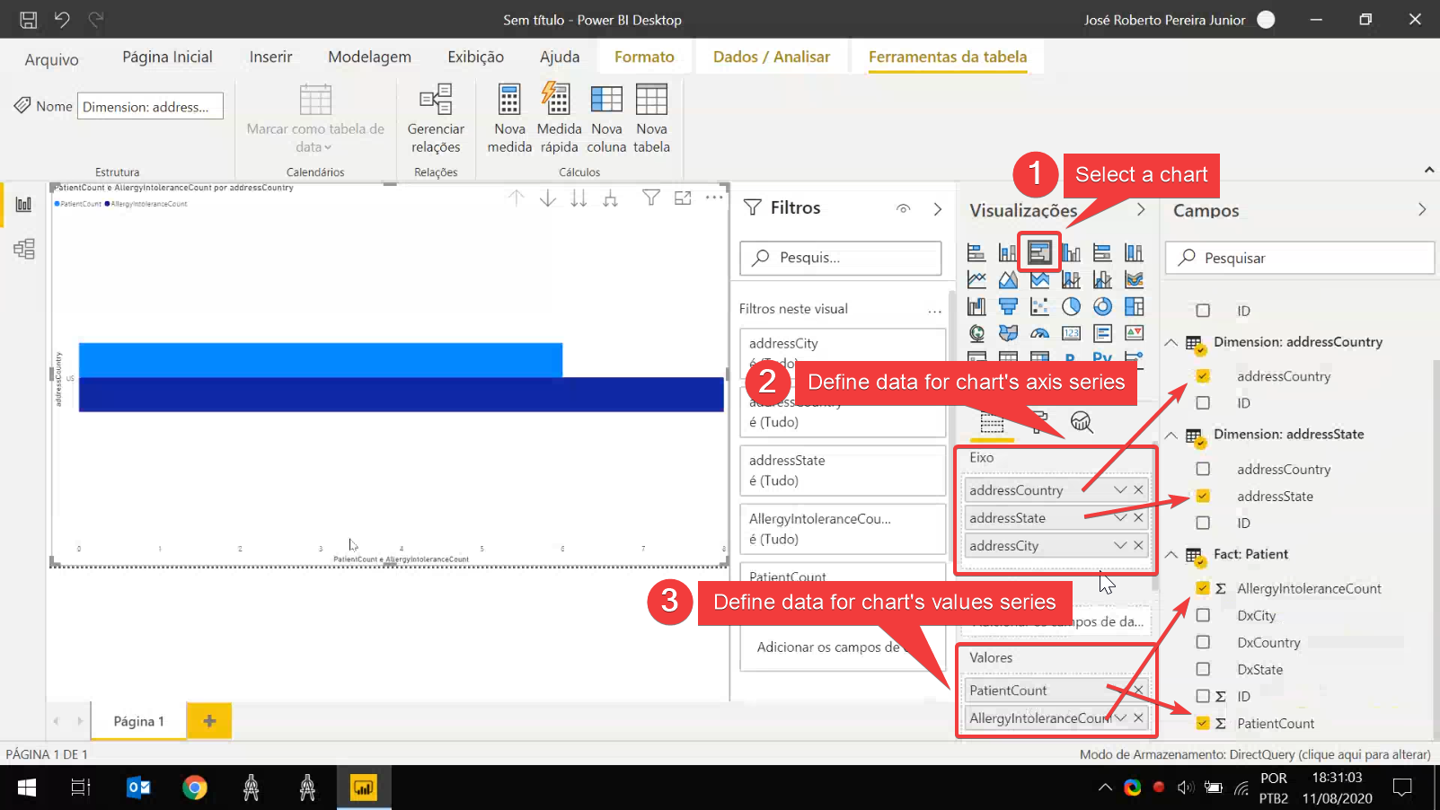
Note that measures defined in fact table was automatically recognized. A measure is pictured in Power BI by a summation symbol (Σ) beside fact table's fields.
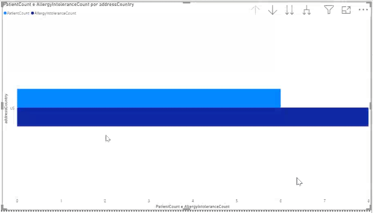
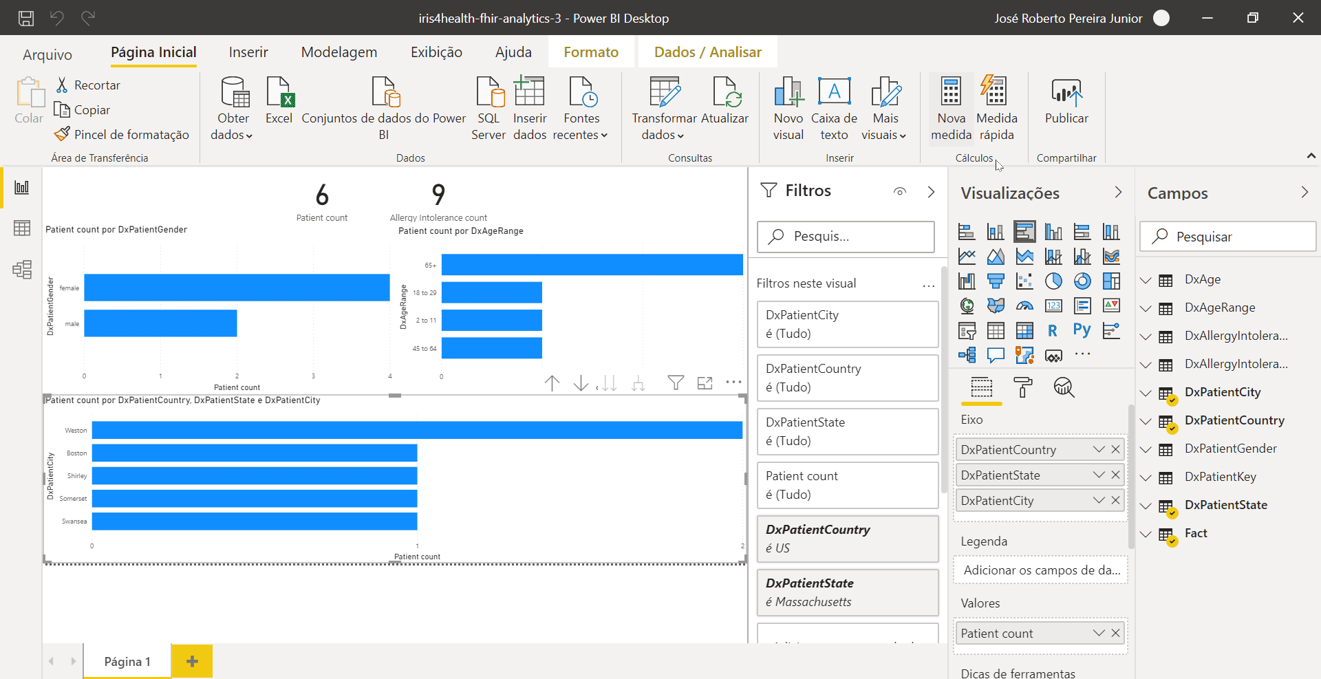
If relations between tables was corrected imported and setup, Power BI can automatically infer drill down logic, as shown below.
Optionally, you can use filters applied to the dashboard as input for feed up external Web pages. In order to do that, create a new measure and follow the steps illustrated below:
SelectedPatientsResourceList =
// Create a measure called SelectedPatientsResourceList which generates a URL to a Web interface, passing out the selected patients resources IDs
CONCATENATE(
    "http://localhost:32783/csp/user/fhirUI/index.html?PatientList=",
    CONCATENATEX(
        // Filter DxPatientKey table by IDs in selected ones in field DxPatientKey of Fact table
        FILTER(
            'DxPatientKey',
            'DxPatientKey'[ID] IN VALUES('Fact'[DxPatientKey])
        ),
        // Use values in DxPatientResourceId column for concatenation
        'DxPatientKey'[DxPatientResourceId],
        // Concatenates using a comma as separator
	    ","
    )
)
In this example a page using FHIR REST API is used to show patients information. More information here.