generated from nmfs-opensci/NOAA-quarto-simple
-
Notifications
You must be signed in to change notification settings - Fork 32
/
summarizing_data.qmd
1446 lines (1177 loc) · 56.7 KB
/
summarizing_data.qmd
1
2
3
4
5
6
7
8
9
10
11
12
13
14
15
16
17
18
19
20
21
22
23
24
25
26
27
28
29
30
31
32
33
34
35
36
37
38
39
40
41
42
43
44
45
46
47
48
49
50
51
52
53
54
55
56
57
58
59
60
61
62
63
64
65
66
67
68
69
70
71
72
73
74
75
76
77
78
79
80
81
82
83
84
85
86
87
88
89
90
91
92
93
94
95
96
97
98
99
100
101
102
103
104
105
106
107
108
109
110
111
112
113
114
115
116
117
118
119
120
121
122
123
124
125
126
127
128
129
130
131
132
133
134
135
136
137
138
139
140
141
142
143
144
145
146
147
148
149
150
151
152
153
154
155
156
157
158
159
160
161
162
163
164
165
166
167
168
169
170
171
172
173
174
175
176
177
178
179
180
181
182
183
184
185
186
187
188
189
190
191
192
193
194
195
196
197
198
199
200
201
202
203
204
205
206
207
208
209
210
211
212
213
214
215
216
217
218
219
220
221
222
223
224
225
226
227
228
229
230
231
232
233
234
235
236
237
238
239
240
241
242
243
244
245
246
247
248
249
250
251
252
253
254
255
256
257
258
259
260
261
262
263
264
265
266
267
268
269
270
271
272
273
274
275
276
277
278
279
280
281
282
283
284
285
286
287
288
289
290
291
292
293
294
295
296
297
298
299
300
301
302
303
304
305
306
307
308
309
310
311
312
313
314
315
316
317
318
319
320
321
322
323
324
325
326
327
328
329
330
331
332
333
334
335
336
337
338
339
340
341
342
343
344
345
346
347
348
349
350
351
352
353
354
355
356
357
358
359
360
361
362
363
364
365
366
367
368
369
370
371
372
373
374
375
376
377
378
379
380
381
382
383
384
385
386
387
388
389
390
391
392
393
394
395
396
397
398
399
400
401
402
403
404
405
406
407
408
409
410
411
412
413
414
415
416
417
418
419
420
421
422
423
424
425
426
427
428
429
430
431
432
433
434
435
436
437
438
439
440
441
442
443
444
445
446
447
448
449
450
451
452
453
454
455
456
457
458
459
460
461
462
463
464
465
466
467
468
469
470
471
472
473
474
475
476
477
478
479
480
481
482
483
484
485
486
487
488
489
490
491
492
493
494
495
496
497
498
499
500
501
502
503
504
505
506
507
508
509
510
511
512
513
514
515
516
517
518
519
520
521
522
523
524
525
526
527
528
529
530
531
532
533
534
535
536
537
538
539
540
541
542
543
544
545
546
547
548
549
550
551
552
553
554
555
556
557
558
559
560
561
562
563
564
565
566
567
568
569
570
571
572
573
574
575
576
577
578
579
580
581
582
583
584
585
586
587
588
589
590
591
592
593
594
595
596
597
598
599
600
601
602
603
604
605
606
607
608
609
610
611
612
613
614
615
616
617
618
619
620
621
622
623
624
625
626
627
628
629
630
631
632
633
634
635
636
637
638
639
640
641
642
643
644
645
646
647
648
649
650
651
652
653
654
655
656
657
658
659
660
661
662
663
664
665
666
667
668
669
670
671
672
673
674
675
676
677
678
679
680
681
682
683
684
685
686
687
688
689
690
691
692
693
694
695
696
697
698
699
700
701
702
703
704
705
706
707
708
709
710
711
712
713
714
715
716
717
718
719
720
721
722
723
724
725
726
727
728
729
730
731
732
733
734
735
736
737
738
739
740
741
742
743
744
745
746
747
748
749
750
751
752
753
754
755
756
757
758
759
760
761
762
763
764
765
766
767
768
769
770
771
772
773
774
775
776
777
778
779
780
781
782
783
784
785
786
787
788
789
790
791
792
793
794
795
796
797
798
799
800
801
802
803
804
805
806
807
808
809
810
811
812
813
814
815
816
817
818
819
820
821
822
823
824
825
826
827
828
829
830
831
832
833
834
835
836
837
838
839
840
841
842
843
844
845
846
847
848
849
850
851
852
853
854
855
856
857
858
859
860
861
862
863
864
865
866
867
868
869
870
871
872
873
874
875
876
877
878
879
880
881
882
883
884
885
886
887
888
889
890
891
892
893
894
895
896
897
898
899
900
901
902
903
904
905
906
907
908
909
910
911
912
913
914
915
916
917
918
919
920
921
922
923
924
925
926
927
928
929
930
931
932
933
934
935
936
937
938
939
940
941
942
943
944
945
946
947
948
949
950
951
952
953
954
955
956
957
958
959
960
961
962
963
964
965
966
967
968
969
970
971
972
973
974
975
976
977
978
979
980
981
982
983
984
985
986
987
988
989
990
991
992
993
994
995
996
997
998
999
1000
---
title: Summarizing data
subtitle: Working with a sample
bibliography: ../references.bib
---
<!-- COMMENT NOT SHOW IN ANY OUTPUT: Code chunk below sets overall defaults for .qmd file; these inlcude showing output by default and looking for files relative to .Rpoj file, not .qmd file, which makes putting filesin different folders easier -->
```{r setup, include=FALSE}
knitr::opts_chunk$set(echo = TRUE)
knitr::opts_knit$set(root.dir = rprojroot::find_rstudio_root_file())
source("../globals.R")
```
[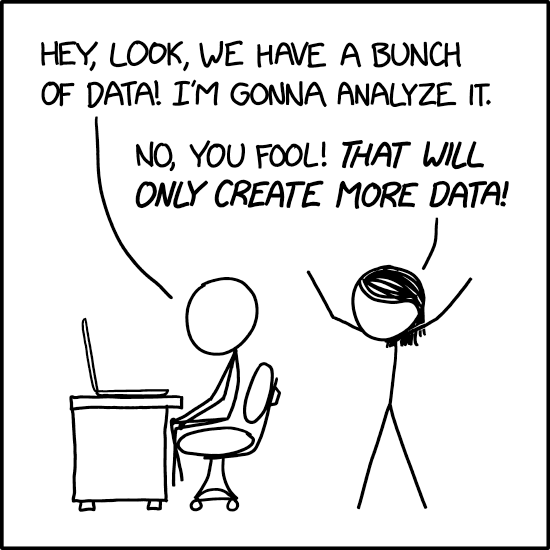{#fig-XKDC2582
fig-alt="Two stick figures in single panel. One sitting at desk states \"Hey, look, we have a bunch of data! I'm gonna analyze it\". The other responds, \"No, you fool! That will only create more data!\""
fig-align="center"}](https://xkcd.com/2582/)
Once we have some data, the next step is often to summarize it. In fact,
we've already done that in some ways. Some statistics like the mean may
be considered a summary of the data. This may be useful because we
prefer large datasets (remember good sampling!), but making sense of a
list of numbers can be really hard! Summaries help us describe, and
eventually compare, datasets, which we are using to infer something
about a population.
Think about it this way. We want to know if several species of iris
(*Iris versicolor*, *setosa* and *virginica*) have similarly-shaped
flowers. Since we can't measure every flower on every plant from these
species, we sample several sites and come up with the following data
(using R's built-in iris dataset, a dataset we will often use).
```{r}
iris
```
<details>
<summary> Getting data into R </summary>
Often in class we will datasets that are included in R. These can
simply be called (we'll learn more about objects when we introduce R in class). Other times we will read in data; how to do that will also be introduced later.
</details>
Overwhelming, isn't it? And this isn't a huge dataset! There are only
150 rows, yet some datasets have tens of thousands! It's really hard (or
impossible) to just look at these numbers and infer anything about the
population. Summary statistics help us get a better mental image of the
distribution of the sample data.
> **Aside**: While summaries can help make sense of data, and eventually
> we'll add p-values to think about things like significance, in best
> case scenarios we don't need this! We are going to focus on graphing
> (visual summaries) and numerical summaries in this section, but
> sometimes the data speaks for itself (or through an easy graph like
> this one!).
>
> [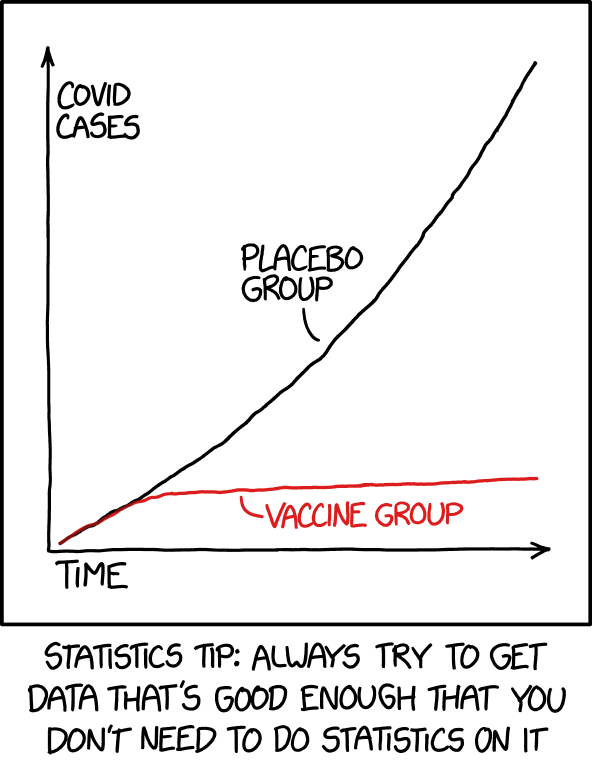{#fig-XKCD2400
> alt="XKCD: Statistics"
> fig-alt="Graph showing a clear difference over time (x-axis) between number of Covid cases (y) in placebo and vaccinated group. Note this not real data (its a comic strip)."
> fig-align="center"}](https://xkcd.com/2400/)
>
> Don't let complicated approaches confuse you! If your findings
> disagree with your (mental or actual) visualization of the data,
> something is likely wrong!
## Types of data
We can summarize data using visual (i.e., graphs) or numerical (e.g.,
summary statistics like the mean) approaches. The specific way we
summarize the data also depends on the type of data. Note, the trait we
are collecting data on may also be called a *variable* (since it varies
across the population and thus sample).
Let's just look at the first few rows of the iris dataset.
```{r}
head(iris)
```
<details>
<summary>What's the data showing? Click on the grey triangle</summary>
We'll use many datasets in class to illustrate points. I don't expect
you to become an expert on any of them, but I will provide some
background along the way. For example, this isn't a botany class, but in
case you are interested, here's some flower morphology.
[{#fig-flower_morphology
fig-alt="Black and white drawing of flower. Notes that petals are the inner parts of the bloom (what we often think of as the flower), while sepals are the outermost parts (we often seen them as the green \"stuff\" around a \"flower\" before it blooms)."
fig-align="center"}](https://commons.wikimedia.org/wiki/File:Sepal2_(PSF).png)
</details>
This dataset includes a few different types of variables.
### Categorical variables
Variables can be categorical (e.g., eye color, or *species* in the iris
dataset). If categorical variables have no clear hierarchical
relationship (again, like eye color and species- one isn't better than
the other), then they are nominal variables. If the categories imply a
rank or order (e.g., freshmen, sophomore, junior, senior; egg, larvae,
pupae, adult) then they are ordinal variables).
### Numeric variables
If data values are based on numbers instead of categories, they are
numeric variables. These can be divided into those are count-based (no
fractions) - we call these discrete data- and those that can take on any
values in a given range - like height or *sepal length* in the iris
dataset- we call these continuous variables.
## Graphical summaries
Visual interpretations or displays of your data are an excellent way to
make patterns, trends, and distributions easier to see (like the comic
above shows). In this section we'll go over a number of graphs. Consider
this is a resource. I don't expect you to know how to make each of these
on your own immediately. We will actually introduce the software we are
using to make these in later sections. Instead, you can return here
later when you are actually making a graph for ideas (and code!). **For
your first read, focus on the images (not the code!)**
While the type of graph you should use will depend on the data (and you
may have several options!) all graphs should have
- A descriptive title
- Move beyond *Y vs. X*. State any patterns you see in the title
to help the viewer know what they are looking for! Honest
interpretation of data is always paramount, but in producing a
graph you will already be making visualization decisions.
- Labeled axes (measure and unit)
- What did you measure, and using what (e.g. Sepal length (cm)).
- Data points
- You have to actually graph something!
Other parts should only be included when needed, like
- A legend
- Only needed for graphs with multiple datasets where color,
shape, or some other visual cue indicates something to the
viewer that would be unclear without added information.
- Trendlines
- Can be used to show the general/overall relationship between
variables. If you use these, make sure to use the right ones!
Don't fit a straight line to a curved relationship!
### Single variable
#### Numerical data
##### Histograms
Occasionally you only want to show the distribution for a single
numerical variable (or how the data themselves are distributed). For
example, we could want to display sepal lengths for all the *Iris
virginica* we sampled. We could do this using a **histogram**.
```{r}
#| label: fig-normal_virginica_plot
#| fig-cap: "Example of approximately normal data"
label_size <- 2
title_size <-2.5
hist(iris[iris$Species == "virginica", "Sepal.Length"],
main = expression(paste("Sepal lengths of ",italic("I. virginica"))),
xlab = "Sepal Length (cm)",
cex.lab=label_size, cex.axis=label_size, cex.main=title_size,
cex.sub=label_size, col = "blue")
```
The above plot is produced using functions available in all R installs.
Many plots now use *ggplot2*, a package you have to install (don't
worry, we'll get there!). However, since you may come back to this
later, I'll also show how this graph using ggplot2, and we'll use that
approach for most of the other graphs in this course.
```{r, message=F}
#| label: fig-normal_virginica_ggplot
#| fig-cap: "Example of approximately normal data"
library(ggplot2)
ggplot(iris[iris$Species == "virginica",],
aes(x=Sepal.Length)) +
geom_histogram( fill="blue", color="black") +
labs(title=expression(paste("Sepal lengths of ",italic("I. virginica"))),
x= "Sepal length (cm)",
y= "Frequency")
```
Histograms put the data in bins (usually automatically set by software,
but you can update!) and then show the number of samples that fall into
each bin. This allows a quick estimate (look at the y, or vertical,
axis) of how many samples were taken. The above images also allows us to
begin to consider the bounds/range of the data (\~4.5-8 cm), which gives
information on the minimum and maximum values. We can also see lengths
around 6-7 cm are most common.
<details>
<summary>Why do these graphs look slightly different? (Click the grey
triangle to see the answer)</summary>
Most programs, including R, have autobreak functions that separate the
data into bins for histograms. Notice ggplot2 uses a different algorithm
to bin the data. That also impacts what you see! Users, however, can
override these, so it's worth noting that differences in bin size can
influence what distributions look like.
```{r}
#| label: fig-charts
#| fig-cap: "The number of bins changes how histograms look ."
#| fig-subcap:
#| - "Auto breaks with ggplot2"
#| - "3 breaks"
#| - "10 breaks"
#| layout-ncol: 3
hist(iris[iris$Species == "virginica", "Sepal.Length"], main = expression(paste("Sepal lengths of ",italic("I. virginica"))), xlab = "Sepal Length (cm)", cex.lab=label_size, cex.axis=label_size, cex.main=title_size, cex.sub=label_size, col = "blue")
hist(iris[iris$Species == "virginica", "Sepal.Length"], breaks=3, main = "Sepal length histogram, 3 breaks", xlab = "Sepal Length (cm)", cex.lab=label_size, cex.axis=label_size, cex.main=title_size, cex.sub=label_size, col = "blue")
hist(iris[iris$Species == "virginica", "Sepal.Length"], breaks=10, main = "Sepal length histogram, 10 breaks", xlab = "Sepal Length (cm)", cex.lab=label_size, cex.axis=label_size, cex.main=title_size, cex.sub=label_size, col = "blue")
```
or, in ggplot2,
```{r, message=F}
#| label: fig-charts-ggplot2
#| fig-cap: "The number of bins changes how histograms look (now in ggplot2)."
#| fig-subcap:
#| - "Auto breaks with ggplot2"
#| - "3 breaks"
#| - "10 breaks"
#| layout-ncol: 3
ggplot(iris[iris$Species == "virginica",],
aes(x=Sepal.Length)) +
geom_histogram( fill="blue", color="black") +
labs(title=expression(paste("Sepal lengths of ",italic("I. virginica"))),
x= "Sepal length (cm)",
y= "Frequency")
ggplot(iris[iris$Species == "virginica",],
aes(x=Sepal.Length)) +
geom_histogram( fill="blue", color="black", bins = 4) +
labs(title=expression(paste("Sepal lengths of ",italic("I. virginica"), ", 3 breaks")),
x= "Sepal length (cm)",
y= "Frequency")
ggplot(iris[iris$Species == "virginica",],
aes(x=Sepal.Length)) +
geom_histogram( fill="blue", color="black", bins = 11) +
labs(title=expression(paste("Sepal lengths of ",italic("I. virginica"), ", 10 breaks")),
x= "Sepal length (cm)",
y= "Frequency")
```
A similar issue exists for qualitative data in regards to the categories
that are combined/used.
</details>
This distribution of this data is (very) approximately normal. We will
define normality more later (equations!), but for now note the
distribution is roughly symmetric, with tails on either side. Values
near the middle of the range are more common, with the chance of getting
smaller or larger values declining at an increasing rate...
Comparing the above graph to other distributions may be an easier
approach to understanding normality. Consider these graphs.
```{r, message=F}
#| label: fig-cardinals_ggplot2
#| fig-cap: "Example of left-skewed data (ggplot2). Note this is not actual data, only simulated for use in example."
set.seed(19)
cardinals <- round(rbeta(10000,10,2)*50+runif(10000,5,10),3)
ggplot(data.frame(cardinals),
aes(x=cardinals)) +
geom_histogram( fill="red", color="black") +
labs(title="Weight of Westchester cardinals",
x= "Weight (g)",
y= "Frequency")
```
```{r, message=F}
#| label: fig-parrots
#| fig-cap: "Example of normal data. Note this is not actual data, only simulated for use in example."
set.seed(19)
parrots<- round(c(rnorm(1000,400,10)),3)
ggplot(data.frame(parrots),
aes(x=parrots)) +
geom_histogram( fill="green", color="black") +
labs(title="Weight of Westchester parrots",
x= "Weight (g)",
y= "Frequency")
```
```{r, message=F}
#| label: fig-blue_jays
#| fig-cap: "Example of right-skewed data. Note this is not actual data, only simulated for use in example."
set.seed(19)
blue_jays <- round(rbeta(10000,2,8)*100+runif(10000,60,80),3)
ggplot(data.frame(blue_jays),
aes(x=blue_jays)) +
geom_histogram( fill="blue", color="black") +
labs(title="Weight of Westchester blue jays",
x= "Weight (g)",
y= "Frequency")
```
The cardinal (@fig-cardinals_ggplot2) data has a longer left tail and is
not symmetric. We call this left- or negatively-skewed data (since it's
going lower on the x-axis). Compare that to the blue jay
(@fig-blue_jays) data; it has a longer right-tail and is positively- or
right-skewed. Again, note this is all relative to symmetric data like
you see with the parrots (@fig-parrots), which is normally-distributed
data.
All symmetric data is not normal, however. Look at the data on robin and
woodpecker weights.
```{r, message=F}
#| label: fig-robins
#| fig-cap: "Example of uniform data. Note this is not actual data, only simulated for use in example."
set.seed(19)
rochester <- round(c(runif(1000,75,85)),3)
ggplot(data.frame(rochester),
aes(x=rochester)) +
geom_histogram( fill="pink", color="black") +
labs(title="Weight of Rochester robins",
x= "Weight (g)",
y= "Frequency")
```
```{r, message=F}
#| label: fig-woodpeckers
#| fig-cap: "Example of bimodal data. Note this is not actual data, only simulated for use in example."
set.seed(19)
woodpeckers <- round(c(rnorm(100,60,4),rnorm(100,80,4)),3)
ggplot(data.frame(woodpeckers),
aes(x=woodpeckers)) +
geom_histogram( fill="orange", color="black") +
labs(title="Weight of Westchester woodpeckers",
x= "Weight (g)",
y= "Frequency")
```
Both these are roughly symmetric but clearly different from
normally-distributed data (we will return to the woodpecker data!). The
robin data (\@fig-robins) is what we call *uniformly* distributed. There
are really no tails, as it appears you are just as likely to see any
number within the bounds as any other. *Kurtosis* is the statistical
term for what proportion of the data points are in the tails. High
kurtosis distributions have heavy tails with multiple outliers. The
uniform distribution is an example of a low kurtosis distribution (it
has no tails!).
This figure may also help.
[{#fig-comparison
fig-alt="Image compares the shape of various distributions."
fig-align="center"}](https://commons.wikimedia.org/wiki/File:Standard_symmetric_pdfs.png)
If we consider the normal distribution (shown in black) to have 0
kurtosis, the uniform (pink) has less, and the double-exponential (red)
has more [@fig-comparison].
Finally, the woodpecker data (@fig-woodpeckers) is what we call bimodal.
It is symmetric in this case (not always true!), but it has a two clear
peaks instead of a single central or skewed high point in the
distribution.
These distributions helps us think about what we would expect to find in
future samples (remember, we are assuming we have good samples!). To
think about future sampling, we can change our y-axis from what we saw
(frequency) to a probability density.
```{r, message=F}
#| label: fig-normal_virginica_overlay
#| fig-cap: "Probability density distribution"
ggplot(iris[iris$Species == "virginica",],
aes(x=Sepal.Length)) +
geom_histogram(aes(y = ..density..),fill="blue", color="black") +
geom_density()+
labs(title=expression(paste("Sepal lengths of ",italic("I. virginica"))),
x= "Sepal length (cm)",
y= "Density")
```
These probability density distributions can be calculated directly from
data (as seen above), but we can also generate these shapes using
equations and values from the data. The benefits of using a distribution
derived from an equation is that it is consistent and easy to describe
(standardized). This is why many common tests we will learn rely upon
the data (or some derivative of it) following a known distribution. For
example, many parametric tests will rely upon the data (or means of the
data, or errors...we'll get there) following a normal distribution. We
can see our parrot data (which came from a normal distribution!) is very
close to a "perfect" normal distribution as defined by an equation.
```{r, message=F}
#| label: fig-parrots_with_overlay
#| fig-cap: "Comparing the distribution of the data to a perfect normal distribution. Note this is not actual data, only simulated for use in example."
parrots_df <- data.frame(parrots)
colors <- c("PDF from data" = "black", "normal curve" = "red")
ggplot(parrots_df,
aes(x=parrots)) +
geom_histogram(aes(y = ..density..),fill="green", color="black") +
geom_density(aes(color="PDF from data"))+
labs(title="Weight of Westchester parrots",
x= "Weight (g)",
y= "Density",
color="Source")+
stat_function(fun = dnorm, args = list(mean = mean(parrots_df$parrots), sd = sd(parrots_df$parrots)), aes(color="normal curve"))+
scale_color_manual(values = colors)
```
<details>
<summary>Bonus question: Why isn't it perfect? (Click the grey triangle
to see the answer!)</summary>
This is an easy example of sampling error!
</details>
##### Box plots (aka, box and whisker plots)
Another way to visualize the distribution of numerical data for a single
group is using box-and-whisker plots.
```{r}
#| label: fig-box_plot_virginica_plot
#| fig-cap: "Example of approximately normal data"
ggplot(iris[iris$Species == "virginica",],
aes(x=Species,y=Sepal.Length)) + geom_boxplot(size = 3) +
labs(title=expression(paste("Sepal lengths of ",italic("I. virginica"))),
x= "",
y= "Sepal Length (cm)")+
theme(axis.text.x = element_text(size=0))
```
These plots show the values of the quartiles of the data. In this way
they start combining numerical summaries (more to come!) and visual
summaries. More to come, but for now imagine you had a 99 data points.
If you arrange the data points from smallest to largest, the **median**
of the data would be the middle (50th data point). If you took the
bottom half of the data (first data to median), the first quartile would
be the middle point (or, in this case, the average of the 25th and 26th
data points). Similarly, the third quartile is the middle of the top
half of the data set (or, if not one number, average of 75th and 76th
data point). Note the median is also the 2nd quartile of the data!
The **box** in the box-and-whisker plot shows the first, second, and
third quartiles, also known as the inter-quartile range (IQR). The
**whiskers** extend to the minimum and maximum values of the dataset
**or**, up to values within a set range. In ggplot, whiskers by default
can only be as long as 150% of the IQR. This means extreme **outliers**
are shown as individual dots. Typically, the most extreme values
(minimum and maximum) plus the first, second, and third quartiles are
together called the **five number summary**.
<details>
"Easy" examples of five number summaries
</summary>
Assume we have data that goes from 1 to 99. The five number summary
should be
```{r}
x <- seq(1:1:99)
summary(x)
```
Note the 1st and 3rd quartiles are averaged!
Similarly, consider the numbers 1-5
```{r}
x <- seq(1:1:5)
summary(x)
```
</details>
#### Categorical data
For categorical data, a bar chart fills a very similar role. Note,
however, we don't bin the data., and there is inherent order for some
examples (nominal data). For example, we could examine the colors of our
*I. virginica*. To do this, we'll need to add some data to our iris data
(notice this produces no output...)...
```{r}
set.seed(19)
colors <- c("blue", "orange", "purple")
iris$Color <- factor(sample(colors, size = nrow(iris),replace = T))
```
and then summarize it...
```{r}
library(Rmisc)
I_viriginica_colors <- summarySE(iris[iris$Species == "virginica",], measurevar = "Sepal.Length",
groupvars = "Color", na.rm = T)
```
before we graph it.
```{r}
#| label: fig-bar_chart_flowers
#| fig-cap: "Distribution of flower colors"
barplot(I_viriginica_colors$N,
names.arg = I_viriginica_colors$Color,
xlab="Colors",
ylab="Frequency",
cex.lab=label_size, cex.axis=label_size,
cex.main=title_size, cex.sub=label_size,
main = expression(paste("Color of ",italic("I. virginica "), "flowers")))
```
Or better
```{r}
#| label: fig-bar_chart_flowers_with_colors_plot
#| fig-cap: "Distribution of flower colors (plot)"
barplot(I_viriginica_colors$N,
names.arg = I_viriginica_colors$Color,
cex.lab=label_size, cex.axis=label_size,
cex.main=title_size, cex.sub=label_size,
main = expression(paste("Color of ",italic("I. virginica "), "flowers")),
xlab="Colors",
ylab="Frequency",
col = colors)
```
Using ggplot2
```{r}
#| label: fig-bar_chart_flowers_with_colors_ggplot2
#| fig-cap: "Distribution of flower colors (ggplot2)"
ggplot(iris[iris$Species == "virginica",],
aes(x=Color,fill=Color)) +
geom_bar()+
labs(title=expression(paste("Color of ",italic("I. virginica "), "flowers")),
x= "Colors",
y= "Frequency")+
scale_fill_manual("legend", values = c("blue" = "blue", "orange" = "orange", "purple" = "purple"))
```
Note the legend may be superflous here (but consider accessiblity -
should we add another distinguishing feature?):
```{r}
#| label: fig-bar_chart_flowers_with_colors_ggplot2_no_legend
#| fig-cap: "Let colors match traits if possible, but note everyone can't see colors and sometimes they are not printed."
ggplot(iris[iris$Species == "virginica",],
aes(x=Color,fill=Color)) +
geom_bar()+
scale_fill_manual("legend", values = c("blue" = "blue", "orange" = "orange", "purple" = "purple"))+
labs(title=expression(paste("Color of ",italic("I. virginica "), "flowers")),
x= "Colors",
y= "Frequency")+
guides(fill = "none")
```
<details>
<summary>\*\*Barchart issues\*\*</summary>
Note all of the bar graphs above share a similar problem. People tend to
like bars, but they are actually just using a lot of ink! We could get
the same information about sepal lengths focusing on just the "top" of
the bar:
```{r}
#| label: fig-bar_charts_but_lines
#| fig-cap: "Note you only really *know* the tops of the bar!"
ggplot(iris[iris$Species == "virginica",],
aes(x=Sepal.Length)) +
geom_freqpoly(color="blue") +
labs(title=expression(paste("Sepal lengths of ",italic("I. virginica"))),
x= "Sepal length (cm)",
y= "Frequency")
```
We can also just display the data!
```{r}
#| label: fig-bar_charts_but_just_points
#| fig-cap: "Displaying the data may be the easiest option for small-ish datasets."
ggplot(iris[iris$Species == "virginica",],
aes(x=Species, y=Sepal.Length)) +
geom_point(color="blue") +
labs(title=expression(paste("Sepal lengths of ",italic("I. virginica"))),
x= "Sepal length (cm)",
y= "Frequency")+
theme(axis.text.x = element_text(size=0))
```
</details>
### Multiple variables
Often we collect multiple pieces of information instead of just one.
This can occur for multiple reasons. We may want to consider differences
in some variable/trait among groups. This means we have either numerical
or categorical data from various groups, but note that groups themselves
are now a piece of data! We can think of these analyses as impact of
group (a category) on traits (numerical or categorical). We will
eventually call these a t-test or ANOVA (when the trait we measure is
categorical) ota $\chi^2$ test (when the trait is categorical). Either
way, this is a case where we are collecting a single piece of data from
multiple groups. Alternatively, we may collect data on multiple traits
from a single group to see how they impact each other. We will
eventually analyze this type of data using regression or correlation.
Regardless of type, we can also graph this data.
#### Numerical variables from multiple groups
When we gather numerical data from various groups and wish to compare,
we can extend our use bar charts and box-whisker plots by using shapes,
colors, or other features to symbolize the groups. For example, we can
illustrate the mean (coming up in numerical summaries) or other summary
statistics using bar plots..
```{r}
#| label: fig-bar_charts_all species
#| fig-cap: "Note the top of the bar is the mean (we'll get there!) for each group!"
ggplot(iris, aes(y=Sepal.Length, x=Species, fill=Species)) +
geom_bar(stat = "summary", fun = "mean") +
labs(title=expression(paste("Sepal lengths of ",italic("I. species"))),
y= "Sepal length (cm)",
x= "Species")
```
or the distribution using stacked histograms...
```{r, message=F}
#| label: fig-stacked_histograms_all species
#| #| fig-cap: "Individual bars use colors to denote how many of each group fall in a given bin"
ggplot(iris, aes(x=Sepal.Length)) + geom_histogram(aes(fill=Species))+ labs(title=expression(paste("Sepal lengths of ",italic("I. species"))), y= "Sepal length (cm)", x= "Species")
```
or box-and-whisker plots.
```{r}
#| label: fig-box_whisker_all species
#| #| fig-cap: "These display five-number summaries for each group"
ggplot(iris, aes(y=Sepal.Length, x=Species, fill=Species)) +
geom_boxplot(aes(fill=Species))+
labs(title=expression(paste("Sepal lengths of ",italic("I. species"))), y= "Sepal length (cm)", x= "Species")
```
We can also still just display the data for each group...
```{r}
#| label: fig-point_all species
#| fig-cap: "We can still just display the data for each group!"
ggplot(iris, aes(y=Sepal.Length, x=Species, color=Species)) +
geom_jitter() +
labs(title=expression(paste("Sepal lengths of ",italic("I. species"))),
y= "Sepal length (cm)",
x= "Species")
```
We also need to ensure the different groups are visible when
distributions overlap. Sometimes stacked histograms (and similar graphs)
make it hard to actually visualize each individual group. One option is
to instead *facet* these graphs. Faceting means we produce different
graphs for each group, treatment, etc, but they (typically) share axes.
This makes it easier to compare the groups.
```{r, message=F}
#| label: fig-faceted_histograms_all species
#| fig-cap: "Note how common axes allow comparison."
ggplot(iris, aes(x=Sepal.Length)) +
geom_histogram(aes(fill=Species))+
labs(title=expression(paste("Sepal lengths of ",italic("I. species"))),
y= "Sepal length (cm)",
x= "Species")+
facet_wrap(~Species, ncol = 1)
```
Another option is to show the cumulative frequency distribution for each
group.
```{r}
#| label: fig-cdf_all_species
#| fig-cap: "Cumulative frequency distributions can be useful in noting exactly where distributions diverge"
ggplot(iris, aes(Sepal.Length, colour = Species)) + stat_ecdf()+
labs(title=expression(paste("Sepal lengths of ",italic("I. species"))),
x= "Sepal length (cm)",
y= "Cumulative frequency")
```
#### Categorical data from multiple groups
For our example, let's return to our focus on the color of flowers for
various species of iris. One option for this is to consider bar plots.
These can be stacked...
```{r}
#| label: fig-stacked_bar_plot_iris
#| fig-cap: "Bar plots are stacked by default and count the number of rows found in each category"
ggplot(iris,aes(x=Species)) +
geom_bar(aes(fill=Color))+
labs(title=expression(paste("Color of ",italic("I. virginica "), "flowers")),
x= "Species",
y= "Frequency")+
scale_fill_manual("legend", values = c("blue" = "blue", "orange" = "orange", "purple" = "purple"))+
guides(fill = "none")
```
or not...
```{r}
#| label: fig-group_bar_plot_iris
#| fig-cap: "Bar plots can also be grouped by adding the position_dodge argument"
ggplot(iris,aes(x=Species)) +
geom_bar(aes(fill=Color), position = position_dodge(width=0.5))+
labs(title=expression(paste("Color of ",italic("I. virginica "), "flowers")),
x= "Species",
y= "Frequency")+
scale_fill_manual("legend", values = c("blue" = "blue", "orange" = "orange", "purple" = "purple"))+
guides(fill = "none")
```
Other options include divergent plots, but those are best for 2 groups
of data. They also require the data to be summarized and somewhat
transformed. For example, we could have blue or not blue flowers.
```{r}
library(plyr)
iris$blue <- revalue(iris$Color, c("blue"="blue", "purple"="not blue", "orange"="not blue"))
```
Then we have to summarize the data.
```{r}
iris_summary <- data.frame(table(iris$blue, iris$Species))
names(iris_summary) <- c("Blue", "Species", "Frequency")
```
and make not blue negative
```{r}
iris_summary[iris_summary$Blue == "not blue", "Frequency"] <- iris_summary[iris_summary$Blue == "not blue", "Frequency"] * -1
```
then plot it.
```{r}
#| label: fig-divergent_bar_plot_iris
#| fig-cap: "Divergent plots show how 2 categories differ among groups"
ggplot(iris_summary,aes(x=Species, y=Frequency)) +
geom_bar(aes(fill=Blue), stat="identity")+
labs(title=expression(paste("Color of ",italic("I. virginica "), "flowers")),
x= "Species",
y= "Frequency")+
scale_fill_manual("legend", values = c("blue" = "blue", "not blue" = "orange", "purple" = "purple"))
```
which we could flip by reversing all x/y arguments..
```{r}
#| label: fig-divergent_bar_plot_iris_flipped
#| fig-cap: "Reorienting graphs may help viewers better visualize differnces"
ggplot(iris_summary,aes(y=Species, x=Frequency)) +
geom_bar(aes(fill=Blue), stat="identity")+
labs(title=expression(paste("Color of ",italic("I. virginica "), "flowers")),
y= "Species",
x= "Frequency")+
scale_fill_manual("legend", values = c("blue" = "blue", "not blue" = "orange", "purple" = "purple"))
```
or using an additional argument (**remember, a lot of this is for later
reference!**)
```{r}
#| label: fig-divergent_bar_plot_iris_flipped_2
#| fig-cap: "Note we get the same results by simply adding the argument coord_flip"
ggplot(iris_summary,aes(x=Species, y=Frequency)) +
geom_bar(aes(fill=Blue), stat="identity")+
labs(title=expression(paste("Color of ",italic("I. virginica "), "flowers")),
x= "Species",
y= "Frequency")+
scale_fill_manual("legend", values = c("blue" = "blue", "not blue" = "orange", "purple" = "purple")) +
coord_flip()
```
<details>
<summary>geom_bar vs geom_col</summary>
geom_bar and geom_col are very similar commands, but geom_bar assumes
its needs to do something to the data (like count it) by default,
whereas geom_col assumes the data are summarized/ready to plot as is.
The extra argument stat=identity above can usually make geom_bar behave
like geom_col.
</details>
In the above cases, each group was measured the same number of times.
However, if this isn't true, visualizations may confound sampling size
with summaries. In those cases, focusing on proportion (explained
below!) of outcomes may be more useful (and will give you the exact same
visualization if all groups were measured the same number of times!).
This is sometimes called a mosaic plot; another way to make them (not
shown here) is using the package *ggmosaic*.
```{r}
#| label: fig-mosaic_plot
#| fig-cap: "For proportion-based visualizations, stacked bar plots may be easier to read than grouped. We just add the position=fill argument to make these."
ggplot(iris,aes(x=Species)) +
geom_bar(aes(fill=Color), position = "fill")+
labs(title=expression(paste("Color of ",italic("I. virginica "), "flowers")),
x= "Species",
y= "Proportion")+
scale_fill_manual("legend", values = c("blue" = "blue", "orange" = "orange", "purple" = "purple"))+
guides(fill = "none")
```
Note we could also facet this data if we had other variables. For
example, assume sampled another set of populations to the west..
```{r}
iris_new <- iris
colors <- c("pink", "orange", "yellow")
iris_new$Color <- factor(sample(colors, size = nrow(iris),replace = T))
iris_both <- rbind(iris,iris_new)
iris_both$Population <- factor(c(rep("East",nrow(iris)), rep("West", nrow(iris_new))))
```
```{r}
#| label: fig-faceted_mosaic_plot
#| fig-cap: "Faceting can make patterns easier to compare."
ggplot(iris_both,aes(x=Species)) +
geom_bar(aes(fill=Color))+
labs(title=expression(paste("Color of ",italic("I. virginica "), "flowers")),
x= "Species",
y= "Frequency")+
scale_fill_manual("Flower color", values = c("blue" = "blue", "orange" = "orange", "purple" = "purple", "pink"="pink", "yellow"="yellow"))+
facet_wrap(~Population, nrow=1)
```
Note we can combined these ideas!
```{r}
#| label: fig-faceted_mosaic_plot_proportion
#| fig-cap: "We can add facets and proportions."
ggplot(iris_both,aes(x=Species)) +
geom_bar(aes(fill=Color), position="fill")+
labs(title=expression(paste("Color of ",italic("I. virginica "), "flowers")),
x= "Species",
y= "Frequency")+
scale_fill_manual("Flower color", values = c("blue" = "blue", "orange" = "orange", "purple" = "purple", "pink"="pink", "yellow"="yellow"))+
facet_wrap(~Population, nrow=1)
```
Finally, we can end this section noting a pie chart is just a
transformed bar chart.
```{r}
#| label: fig-faceted_pie_plot_proportion
#| fig-cap: "We can add facets and proportions."
iris_both$Share <- ""
ggplot(iris_both,aes(x=Share)) +
geom_bar(aes(fill=Color), position="fill")+
labs(title=expression(paste("Distribution of flower colors differ among populations of ",italic("I. species "))),
y="",
x="")+
scale_fill_manual("Flower color", values = c("blue" = "blue", "orange" = "orange", "purple" = "purple", "pink"="pink", "yellow"="yellow"))+
facet_grid(Population~Species) +
coord_polar(theta="y")
```
#### Relationships among data from a single group
Instead of collecting data on a single trait from multiple groups, we
may collect data on multiple traits from a single group. For example, we
could want to see if petal length is related to sepal width in
*I.virginica*. This relationship could be visually summarized using a
scatter plot.
```{r}
#| label: fig-scatterplot
#| fig-cap: "Scatter plots show relationships among numerical variables."
ggplot(iris[iris$Species == "virginica",],
aes(x=Sepal.Length, y=Petal.Length)) +
geom_point() +
labs(title=expression(paste("Larger sepals means larger petals in ",italic("I. virginica"))),
x= "Sepal length (cm)",
y= "Petal Length (cm)")
```
Obviously we can (and will) combine many of the above approaches. For
example, we may want to see if relationships among two numerical
variables differ among groups (an ANCOVA!).
```{r}
#| label: fig-scatterplot_all_species
#| fig-cap: "We can add facets and proportions"
ggplot(iris,
aes(x=Sepal.Length, y=Petal.Length, color=Species)) +
geom_point() +
labs(title=expression(paste("Larger sepals means larger petals in ",italic("I. virginica"))),
x= "Sepal length (cm)",
y= "Petal Length (cm)")
```
We'll get to these later in class, but I just want to note their
existence here. Finally, if you are reading this for the first time,
don't worry about the tests (just like the code!). We will explain how
all these tests are related when we get there!
Finally, note data of this type may include time or dates. We'll use a
different dataset to illustrate this.
```{r}
#| label: fig-scatterplot_regression
#| fig-cap: "Scatter plots can also include temporal data"
airquality$Date <-as.Date(paste(airquality$Month, airquality$Day,"1973", sep="/"), format ="%m/%d/%Y")
ggplot(airquality, aes(x=Date,y =Temp)) +
geom_point(col = "orange") +
labs(title="Temperature over time",
x= "Date",
y= expression("Temperature " ( degree*F)))
```
We can also add lines...
```{r}
#| label: fig-scatterplot_regression_lines
#| fig-cap: "Scatter plots can also include lines"
ggplot(airquality, aes(x=Date,y =Temp)) +
geom_point(col = "orange") +
geom_line()+
labs(title="Temperature over time",
x= "Date",
y= expression("Temperature " ( degree*F)))
```
We can even include multiple data sets!
```{r}
#| label: fig-scatterplot_regression_lines_two
#| fig-cap: "Scatter plots can also include multiple lines"
ggplot(airquality, aes(x =Date,y =Temp)) + geom_point(aes(col ="Temp")) + geom_line(col="orange") + geom_point(aes(y=Wind+50, col = "Wind speed")) + scale_y_continuous(sec.axis = sec_axis(~.-50, name = "Wind (mph)")) + geom_line(aes(y=Wind+50))+
labs(title="Environmental measurements over time",
x= "Date",
y= expression("Temperature " ( degree*F)))
```
#### There's more to do and think about!
This just scratches the surface of potential ways to visualize data. For
example, heatmaps can be used to show location specific data and we can
build interactive or animated visualizations. However, the basic
principles we've examined here should get you started.